If you've not see the other two tutorials, please do them in order first:
Part 1 - Lighting
Part 2 - Interior lighting
As you will NEED the understanding from those two to get the relevant pieces from this lesson.
So right out of the box let me say that on it's own, the lighting situation in Game-Guru is ABYSMAL. I mean it's really painfully dreadful in how archaic and primitive it is. That said, I am a firm believer that you can take even simple tools and craft fine products. So I've done a lot of the hard work for you to work out the details of what's involved with getting your lighting looking as clean and slick as possible.
I've modified our room from the previous lesson from this:
Remember this?
To this:
So it's a little dark but you can see I've replaced the chairs with the plasma tubes from the new Sci-Fi DLC. I've added *ONE* green static light to provide some illumination but these are getting almost all of their color from the illumination map they ship with.
On mapping
What's an illumination map? Some of the more high quality items on the store or available as DLCs from "The Game Creators, Inc." include what's called a illumination map as well as the standard normal map (Normals create bump-mapping which is introduced via specularity).
 |
| This is how your computer sees a normal mapped texture. |
This is a normal map for a tinfoil texture.
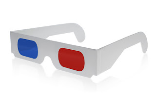
The lighter blue areas create a 'shiny' spot for the rendering engine. The darker red/blue areas affect the lighting in such a way that it will artificially shadow and shade a two dimensional texture and make it look THREE dimensional even though it's not. So you end up with some really photo-realistic results. This is actually a pretty regular way for games to handle three-dimensional rendering these days. In terms of our gift wrapping example, it's a gift wrapped in three-dimensional holographic paper which looks really awesome with those silly paper glasses on.
 |
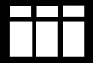
| A very simple window reflection mask, aka Illumination map. |
In terms of our gift wrapping example, imagine using neon-light up paint on the three-dimensional wrapping paper. That's what game-guru is doing here, in that dark room, to make those barrels look green and stand out no matter what.
An important thing to note is that without an illumination map, you are completely relying on the normal map to provide lighting; as such a lit object such as a window, skylight, lamp, etc will never look right without illumination mapping!
Got it?
Still want to go on?
Good. From here on, things get much more difficult. The rewards at the end are worth it though.
There are TWO types of light sources in Game Guru (Hereforth referred to simply as "GG"): Static and Dynamic types. A static light source is used when light mapping, as discussed in tutorial #2. A dynamic light source can be used to light dynamically - meaning it can be turned on/off/etc.
Dynamic light sources are the real weak point here. While static mapping helps a LOT to alleviate this, they are simply echoes of what you really want to see. So there are a few principles about dynamic lighting you need to understand. First is that a dynamic light will shine through walls. So it will go through a room and into the next one, lighting up those objects. Further, the engine as of current can only render *2* dynamic lights at any given time in view. So make sure you plan accordingly; try to make sure if you're using dynamic lights that you do not ever use them in large quantities in an area. Use them sparingly as spot lighting, to draw attention to an area or illuminate something important.
What alien?
In the above picture I've got our four plasma tubes and a friendly Alien NPC in our room. I'm using very low ambient and surface level lighting (10 each) and have four green static lights and one large white static light on the right. Note the lack of illumination mapping on the ceiling tiles means those light bars don't stand out much. Also notice there is no green reflection on the alien. Just a few points of light coming from our sun source which unfortunately will always filter through walls. Again, not a world ender - just plan around it.
Oh, there he is!
So at this point what I've done is kept the same light levels but added a green dynamic light of moderate size slightly forward and between the array of objects. This provides more room lighting overall as well as a green tint to our alien, which provides a sense of realism. It still looks.. off but at least is a little more respectable.
Here what I've done is decrease shadows slightly, increase bloom significantly, and increased surface lighting (which is how much light is shown from received sources). It's definitely got that 'radioactive' feel I was going for now.
- http://planetpixelemporium.com/tutorialpages/light.html
https://forum.game-guru.com/thread/215134
- Saving colors in mspaint for gg use later
Static lighting secrets
First, a quick summary of our principles before we begin:- Size matters
- Intensity via overlap and clustering
- Overlapping colors
- Mixing dynamic and static lights
Just a heads up - we're changing our example for the rest of this lesson - it will herein be a car parked in a garage (buildings pack, warehouse interiors, small blue warehouse) with a *ZERO AMBIENT LIGHTING setting and very low surface lighting value of 1!
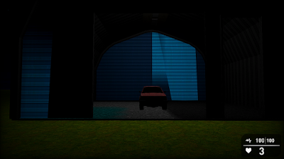
This is a single 500 size static light.
So in the above, if you go to full size on it, this picture shows very clearly a reasonably well lit car in a garage with traces of light spilling out the door onto the terrain below. The problem, while it looks *OK* and would quite honestly be acceptable in most cases for a Game-Guru offering, is that it won't illuminate *ENOUGH*. So what I've done is this:
I've added a single dynamic light of 500 size. So you can see here the light is moderately brighter; the walls light up more and you still have light spilling out. But there's also trace light spilling out through the walls on the sides onto the ground. If you setup your scene right, people will never notice. That said, it is an error and it's up to you whether this is the optimum route to take. Personally I would just use the size 2500 light and make an illumination map for the light piece up top. I've also found that certain light colors simply don't show up much. Whites and bright blues, for instance, are pretty bad at lighting scenes. That said you can improve this by adding MORE STATIC LIGHTS. Now in my experience this can be overkill; you can totally wash out a scene by using more than three overlapping static lights. Here's three small (100 size) static lights overlapping right above the car.
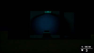
Note the intensity of the weak lighting, it's position, and how it impacts the scene. It gives the appearance of a dim blue light being cast on the car. It also makes the car LOOK blue. Red static lights are especially bad at this.
Here we're using several medium (200 size) cyan static lights. It still washes out the scene but lights up the back wall now. This, to me, just doesn't cut the mustard. Compare all that work setting up those lights to just one LARGE (1500 size) cyan light.
Seems like an improvement to me, though it's still not where it should be. So we add a dynamic light!
So basically what we've got here is a large static cyan light (1500) and a dynamic white light (size 500). This was done to show how to provide emitted lighting while still having cyan contrasting.
We still have the light filtering out the sides so I'd probably use cheap filler models (non-enterable buildings, for instance) on either side to hide the excess dynamic lighting. Alternately you can make the dynamic light smaller.
SPECIAL BONUS SECTION
Special thanks to Wolf @ the Game-Guru forums for this!
Inside of your Game-Guru file, you'll find a 'Setup.ini' file. It has several lightmapper related settings. The higher the numbers, the longer it will take for the lightmapper to compile, but the better it will look on static surfaces.
The lower the number.. the more it will look like a travesty like this:
 |
| I think I used size 8 quality 8 here? |
This is not something I can provide a one size fits all solution to. I'm going to recommend you try adding up to increments of 128 each time or use 1024 as a starting block. You'll need to close and reopen Game Guru each time to achieve lighting of sufficient quality.
Also if you recall earlier, I said *NOT* to use white lighting. This is mostly true. White lighting for some reason doesn't quite affect textures in a meaningful way. It helps illuminate a scene, but doesn't really do more than just raise existing values. So I use this chart:
http://planetpixelemporium.com/tutorialpages/light.html
Note the color values. This tutorial I just linked above is a HUGE piece of properly lighting a scene. You want to add to a scene, not detract. Use your colors to really draw a person in and make them feel at home. For examples, check out Wolf's Shavra: Renaissance game. He's got a real good handle on usage of static lighting; he's even written his own tutorial HERE. Be aware your static lighting is directly proportionate to surface levels in the Tab-Tab screen. And my last little tidbit - when using static lighting, turn your shadows WAY, WAY down. Those shadows will interfere with generated lightmapped shadows. I typically have mine down around 10 or at most 20 for just the barest hint of shadow.
Thanks, let me know if this helped you at all!


No comments:
Post a Comment