Welcome to my first Technique Training - how to build a basic level. In this example we'll be building a detailed and moderately realistic city scene; specifically a day and night version. We'll be starting with the day version and moving to night in the second lesson (which will combine an upcoming lesson on advanced lighting techniques).
Objects used: I have a lot of objects but I wanted to keep it as accessible as possible. There are some unique elements such as VA's playground set but that can be replaced with whatever you prefer. The vast bulk of this will be done with TGC's city set, which is a bit dated but fits the bill for a simple and rapid level build which looks like a city. I also use my
1024px HQ Road Terrain set.
Saving and Build Order
Let's start with the most basic element here; saving. Unfortunately GG lacks a sophisticated
CVS system; so you have to basically do it yourself. The reason for this is because invariably as you are designing you will run into problems. It's often a lot easier to simply reload a save than it is to try to fix the issue after it's been done. Some tricks are to use lots of folders. To save in chunks - like every day, or every major step along the way. Save them as different filenames so that you can identify each phase of development.
I typically will use:

Basic
Detail
Entity
Lighting
and Production as my folder names. The levels are built in that order; specifically Basic models are put down, and shape is put first. Then detail is added. After sufficient environmental detail is added, I then will add entities and lighting (in that order).
I try not to make too many as these FPM files can get rather large. As you can see, our example file (shown above) is 57mb. That's nothing to sneeze at when you're making 10-15 copies of the same file.
Fleshing out the basics
So when you're beginning at your rather huge, empty canvas you're going to be wondering 'what exactly do I do here?'. Well, first, you're going to want to have some sort of plan as to what you are doing. In our case, we're making a reasonably believable city scene. We want to start by laying out all the big pieces first. Remember that the larger they are, the more it will attract the player's attention. They will naturally gravitate towards larger pieces so try to set the larger landmarks as a sort of 'endpoint destination' for the player. In my case, they'll simply be heading 'to the horizon'. They won't get there of course, but it's important to set that as the goal.
There. Now you can see the start marker and a clear line going from one position to the other. At the far end of the map we have large, low-poly models on an elevated platform. So let's break this down:
1) Large models, again, set the destination.
2) The elevated platform gives a sense of distance and depth. It also conceals the edge of the world.
3) Low Poly models ensure that you will not be chewing up vital CPU resources since these objects
be in the player's vision the entire time.
What is a low poly model? A low poly model means low polygon count. Polygons are effectively how models are constructed and the more of them there are, the more detailed they are - but at the expense of vital memory and CPU resources. On top of that, there's a massive amount of free models available in the Game Guru community but a significant portion are flat-out too old to use as foreground elements. They make great background elements though! So never turn down free items and always try to see the intrinsic value to each piece.
As we continue, we'll be adding more and more larger pieces to help flesh out the player's opening view.
I ended up having to remove the building on the right with the white top later, due to some issues with it disappearing mid-level. As you can see on their own these buildings are very bland. I also placed some simple cobblestone panels underneath the buildings to help build a sidewalk onto. All of this is simple level building at it's finest. The white dashed lines are a set of 'road lines' that go well with
my road terrain set and were provided by VA's store. I paid for them as they're definitely worth it.
Details Matter
One of the problems with a lot of the offerings I see typically produced by the Game-Guru and game hobbyist community at large is a severe lack of focus on details. Little things matter. The better you dress up the scene, the more immersive it is for the gamer walking through it. It's important to provide a consistency in terms of art style, methods, and colors, whenever possible.
As stated before I was using the cobblestone platforms included with TGC City Pack. They however do not transition well on their own and it's not always suitable to use the included curbs.
Here you see a typical problem with models not transitioning well.
My solution was to use the terrain system by raising a small corner to slightly overlap...
Then using the leveler tool to give it a nice uniform lip. I then matched the background to the color of the cobblestone as best as I could (this is using default terrain at this point)
Details like this are small, but really add to the totality of a scene when a player encounters it.
Use small objects really provides a greater sense of realism for the player. It's one thing to have a city full of large buildings... it's another to have a city street with lines, manholes, sewer grates, curbs, trash bins, etc.
 This is only scratching the surface of detailing a level.
Blank areas also can act as a draw, but usually not in a good way. if you forget to detail a section, it will stand out like a sore thumb as something that just looks unprofessional and unclean. Use blank areas instead to draw the player's attention to places they should go, directions to explore.
Take for instance the lot to the right. It's not going to be a player area per-se but I can't just leave it empty. So I decided to make it an overgrown lot with some weeds, trash, fencing, etc.
Looks a bit better than a simple green rectangle, but still needs more.
So how about some vegetation?
Note one really important thing here; my terrain is very asymmetrical. It's not the same two buildings, repeated, in a perfect grid. The human brain sees symmetry as very false. Asymmetry is how you can add that extra touch of realism to your games.
Note the slight cant on the upper right box. This type of thing seems far more believable than a simple 'here's a stack of boxes'.
Another, more subtle level of asymmetry - lowering the height of the stone platform so the curb sits slightly above it. This barest of reliefs adds a much greater sense of immersion.
It's important to provide landmarks for the player to gravitate to. These are typically areas with higher level of detail, variations in object quantity/type, and colors. You also want to do this to highlight areas of interest not necessarily relevant to the main plot - for instance, a secret.
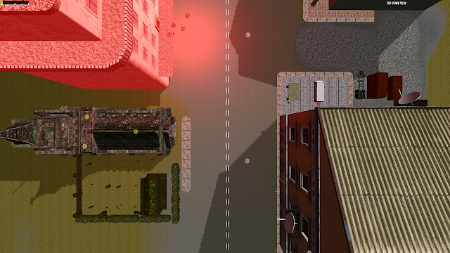
The red light on the left draws them in, the right side is the real prize.
Don't forget to add nice finishes like plants, vegetation, cars, etc.
There! Now we have the perfect area to stash some goodies for the more intrepid player as a reward for their curiosity.
 Remember to work with the tools you have. Extra models can be repurposed for small walkways, fencing, etc.
Now we've setup a very basic scene. I don't feel this is anywhere closed to finished but we'll get more into it as we progress further through our tutorials in future installments. Let's take a look at how it seems on the ground.
Not bad for 45 minutes of work!
We still need a lot more work to make this complete, but the basic 'welcome to the area' scene is pretty well set. We'll continue on in our next installment shortly! We still have to add more details; more lighting, shadows, and of course enemies/entities.
See you soon!


 It's not even close.