Search This Blog

Monday, October 31, 2016

Lighting guide part 4 addendum/clarification

So recently it was brought to my attention that the wording I used in my previous lighting guide was confusing or came across as flat out wrong.  This was specifically because I was trying to simplify the concept for a general audience.  As a result of this though I feel a clarification is in order.

Here's the post in question (I recommend reading it if nothing else for the excellent screenshots):

https://forum.game-guru.com/thread/216552?page=1#msg2561577

And the specific bit I want to address is here:

"Now on to what rubs me against the wolfish fur: Lee is wrong.

Quote: "The response was nothing less than astonishing. Lee told me outright that the brightness of the static lights is DIRECTLY tied to the bloom slider."


It isnt. I've been using mid level bloom settings around 50 in most of my scenes. I've only started to go higher because I was going for a washed out, hazy retro'ish look with recent efforts.
Seeing this I loaded up a large, completely lit map of mine and started to play with the bloom slider. I got the results I have expected. Bloom is just that. Bloom. While it adds a lot haze and shininess directly to light sources and bright surfaces it does not affect the lightmaps themselves
."

This is 100% correct.

THE ONLY VALUES THAT SHOULD EVER DIRECTLY INCREASE LIGHT POTENCY SHOULD BE THE ACTUAL LIGHT VALUES OF AMBIENT/SURFACE LIGHT.

My response was thus:

"Sorry if I was unclear - surface light value IS the primary driver for static light potency (as mentioned I think in my lighting guide, section 3) ... but bloom *DOES* have an impact on how bright those values appear. It's obvious the way I worded that in my 4th guide is a bit in error and will need a fix to clarify.

But basically I get what Lee was saying. Because of the additive effect bloom has on light values as rendered, it has an EFFECTIVE (as in not direct, but end result is similar) value of increasing the light's brightness.

Even wolf's example shows this very clearly:


Pay specific attention to the wall underneath the foremost blue column in the middle of the room. It very clearly is getting brighter.


So as you can see - the pillar in the middle is increasing in brightness per the renderer.  While the ACTUAL LIGHTMAPPING IS NOT CHANGED the appearance to the end user is that it is brighter.


Hope that clears things up!


Monday, October 24, 2016

Technique Training/Evaluation: Seriously Advanced Lighting for Game Guru (part 4)


NOTE: I POSTED AN ADDENDUM TO THIS TO BE READ AFTER THIS DOCUMENT AS OF 10/31 - Please read this once you've completed this tutorial: http://gamegurureport.blogspot.com/2016/10/lighting-guide-part-4.html

So when I say "seriously advanced" let me just preface that by saying that ... this is still Game-Guru. The lighting engine is still a decade or so behind where it should be.  But we can still fake it well enough to be decent.


WARNING: THIS ARTICLE ASSUMES YOU HAVE READ THE PREVIOUS THREE.

So when I wrote my last lighting article I thought that'd be the last one.  However, I recently had some correspondence with Lee Bamber (@leebamber).  He's the head programmer for the Game-Guru project.  Imagine this guy:

No, seriously, imagine it.
As a programmer.  That's Lee in a nutshell.  He's pretty competent at programming but does it all himself; he takes on advanced topics and tries to make it available for the everyday layman.  Overall, he does ok, which is actually quite the compliment given the magnitude of the task.

Anyways this correspondence basically stemmed around me asking him if there's any way to increase the brightness of the static lighting in game-guru.

The response was nothing less than astonishing.  Lee told me outright that the brightness of the static lights is DIRECTLY tied to the bloom slider.

Think about that for a moment.

So basically the brighter you want your static lights, the higher that bloom slider needs to be.  It's a minor, but incredibly important distinction.

Now let's show that in action.  Here's a screenshot from Wolf's upcoming 'Acythian' cyberpunk game.

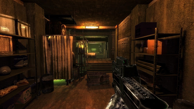
There's at least 7 separate lightsources here.  Can you find them all?
Now this isn't a maximum bloom setting, but it's up pretty high.  He's running around 70 or 80, I'd wager.  I realize it's not the latest Deus Ex title, but this is pretty damn good for the Game-Guru Engine.  My wife, a well seasoned gamer, knows well the limits of what she calls a '10 year old graphics engine' when she sees it.  She couldn't believe this came from Game Guru.

Wolf's advice for this particular piece goes back to something I wrote about in part three of the lighting tutorial:

"You increase lightmappingquality to 1000 and lightmappingsizeentity as well (or higher) in the setup.ini. Now you place your lights either according to realism or colorscheme. I have written a lot on that in the past, lets just say here that basic leveldesign rules apply. (This is important because Gurus lightmapper is a bit wonky and so is the post processing which means that bad choices stick out way more than in something like the UE4.)"

If you've read the previous guides, then you know exactly what he means by this.

My own efforts have yielded improved results as well.  Here's a little before and after:
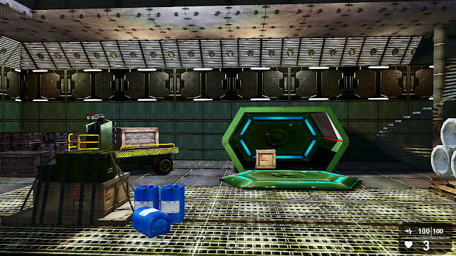
Single light source, default settings.

Well the after looks remarkably similar but the devil is in the details, notably the lines between the shadow and light are far better aliased.  They're smoother; the light range is moderately better on the actual objects in question as well.  Take a look - make sure you open it up in a new window to get a real close look because most of the improvement is very hard to see.  Focus on the shadows on the boxes and in the green crate.


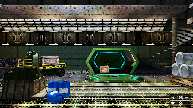
With a single light source, using 1000 quality/1024entity settings in the setup.ini

So if you're not aware, I am using a modification to gameguru called Reshade.  Reshade was brought to us by NomadSoul, who ported it so we can use it.  It's a AAA post processing system which can really improve the quality of your game's output and graphics.  It can't add dynamic lighting or pre-processing stuff though so mostly you're just sharpening up the graphics or adding a filter.

I've messed with it ... significantly... for months.  My first efforts with it were documented here: http://gamegurureport.blogspot.com/2016/01/just-little-update-nomadfx-reshade-mod.html

I have to say that this particular piece is pretty much a 'must have' for Game-Guru.  If you want Game-Guru to look like your game came out in the past 10 years, you need this.

I believe if you want your game to sell, it needs to compete... at least a little.  I can respect the efforts of anyone who puts significant time into their game.  But if you aren't trying to tune it up so people will find it graphically pleasing - you will pay the price.  Interest will wane or collapse.  You will be derided privately and publicly.  Adding post processing and tuning it is part of that process.


As you can see the jaggies are removed, edges are smoothed, bloom is cleaner, lighting is nicer and the tone map is significantly improved.
 
The cartoon setting allows older models to look more like they belong in a modern context.  A lot of older freebie stuff had very simple textures which effectively sent it to background art. 


Note the darker lines and more dramatic color ranges.  It's a fast way to a borderlands-style look.  One thing that WOULD need done is to make a mask for the HUD elements; it's within reshade's protocols so make sure you read the files that come with it.

As you can see there's a lot here that can be done to help create a unified theme for your game or bring it up to a more modern level.  Gamers with lower power cards (this author uses a GTX960) will need to disable Reshade as it will cause a framerate dip.  It assumes you have something capable of running it.


Picking appropriate lighting colors


Inside the GG engine, there's several different lights available.  These choices result in some of the most atrocious color schemes possible.  Unless you are specifically looking for a lime green or neon purple color to an area, you will need to modify these considerably by customizing the colors so they don't wash out your textures.

The best way to do this is to pick a standard color you like (Orange, Green, Blue, whatever) and move it towards the white range.  White effectively is a 'clear' color for the renderer when using static lights.  Let me say that again:

WHITE IS EFFECTIVELY A CLEAR COLOR FOR THE LIGHTMAPPER.

So if you use white lights you will sit around scratching your head wondering why the hell you're not getting any brightness.  What you want to do instead is pick a color like yellow - and move it towards the white range - like this:

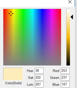
This will provide a nice, orange glow.
If you are thinking about how this lightmapper works, it effectively throws a layer on top of the texture, TINTING IT towards the color range you are trying to achieve.  So the 'whiter' it is, the more transparent it applies it towards the texture.  The darker the color, the darker it will apply it.  You can actually make lights and that in and of itself is interesting.

This tinting is applied as a layer which is then controlled in intensity by bloom.  I honestly believe this should be a separate setting.  Why it was tied to bloom I will never understand.

So using my existing scene, I've modified the settings from bloom at 35 up to 80, my usual trick of a light fog to unify colors and lowering the ambient down from 35 to 20.  This is also with the enhanced 1000/1024 lightmapping setting in the setup.ini.

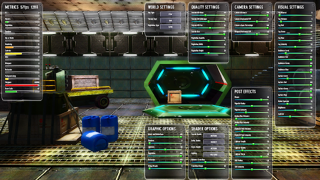
I think this looks much better, don't you?

As you can see the lightmapped objects look phenomenal for something out of a mediocre engine like Game-Guru.  The illumination mapped objects (the Dagored scifi walls and Jackal's free sci-fi container) look awesome with some bloom, really giving them a feel of brightly lit objects.   It's really important not to go overboard here otherwise you will wash out your scene very quickly.  This is especially true with the ambient light levels; if they are set too high with a high bloom setting, you will get nothing more than a retinal migraine.

As usual, I hope these tips and tricks have helped you as they help me.

NOTE: I POSTED AN ADDENDUM TO THIS TO BE READ AFTER THIS DOCUMENT AS OF 10/31 - Please read this once you've completed this tutorial: http://gamegurureport.blogspot.com/2016/10/lighting-guide-part-4.html

If you have any additional comments, leave them below!

Friday, October 14, 2016

Protogenic Subculture, a private pack design by Wolf!

Wolf remains one of my favorite artists on the store, as well as off the store.  You'll find a link on the right to his personal page as a result.

He's got a good eye for creating interesting and unique shapes.  His designs are among the most daring shapes you can find available for Game Guru.  Also important to me is that he shares a passion for Sci-Fi; specifically cyberpunk.

Purchase Protgenic Subculture HERE!

Cyberpunk, for those who don't know, is a specific sub-set of Sci-Fi which revolves around neon textures, rusty pipes, gears, a sort of grungy technomancer look that really looks great in games.  Deus Ex, for example, could be considered Cyberpunk.

Or, according to a '94 issue of Mondo 2000, meet the above criteria.

This kit is not available on the TGC store.  It's privately sold.  It's also well priced (currently costing $10, get it while you can!)

Some of these clutter objects are very large, like the satellite array, which is EEENNOOORMOUS

It features a whopping 79 total entities.  Most of them are clutter objects, but brilliant ones that are low poly enough to be used in many, many projects.  Further, a great many are illumination mapped so you can get illumination effects when you add lighting.

Please note, actual pieces are shown above from the kit.
Basically the concept here is you take a city scene and modify it to make it more cyberpunk style.  This can be done very rapidly by simply building a standard city (use my instructions, if you need help!) and simply adding the pieces of flair, as it were.

Here's a quick example:
Literally the barest minimum here, two objects added to a building.
You can do a lot with these pieces.  The mazes of wires, the advertisements make for a rich setting.

They also go well with his other pieces by following the same trend; you can use pieces from the Mega Pack 01's future set if you are looking for another good bargain to mix with these.

Overall, I'm exceptionally pleased with this.  It's been a great investment and will do much to improve my levels as they move forward.

For the money this is a fantastic value.  These set pieces will give you a lot of mileage.  My only complaint is that they look better in his editor than they do in Game-Guru.  But honestly, that's really par for the course at least until Game Guru's renderer improves.  Regardless, they still prove to be quite capable and worth the pickup.


IN THE INTEREST OF DISCLOSURE I RECEIVED THIS PACK AS A REVIEWER'S KIT. IT DID NOT IMPACT MY ANALYSIS OF THIS AT ALL.  I RECEIVE NOTHING FOR PROVIDING POSITIVE REVIEWS.

Thursday, October 6, 2016

Dagored's Sci-Fi Corridors and Halls

I've been meaning to purchase from Dagored for quite a while.  Unfortunately I just couldn't find the item which struck my fancy the most.  I have, however, eyed the Sci-Fi Corridors and Halls pack for a considerable length of time.  I felt I owed Dagored a purchase - a while ago he gave me a custom model that I'm still holding onto - a scientist for a game I've been working on (kept under wraps for now).  

So eventually I gave this thing a real hard look and realized: Hot damn.. this is going to look good with static lighting.

Here's a demo video using stock dynamic lighting:


So I gave it a further look and found it comes with several really excellent pieces, like this animated vent:

The texture is so-so but the rotating fans are very well done.  Overall a good piece.

 A good enemy model (for game guru, this is fairly rare):

The centurion is really well done overall.  I will likely retexture it later to give it a 'more ancient' feel.
So you actually get SEVERAL enemy models.  The other two are less noteworthy (the spider and the drone).  But they are there and frankly with character/enemy models being among the highest individually priced assets on the store, this is a boon.

You also get this HIGHLY detailed shuttle:
Not bad and given you can go inside it has significant utility.
The shuttle is obviously inspired by the Star Trek 'runabout' shuttle.  That said, it's clearly not identical and has it's own variations - enough to stand on it's own two feet.  I am not wild about the bright reds and blues though so I'll probably mute those for my own project.  I like to retexture/color things I buy for personal use and this will be no exception.  I do really like the smooth lines on the cockpit and the interior panels as well.

There's even this slick lift:
The script that comes with it is useful for other projects as well!
I really like how the texturing on the lift is properly aligned.  One major pet peeve for me is when people do not actually align their textures with the shape.  It's part of the reason I won't release any of my own modelling attempts - I have difficulty texturing like this.  Bravo, Dagored :)

So you literally get three enemies, a bomb/mine, a shuttle, a teleporter chamber, a lift and script for the lift... and that's not even counting the actual ROOMS AND CORRIDORS.

The corridors came out extremely well.  I will use some of his stock photos for example's sake but after I get home tonight I will try to add my own photos with some lighting so you can see how well they respond.  One *REALLY* nice surprise is that on 'highest' shader level for the entities I discovered the hallways and rooms have illumination mapping!

The quality on these pieces, despite their simplistic shapes, is extremely high.  I'm very satisfied with my purchase.  One very nice bonus was finding that all of this stuff snaps together exceptionally well.  Normally there's a lot of fitting and wiggling and trying to put this stuff in such a way that it just.. eats up time.  Not to mention Game Guru has a nasty glitch that's been going on for a while where if you are moving an object sometimes it will slide it the entire length of the map.  So grid snap is pretty much a MUST and this whole set it aligned properly.

Please check back on this post later for pictures of some of my own tests/attempts!


Bottom line on this one is it's a steal.  I've used all manner of Sci-Fi kits and while most are fairly good this one makes putting together a decent base or installation a breeze.  Coupled with the bonus goodies and it's a no brainer.