Search This Blog

Showing posts with label technique evaluation. Show all posts

Thursday, July 28, 2016

Technique Training: Mountains out of mole hills!

Time for another Technique Training, class is in session!

One of the hallmark features of game-guru is the terrain system, which is basically the main difference between the old FPS Creator X9/10 and Game Guru (or FPS Creator Reloaded, if you remember it back that far).  This system, however, initially feels very bland.  With a little work though, you too can get pretty excellent looking terrain if you have an idea of how to use the tools available!

The first thing we're going to need is some inspiration.  As always, I start in the usual place - google image search.

 It's really that simple, honest.

Today, I've selected this picture as my inspiration.  Please note, it's not designed to be a direct copy, but rather just something to give me ideas and a general feel for how I want my terrain to look.

From: http://feelgrafix.com/data_images/out/7/799038-fantastic-mountains-wallpaper.jpg

So what we're going to do to start is load up a new, flat level and make the terrain sculpting tool the largest size possible (With the + key).  Once it's the largest size possible, you're going to simply pick a point and make a mountain, right?


We're all done, right?
So you've made your giant lump.  Congratulations!  You've now officially joined the ranks of 'first time Game-Guru' user!   Obviously, this is wholly insufficient for what we need.  We are looking for a broad, jagged mountain range.  So at this point the next step is to offset your position a little bit and 'build up' some larger hills to the side and front of it.  I generally will try to add a light slope to the front as well because most mountains have this feature.


It's a little better, more 'mountainy', for sure.  Miles to go though.
Now a big part of making mountains in GG look decent is adding depth to them; this is done not by adding tons and tons of hills but rather using a physical parallax effect.  What's parallax, you ask?  Parallax, simply put, is a layering method to produce a more depthful effect when looking at a flat image.  In the past (and even in today's modern indy games/side scrollers/etc) it was used to produce a look that provides a faux three dimensional effect.  In this case, we're going to be basically placing one mountain range BEHIND another.

Image courtesy of Opengameart.org
In the case of game guru, we're going to create a parallax style background by using physical elements.  The layering of mountain ranges will provide a *REAL* tangible feel to them, which is part of why I chose the original picture.  If you notice, said picture has two basic seams of mountains running next to each other.  That's what we're going to achieve here.


Note, this second mountain range is the one on the right, offset about one max size half circle width.
At this point you've got the basic terrain features.  And boy do I mean basic.  You have a few lumps and some rounded components which show the barest approximation of that beautiful vista I chose earlier.  Don't worry, we'll tighten it up.  The next thing you're going to want to do is make the circle about half of maximum size and start drawing lines to connect the ranges and taper off.

Still looking very much like a mashed potato mountain, but getting closer.

At this point you're thinking "Yeah, yeah... This is the easy stuff.  ANYONE can do this.  These mountains are neither good nor convincing!".  And you'd not be wrong. Except this is just the barest piece.  The next part is the crucial part, the part that really shapes this into a realistic mountain.  You want to take your brush size down to the smallest size possible.  What you're going to do now is starting at the top of the mountain and steadily drawing lines down to the bottom.  This is to represent the hard edges you find on any mountain (aside from dome types, that is). Continue drawing lines down the side, breaking lines of into separate branches.  Make sure you don't spend too long in one place or you will have a very ugly spire sticking up.

Remember to start at the top!
Continue tracing down the mountain, and going over each major ridge to give it a hard rocky look.  It doesn't take much experience to do this.  You can pick up the technique pretty fast.


When you overdo a section, like I did on the right, plan on doing a little extra to make it look natural.
After about 20 or 30 minutes of fine shaping you'll have a much more realistic rock face with hard ridges, faults, etc.  It's real important to try to capture the shape of the type of mountain you are working with.

Definitely looking more mountainous now!
So you can see that it's looking more like a mountain but there's still a lot of overly sharp edges which don't quite look right.  Even the most harsh mountain range still has SOME degree of erosion to it.  So after you get this much of your shaping done, adjust your tool to be about half of maximum size again.  Click on the blend mode tool and start doing 'taps' over the harder terrain to soften it up.  It's important not to overdo the blend tool so just highlight an area and click once, twice, or however much is needed until you get the desired shape.  This will make the mountains seem far more natural.  You also can use the shift key to create indents or create channels (as opposed to ridges).  You can also do single shift-clicks to create minor pockmarks that are far more realistic than a single click to raise terrain.

It's subtle, but you can see the difference the most on the right.
Now depending on how good you want this to look, you can probably stop there if you really just want some background mountains for a game.  But if you're trying to create a photorealistic shot, you're going to want to adjust every component.  Let's start by changing from the 'lush' terrain to 'Lush HD' and putting all the graphical settings in GG to 'highest'.


Hard to believe this was a bland old mound 30 mins ago, eh?
Understanding what you're working with for mountains is very important; if you're just winging it, you're going to look amateurish.  And we wouldn't want that, would we?  So take a look at some reference material, research growth patterns in geology, whatever.  In this case, I'll save you some trouble on a rudimentary thing like vegetation.  Vegetation rarely grows on the tops of mountains. It's typically moderate or dense at the bottom and then becomes more sparse as it goes up. 


Just a start, but the basic concept is there.
With Game Guru, I prefer vegetation quantity on 100%.  The width and height for this were set at 50% (default values).  I initially started with swapping the sky to my 'moonlit ocean' sky.  Vegetation matching as a result required a darker, less obtrusive color.  This one I think is called 'thistle'.


Lookin' good for something not even done yet!
While that's nice, I realized I wanted to give the other terrain features as well including the half-rounded hill, inlet with island, and simple path. It's important to lay down secondary vegetation as well.  For this I used foliage bushes 1 and 2.  For bush 1 (the smaller of the two) I used the spray tool (the "I") key.  For the larger bushes (bush 2) I hand positioned them and rotated them periodically to give them a more natural look.


Adding some minor vegetation to the island and inlet.
One of the tricks I use to make inlets is to reduce the terrain to a depth I like (moderately shallow, player-depth water) then use the Level mode tool to 'cut out' the terrain I want.  I usually move the mouse around rather slow for specific areas and moderately fast for areas to give a slight elevation to (such as that slight beach in front of the island).

Continue tuning until you get the desired result.


Creeping foliage up the side, a good waterfront, reasonable mountains... success!

Around this time you can add decals for fog (free ones on the forums, HERE or HERE which will provide you reasonably decent fog that you can tune to either give a misty mountain appearance or perhaps that of a volcano.

Placement of these is trial and error but not terribly difficult.

That said, I wanted to get close to the original, if possible.  so I added a few more pieces including a rounded hill that had a sharp cutoff through it to give a similar appearance to what is in the original picture.  I used the level tool to cut through the mound to give it that sharp rock face.


The leveling tool is one of my favorite additions to the toolkit.

Now it's time to set the sky and colors.   It takes a little twiddling but you'll notice that when I switched the sky up I had serious issues with the existing foliage being too dark; here again I had to go modify it to suit the scene, as you will often do.

Thistle is real good, but pretty dark, overall. 
You can find yourself in a number of possibilities the terrain system.  It's very flexible and fluid if you're willing to invest the time into trying to learn new things.
Probably my favorite pic of the lot.

One trick is to take rocks from the scenery that comes with Game Guru and add them to the mountain.

You can get a sense of my workflow here with the reference photo on the left and the editor on the right.
In the above picture I'm positioning one of several rocks which are masked by the vegetation system.


The final result came out pretty good.  Of course there's always more work that could be done but overall I'm pleased with the results.  Hopefully you'll be pleased with your results too.  Feel free to post some images of your own to imgur.com and link them in the comments.


Thursday, July 7, 2016

Technique Evaluation: Advanced lighting techniques (lighting part three)

Welcome to 'lighting part three', a tutorial on advanced lighting techniques in Game-Guru. I warn you, this subject matter is heady and can be difficult to really grasp.  It is, however, vital, if you wish to get the best quality in terms of lighting and performance from your Game-Guru engine.

If you've not see the other two tutorials, please do them in order first:
Part 1 - Lighting
Part 2 - Interior lighting

As you will NEED the understanding from those two to get the relevant pieces from this lesson.

So right out of the box let me say that on it's own, the lighting situation in Game-Guru is ABYSMAL.  I mean it's really painfully dreadful in how archaic and primitive it is.  That said, I am a firm believer that you can take even simple tools and craft fine products.  So I've done a lot of the hard work for you to work out the details of what's involved with getting your lighting looking as clean and slick as possible.

I've modified our room from the previous lesson from this:
 Remember this?

To this:


So it's a little dark but you can see I've replaced the chairs with the plasma tubes from the new Sci-Fi DLC.  I've added *ONE* green static light to provide some illumination but these are getting almost all of their color from the illumination map they ship with.

On mapping


What's an illumination map?  Some of the more high quality items on the store or available as DLCs from "The Game Creators, Inc." include what's called a illumination map as well as the standard normal map (Normals create bump-mapping which is introduced via specularity).
This is how your computer sees a normal mapped texture.
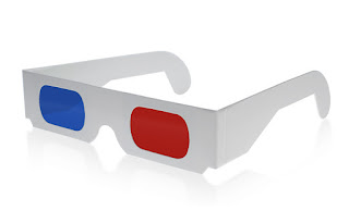
What?  Huh? Spec-u-whatity?  I assumed a level of knowledge you don't have, sorry about that.  Ok so you *PROBABLY* know how textures and mapping work but if you don't the basic concept is similar to wrapping a gift for christmas.  If a plain colored brown box is your model, then texture mapping is the actual gift-wrap.  Think of Normal-mapping as a sort of color coding which introduces a false sense of depth to a two dimensional piece of wrapping paper by putting it in that awful red/blue color with 3d goggles that were such a rage in the 80's.


This is a normal map for a tinfoil texture.
The lighter blue areas create a 'shiny' spot for the rendering engine.  The darker red/blue areas affect the lighting in such a way that it will artificially shadow and shade a two dimensional texture and make it look THREE dimensional even though it's not.  So you end up with some really photo-realistic results.  This is actually a pretty regular way for games to handle three-dimensional rendering these days.  In terms of our gift wrapping example, it's a gift wrapped in three-dimensional holographic paper which looks really awesome with those silly paper glasses on.
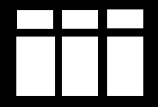


A very simple window reflection mask, aka Illumination map.
So going back to it, what's an Illumination map?   Now that you know how a texture map and normal map work; what the hell is an illumination map?  Ok - this takes the whole concept of texture mapping and adds another layer (some applications add many, many more, but this is a very simple one that very many game engines use, including Game-Guru).  It's simply a high-low value which tells the game engine if a portion of the texture should be really bright at all times.  This gives it an appearance of being illuminated (imagine that).

In terms of our gift wrapping example, imagine using neon-light up paint on the three-dimensional wrapping paper.  That's what game-guru is doing here, in that dark room, to make those barrels look green and stand out no matter what.

An important thing to note is that without an illumination map, you are completely relying on the normal map to provide lighting; as such a lit object such as a window, skylight, lamp, etc will never look right without illumination mapping!

Got it? 

Still want to go on?

Good.  From here on, things get much more difficult.  The rewards at the end are worth it though.

There are TWO types of light sources in Game Guru (Hereforth referred to simply as "GG"):  Static and Dynamic types.  A static light source is used when light mapping, as discussed in tutorial #2.  A dynamic light source can be used to light dynamically - meaning it can be turned on/off/etc.

Dynamic light sources are the real weak point here.  While static mapping helps a LOT to alleviate this, they are simply echoes of what you really want to see.  So there are a few principles about dynamic lighting you need to understand.  First is that a dynamic light will shine through walls.  So it will go through a room and into the next one, lighting up those objects.   Further, the engine as of current can only render *2* dynamic lights at any given time in view.  So make sure you plan accordingly; try to make sure if you're using dynamic lights that you do not ever use them in large quantities in an area.  Use them sparingly as spot lighting, to draw attention to an area or illuminate something important. 


What alien?

In the above picture I've got our four plasma tubes and a friendly Alien NPC in our room.  I'm using very low ambient and surface level lighting (10 each) and have four green static lights and one large white static light on the right.   Note the lack of illumination mapping on the ceiling tiles means those light bars don't stand out much.  Also notice there is no green reflection on the alien.  Just a few points of light coming from our sun source which unfortunately will always filter through walls.  Again, not a world ender - just plan around it.

 Oh, there he is!

So at this point what I've done is kept the same light levels but added a green dynamic light of moderate size slightly forward and between the array of objects.  This provides more room lighting overall as well as  a green tint to our alien, which provides a sense of realism.  It still looks.. off but at least is a little more respectable.


Here what I've done is decrease shadows slightly, increase bloom significantly, and increased surface lighting (which is how much light is shown from received sources).  It's definitely got that 'radioactive' feel I was going for now.

Color usage:
- http://planetpixelemporium.com/tutorialpages/light.html
https://forum.game-guru.com/thread/215134
- Saving colors in mspaint for gg use later

Static lighting secrets

First, a quick summary of our principles before we begin:
- Size matters
- Intensity via overlap and clustering
- Overlapping colors
- Mixing dynamic and static lights

Just a heads up - we're changing our example for the rest of this lesson - it will herein be a car parked in a garage (buildings pack, warehouse interiors, small blue warehouse) with a *ZERO AMBIENT LIGHTING setting and very low surface lighting value of 1!

This is a single 500 size static light.

Now let's get onto our first principle - Size matters.  This is relevant not because of the inherent phallic innuendo but because in the realm of static lighting, you are fighting with really weak influences on your environment.  The simplest way to improve that is to simply use a rule of thumb - a static light's size and influence is roughly 1/5th that of a dynamic light. So a size 500 dynamic light needs a size 2500 static light.  Even then it won't QUITE be the same, but it will help significantly cover areas and properly detail lights.  Here's our example with a 2500 size static light:


So in the above, if you go to full size on it, this picture shows very clearly a reasonably well lit car in a garage with traces of light spilling out the door onto the terrain below.  The problem, while it looks *OK* and would quite honestly be acceptable in most cases for a Game-Guru offering,  is that it won't illuminate *ENOUGH*.  So what I've done is this:


I've added a single dynamic light of 500 size.  So you can see here the light is moderately brighter; the walls light up more and you still have light spilling out.  But there's also trace light spilling out through the walls on the sides onto the ground.  If you setup your scene right, people will never notice.  That said, it is an error and it's up to you whether this is the optimum route to take.  Personally I would just use the size 2500 light and make an illumination map for the light piece up top.  I've also found that certain light colors simply don't show up much.  Whites and bright blues, for instance, are pretty bad at lighting scenes.  That said you can improve this by adding MORE STATIC LIGHTS.  Now in my experience this can be overkill; you can totally wash out a scene by using more than three overlapping static lights.  Here's three small (100 size) static lights overlapping right above the car.
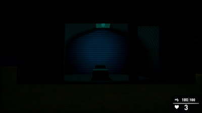

Note the intensity of the weak lighting, it's position, and how it impacts the scene.  It gives the appearance of a dim blue light being cast on the car. It also makes the car LOOK blue.  Red static lights are especially bad at this.


Here we're using several medium (200 size) cyan static lights.  It still washes out the scene but lights up the back wall now.  This, to me, just doesn't cut the mustard.  Compare all that work setting up those lights to just one LARGE (1500 size) cyan light.


Seems like an improvement to me, though it's still not where it should be. So we add a dynamic light!


So basically what we've got here is a large static cyan light (1500) and a dynamic white light (size 500).  This was done to show how to provide emitted lighting while still having cyan contrasting.
We still have the light filtering out the sides so I'd probably use cheap filler models (non-enterable buildings, for instance) on either side to hide the excess dynamic lighting.  Alternately you can make the dynamic light smaller.

SPECIAL BONUS SECTION

Special thanks to Wolf @ the Game-Guru forums for this!
 
Inside of your Game-Guru file, you'll find a 'Setup.ini' file.  It has several lightmapper related settings.  The higher the numbers, the longer it will take for the lightmapper to compile, but the better it will look on static surfaces.
The lower the number.. the more it will look like a travesty like this:
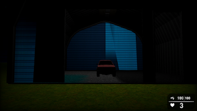

I think I used size 8 quality 8 here?

This is not something I can provide a one size fits all solution to.  I'm going to recommend you try adding up to increments of 128 each time or use 1024 as a starting block.  You'll need to close and reopen Game Guru each time to achieve lighting of sufficient quality.

Also if you recall earlier, I said *NOT* to use white lighting.  This is mostly true.  White lighting for some reason doesn't quite affect textures in a meaningful way.  It helps illuminate a scene, but doesn't really do more than just raise existing values.  So I use this chart:

http://planetpixelemporium.com/tutorialpages/light.html

Note the color values.  This tutorial I just linked above is a HUGE piece of properly lighting a scene.  You want to add to a scene, not detract.  Use your colors to really draw a person in and make them feel at home.  For examples, check out Wolf's Shavra: Renaissance game.  He's got a real good handle on usage of static lighting; he's even written his own tutorial HERE.  Be aware your static lighting is directly proportionate to surface levels in the Tab-Tab screen.  And my last little tidbit - when using static lighting, turn your shadows WAY, WAY down.  Those shadows will interfere with generated lightmapped shadows.  I typically have mine down around 10 or at most 20 for just the barest hint of shadow.

Thanks, let me know if this helped you at all!

Wednesday, December 23, 2015

Technique Evaluation: Lighting in Game-Guru

If there's one complaint I have about a lot of the homebrew games I see being made with Game-Guru (GG), it's the lighting.  It's clear people are going out of their way to develop games that they play for fun and usually are decent enough - but the lighting is atrocious.  This is because the default settings in GG are less than ideal for most if any games.  They are great for placing objects and determining where you want things to go though.  In that sense it's great as it shows you exactly what you did wrong because the seams and shadows stand out like a sore thumb.  Which is precisely why you don't want to use that on your base game.

From a previous article on ground clutter - note the very jarring colors/textures.


There are two different types of lighting in Game-Guru:  Interior and Exterior.  Both have different processes but similar methods.

Interior lighting is highly reliant upon placed static lights.  Exterior lighting much less so as the sun (which is not adjustable at this time) handles a lot of it.

I'll get into interior lighting in another article as it requires a significant amount of changes to level design and methodology.

For exterior lighting, you'll primarily be messing with the 'tab-tab' screen.  To reach it, simply fire up the game in test mode then hit tab twice.  Simple, right?

The 'easy game maker' sure has a lot of complicated options, eh? :)

As you can see in the above picture there are a significant amount of options.

Starting from left to right, top to bottom:
  • The 'metrics' are debug information used for troubleshooting speed, efficiency, etc.  That's another discussion for another day.
  • World settings are your most basic settings: What type of sky you want, what  kind of terrain you're using, and the type of 'grass' you can paint on the ground.
  • Quality settings can be summed up as: LOD = how far away things start to get shitty looking to save on rendering cost, how big the 'map' is, and vegetation settings.
  • Camera settings - I almost never mess with this because the defaults are good for most FPS games.  
  • Visual settings - the most relevant panel in the list.  This affects the colors and lighting you'll be using.  I'll go into further detail below.
  • Graphic options:  This is a more 'high end' feature.  It affects water reflection opacity, how 'thick' the shadows are, lightray amount and vegetation.  Occlusion and debug visuals will require hand tuning in your final pre-game tests.
  • Shader options:  I pretty much leave distance transition settings normal and put everything on highest.  
  • Post effects: What happens "AFTER" the lighting is done.  Bloom affects how fuzzy your light will look.  Vignette radius and intensity - Primarily used to give that 'old time horror game' feel.  Motion blur distance - I hate motion blur, so I disable this typically.  Depth of field I leave at 25 out of 100 but this can really give your game a sense of distance so definitely play with it to see what works best.

So really we've established that for MOST outdoor scenes your most important settings are going to be found in the visual settings tab.

 So let's start with the fog settings.  Starting in a previous version, the fog system is actually VERY impressive in Game-Guru.  It's a blended technique vs the brute force method original versions used. So in reality it's actually very good for making scenes have a unified color, which in turn helps unify the theme.  It also blends the distance very well so the horizon isn't as sheared.

A good example of using light fog to unify the color palette and theme.

A side note: On unifying colors the idea is that if you take a color and use it as a base or blend for the others you will help make a scene feel less jarring.  This can take the form of a common color, shape, or in this case - a fog to overlay a blended color.

I recommend setting fog nearest to around 5 and fog distance between 10 and 30.  Then select the colors you want from the R/B/G sliders.  Fog intensity will typically be around 30-40, unless you want a very heavy fog.

Someone overdid the fog and lighting, methinks.

Ambiance level is another slider you wll need to modify often; it's how much of the ambience r/b/g levels are automatically applied to a surface.  This is important because the brighter this is, the overall brighter your textures will be.  I generally find a setting between 15 and 25 is best here if the color bars are at 100.

Surface level will show HOW MUCH light is reflected by your textures.  This is especially important outside as it determine how much of the sun's light is put on your textures!  Often you will find less is more with this engine; setting this too high will cause highly pronounced shadows which at times are good but often just make things look very clean and unprofessional.

Yeah, it's the unreal engine.  This picture illustrates a low level of ambient lighting (around 5-10 in game guru terms) and a high level of surface lighting to highlight the sun's light (think 30-50).

Another important setting here is 'global specular'.  This slider controls the mirror-like qualities of the textures being hit with light.  This differs from the surface level because surface level changes the lighting on the textures themselves... global specular changes how reflective it looks.  Imagine the difference between a white wall and a mirror.  Both can reflect light very well, but the mirror has that telltale bright spot.

Specularity is low on the right and high on the left.

Understanding these settings is important for fine tuning your lighting.  There is no one size fits all here.  Every setting has to be carefully measured and tested but it does no good for you to not know what they do or how they work.

Let me know in the comments if this helps your project!