Congratulations on surviving another year!
It's difficult, I know, but we all try our best.
So here's to what was and to what will be next year.
I've begun my new years resolutions early and begun expanding my toolset. I'm working now with skyboxes and blender for models. And at least in the near term I should be able to make some functionally decent simple models for my games.
I've always said I'm not an artist, but perhaps I'm just limiting myself.
This year, perhaps we find out.
New baby, new job, new skills - should be interesting.
Thursday, December 31, 2015
Tuesday, December 29, 2015
OldFlak's Deep Space Skies Set
Given my Sci-Fi game, I was in the market for some purpose-built skyboxes that looked good and were reasonably priced. I searched about a bit and eventually settled on the 'deep space package' found here https://en.tgcstore.net/pack/10689 and made by the artist "OldFlak".
Normal pack price is 5 dollars for 4 skies (normally 2 USD per sky) at a savings of 38%.

There's not much out there about the artist himself; he's much like myself though in that he doesn't appear to have been a lifer evolving from older iterations of The Game Creators products (like the original FPS Creator).
His initial offerings are several series of skies which fit different genres. I agonized for a while over which sets of skies to buy from the various producers and eventually chose his because of their overall utility and ingenuity.
Now a few notes here. First, when I purchased this I had some issues which I reported on here: https://forum.game-guru.com/thread/213912 ... these issues to the best of my knowledge were not the fault of the author and should be fixed at this time. If they are not, my repair process is listed on that link. It bears mentioning that when I complained about the issues OldFlak threw in a free sky, which was unnecessary but very welcome :)
The four various skies all showcase different types of skies and while I have some complaints I will say I find it's been an excellent value.
First in my game I've been using the appropriately named "Amethyst Nebula". Here's a video of what it looks like (from OldFlak's youtube channel):
One thing you'll notice here is the white ringed sphere, which initially I didn't like but I found if I put one of DevCore's free fog decals over where it hangs in space it looks pretty good. The same follows for the 'vapour moon' which has a static vapor image that looks cool at first but needs a little oomph to keep it from getting stale. Thankfully the Devcore fog is free and works well (See my freebies post here: http://gamegurureport.blogspot.com/2015/12/the-comprehensive-must-have-free-stuff.html)
There's also a really nice one called the Sear Nebula - which is found here:

This is one of the better skyboxes in the kit, IMO.
Now, the Sear Nebula looks great; it's got nice colors and those yellow wisps look better in game than they do on the store. Included with this pack though is also an intriguing design called the 'Sear Nebula Outpost'. This one is the same but with a static image of a dome-structure and floor built in.

It's the only one of the four skies with a ground plane.
At a glance it looks flawless but there's some shears in the texturing that at first seem out of place but when actually put into an appropriate map it seems to work well. Also if you look straight up there's a nice circular connector for the 6 supporting rods of the dome. I will likely be using this for one of my final maps.
The bottom line: All in all I know these maps look great, not just from my own words but EVERY SINGLE PERSON who has playtested my game's first level has remarked on the awesome outside sky when they first go looking out the windows. I make sure to showcase the outdoors in my levels time and again, even in secondary scenes. One can only do that if the quality of the skybox is up to par.
The
appearance of depth is huge in games like these; to give people a sense
of awe and make them realize that the world is bigger than the small
level they've been assigned. While these textures aren't perfect,
they're really well done and more importantly - ambitious. I appreciate
what's been done here and if I had to would spend the money again.
Monday, December 28, 2015
Status Update: Monday 12/28/15
I missed my status update on Friday because I had a lot going on.
Christmas is a done deal, yay. No more stressing about gifts and running around like a chicken with my head cut off.
Stalled projects:
Mechwarrior Dark Age game - on hold until I finish other projects. Still optimistic I can make it work with the right engine and some porting.
My 'Neo-Monegasque' book series - ... @#$^... I've really come to hate this book series. After getting bad feedback from one of the preview-reviewers I'm contemplating just finishing it and letting it die a quiet death.
Other books - I keep a mental fire lit, but mostly my energy is on things below.
Active projects:
I have a lot of 'pre-baby' stuff to do in prep for this kid that's coming. Like finding a better doctor, more suitable, etc.
I did a lot of game development work over this weekend and am very pleased with the results.
 The receiving 'opening' area. I think I've finally licked the interior lighting issues on that pillar.

The right of the pillar; a visible and nearly completed docking area, ship, warning signs/lights and some of the rest of the station extend beyond view. Had an issue with occlusion killing the objects just beyond the glass so I had to turn occlusion down to 0 to fix it for now. I need to re position that lightray decal though. Also missing my red lighting for the warning light, which I had to remove in the process of troubleshooting the missing object situation. This area still needs a lot of tweaking, I think but with proper lighting it should be fine.

I really like this hallway, what can I say. I use it's combination of natural and indoor lighting to provide a nice looking calm scene; this will be contrasted later when things go to pot and things are all busted up. In all, I like how it looks so I try to include this as a 'progress' screenshot so you can kind of gauge against previous configs.

Receiving Rec Area/Dining hall. Continues to be a source of difficulty for me with lighting artifacts that I can't isolate the source of. That said, it's getting there. The addition of EAI's arcade cabinets and the old cosmic diner pinball machine gives it a more natural feel. I cleaned up some of the elements after taking this picture (Pinball machine, walls, arcade machines) so they didn't feel so clumped together.

The new area - the fusion core. Was going to be a water reservoir but had trouble with indoor water setups. It was tremendously tricky to get the lava functional as it is but I like it. From here there will be pathways to engineering and the bridge, as well as crew quarters. I have a lot more work to do here but the start is looking very nice.
I was given some feedback that the lighting looks a lot better than previous screenshots. Also that it reminds the viewer of system shock, which to me is high praise. I think system shock most closely embodies what I'm going for here, though obviously these two are quite different.
Anyways at this point, I'm considering a hub and spoke design for the maps, whereas I was considering something a lot more linear. This will allow a more reusable level design, though I'm not 100% sold on it.
Another key point of progress was made in getting some older characters functioning with one of smallg's scripts. It gives me a core AI to work around and that saves a lot of time. I can clean it up and make it run a lot nicer with my background in AI code. But the base is pretty good so I'm happy with that. It also gives me access to models which I can configure for my own use.
Christmas is a done deal, yay. No more stressing about gifts and running around like a chicken with my head cut off.
Stalled projects:
Mechwarrior Dark Age game - on hold until I finish other projects. Still optimistic I can make it work with the right engine and some porting.
My 'Neo-Monegasque' book series - ... @#$^... I've really come to hate this book series. After getting bad feedback from one of the preview-reviewers I'm contemplating just finishing it and letting it die a quiet death.
Other books - I keep a mental fire lit, but mostly my energy is on things below.
Active projects:
I have a lot of 'pre-baby' stuff to do in prep for this kid that's coming. Like finding a better doctor, more suitable, etc.
I did a lot of game development work over this weekend and am very pleased with the results.


The right of the pillar; a visible and nearly completed docking area, ship, warning signs/lights and some of the rest of the station extend beyond view. Had an issue with occlusion killing the objects just beyond the glass so I had to turn occlusion down to 0 to fix it for now. I need to re position that lightray decal though. Also missing my red lighting for the warning light, which I had to remove in the process of troubleshooting the missing object situation. This area still needs a lot of tweaking, I think but with proper lighting it should be fine.

I really like this hallway, what can I say. I use it's combination of natural and indoor lighting to provide a nice looking calm scene; this will be contrasted later when things go to pot and things are all busted up. In all, I like how it looks so I try to include this as a 'progress' screenshot so you can kind of gauge against previous configs.

Receiving Rec Area/Dining hall. Continues to be a source of difficulty for me with lighting artifacts that I can't isolate the source of. That said, it's getting there. The addition of EAI's arcade cabinets and the old cosmic diner pinball machine gives it a more natural feel. I cleaned up some of the elements after taking this picture (Pinball machine, walls, arcade machines) so they didn't feel so clumped together.

The new area - the fusion core. Was going to be a water reservoir but had trouble with indoor water setups. It was tremendously tricky to get the lava functional as it is but I like it. From here there will be pathways to engineering and the bridge, as well as crew quarters. I have a lot more work to do here but the start is looking very nice.
I was given some feedback that the lighting looks a lot better than previous screenshots. Also that it reminds the viewer of system shock, which to me is high praise. I think system shock most closely embodies what I'm going for here, though obviously these two are quite different.
Anyways at this point, I'm considering a hub and spoke design for the maps, whereas I was considering something a lot more linear. This will allow a more reusable level design, though I'm not 100% sold on it.
Another key point of progress was made in getting some older characters functioning with one of smallg's scripts. It gives me a core AI to work around and that saves a lot of time. I can clean it up and make it run a lot nicer with my background in AI code. But the base is pretty good so I'm happy with that. It also gives me access to models which I can configure for my own use.
Friday, December 25, 2015

Thursday, December 24, 2015
The Comprehensive "Must-have Free Stuff Guide for Game-Guru" (part 1)
Just in time for Christmas, as promised! My comprehensive free stuff list :)
Please note - there are a massive amount of free items out there. It's to the point where I couldn't even HOPE to put them all in one place. This is just a list for you to get started with.
As I've stated before, Game-Guru is not an exceptionally powerful engine. It's primary strengths are really in three or four main areas:
- Community - the community is tight knit and not full of knobs. Very nice people helping each other really is a refreshing change of pace.
- Dev team - despite their size and at times inexperience, they remain dedicated and are constantly improving the product.
- Shaders - this is the cheapest price point to get a shader-capable game engine shy of working in unreal/etc. But those professional engines have something this one lacks:
- Assets. Assets galore. Granted, I'd say maybe 20% are AAA rated, most slot into the serviceable category and a few are in the 'backdrop only' area. But still - for the price of a single 'component' for Unity you can buy an entire artist's 600 piece collection in Game-Guru.
Exceptionally good tools at unity, but the price orients that towards a professional studio.
On the note of 600 piece artist collections, here are the three I had in mind:
But we're not here to discuss paid collections are we? We're here to discuss free ones.
So without much delay - here's my list of free stuff (volume 1) of must-have freebies.
TGC Store:
Game-Guru Files:
- Favorites:
- Code Crusher's Sci-Fi Pack
- Alfredx10's Scifi world 1
- Alfredx10's Scifi world 2
- Henry Ham's Gas Bottle
- Flowing water w/ animation
- JForth's Animated Console
- Rolfy's awesome animated sirens
- Voodoo's incredible scifi build kit
- Seriously though there's tons on there - make sure you check it all out by visiting the site directly!
3rd Party Sites:
Forum Freebies:
Forum Freebie Scripts:
And the granddaddy of scripts collections: Smallg's massive script stockpile
As stated, there's tons more out there. Use the forums, the tgcstore, google, whatever you can to get the free stuff. Support the authors when you can- most of these guys do this for fun and I go out of my way to purchase some of their pay items as way of a thank you for their hard work.
Wednesday, December 23, 2015
Technique Evaluation: Lighting in Game-Guru
If there's one complaint I have about a lot of the homebrew games I see being made with Game-Guru (GG), it's the lighting. It's clear people are going out of their way to develop games that they play for fun and usually are decent enough - but the lighting is atrocious. This is because the default settings in GG are less than ideal for most if any games. They are great for placing objects and determining where you want things to go though. In that sense it's great as it shows you exactly what you did wrong because the seams and shadows stand out like a sore thumb. Which is precisely why you don't want to use that on your base game.

There are two different types of lighting in Game-Guru: Interior and Exterior. Both have different processes but similar methods.
Interior lighting is highly reliant upon placed static lights. Exterior lighting much less so as the sun (which is not adjustable at this time) handles a lot of it.
I'll get into interior lighting in another article as it requires a significant amount of changes to level design and methodology.
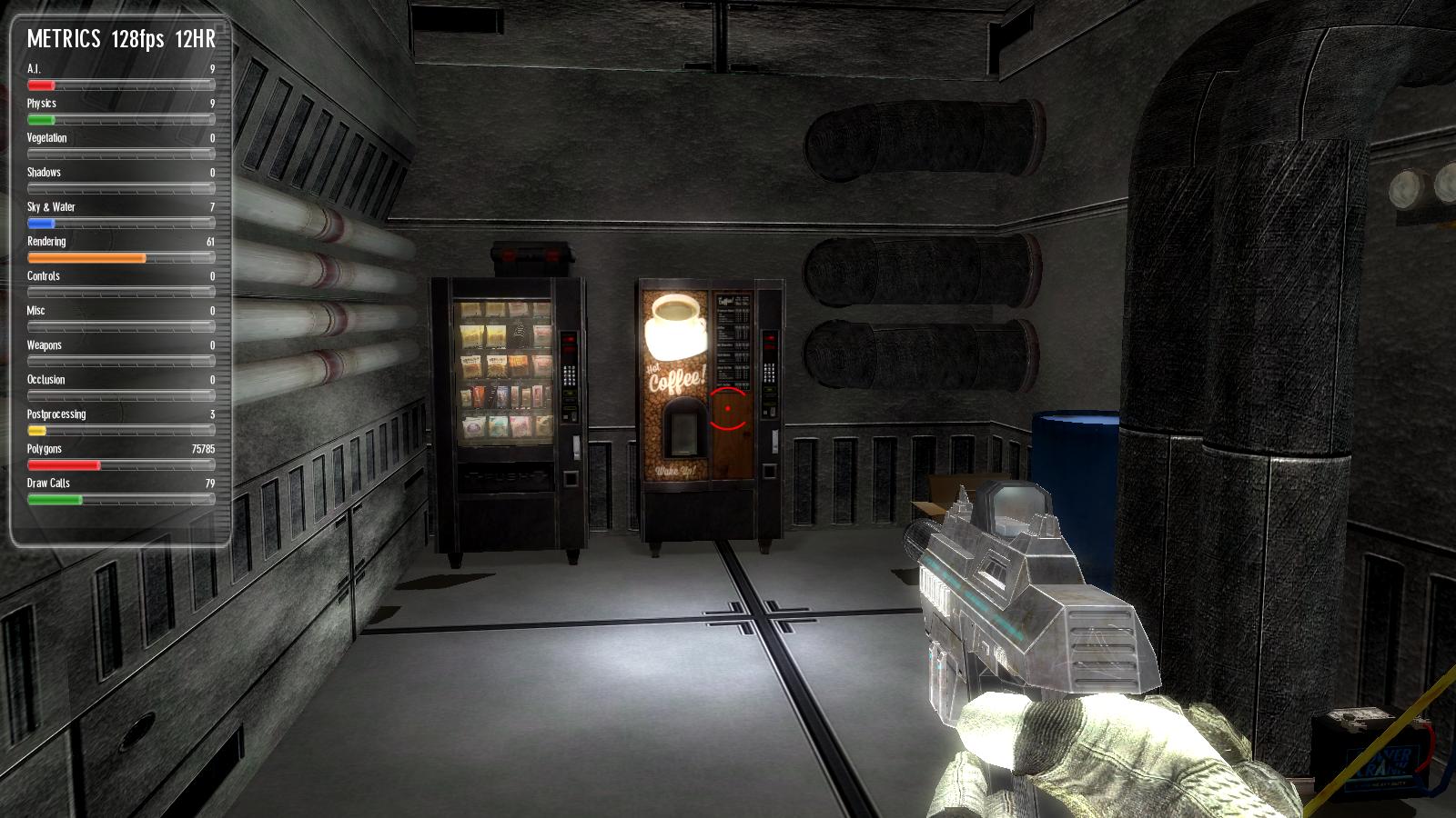
For exterior lighting, you'll primarily be messing with the 'tab-tab' screen. To reach it, simply fire up the game in test mode then hit tab twice. Simple, right?

Starting from left to right, top to bottom:
So really we've established that for MOST outdoor scenes your most important settings are going to be found in the visual settings tab.
So let's start with the fog settings. Starting in a previous version, the fog system is actually VERY impressive in Game-Guru. It's a blended technique vs the brute force method original versions used. So in reality it's actually very good for making scenes have a unified color, which in turn helps unify the theme. It also blends the distance very well so the horizon isn't as sheared.

A side note: On unifying colors the idea is that if you take a color and use it as a base or blend for the others you will help make a scene feel less jarring. This can take the form of a common color, shape, or in this case - a fog to overlay a blended color.
I recommend setting fog nearest to around 5 and fog distance between 10 and 30. Then select the colors you want from the R/B/G sliders. Fog intensity will typically be around 30-40, unless you want a very heavy fog.

Ambiance level is another slider you wll need to modify often; it's how much of the ambience r/b/g levels are automatically applied to a surface. This is important because the brighter this is, the overall brighter your textures will be. I generally find a setting between 15 and 25 is best here if the color bars are at 100.
Surface level will show HOW MUCH light is reflected by your textures. This is especially important outside as it determine how much of the sun's light is put on your textures! Often you will find less is more with this engine; setting this too high will cause highly pronounced shadows which at times are good but often just make things look very clean and unprofessional.

Another important setting here is 'global specular'. This slider controls the mirror-like qualities of the textures being hit with light. This differs from the surface level because surface level changes the lighting on the textures themselves... global specular changes how reflective it looks. Imagine the difference between a white wall and a mirror. Both can reflect light very well, but the mirror has that telltale bright spot.

Understanding these settings is important for fine tuning your lighting. There is no one size fits all here. Every setting has to be carefully measured and tested but it does no good for you to not know what they do or how they work.
Let me know in the comments if this helps your project!

From a previous article on ground clutter - note the very jarring colors/textures.
There are two different types of lighting in Game-Guru: Interior and Exterior. Both have different processes but similar methods.
Interior lighting is highly reliant upon placed static lights. Exterior lighting much less so as the sun (which is not adjustable at this time) handles a lot of it.
I'll get into interior lighting in another article as it requires a significant amount of changes to level design and methodology.
For exterior lighting, you'll primarily be messing with the 'tab-tab' screen. To reach it, simply fire up the game in test mode then hit tab twice. Simple, right?

The 'easy game maker' sure has a lot of complicated options, eh? :)
As you can see in the above picture there are a significant amount of options.
Starting from left to right, top to bottom:
- The 'metrics' are debug information used for troubleshooting speed, efficiency, etc. That's another discussion for another day.
- World settings are your most basic settings: What type of sky you want, what kind of terrain you're using, and the type of 'grass' you can paint on the ground.
- Quality settings can be summed up as: LOD = how far away things start to get shitty looking to save on rendering cost, how big the 'map' is, and vegetation settings.
- Camera settings - I almost never mess with this because the defaults are good for most FPS games.
- Visual settings - the most relevant panel in the list. This affects the colors and lighting you'll be using. I'll go into further detail below.
- Graphic options: This is a more 'high end' feature. It affects water reflection opacity, how 'thick' the shadows are, lightray amount and vegetation. Occlusion and debug visuals will require hand tuning in your final pre-game tests.
- Shader options: I pretty much leave distance transition settings normal and put everything on highest.
- Post effects: What happens "AFTER" the lighting is done. Bloom affects how fuzzy your light will look. Vignette radius and intensity - Primarily used to give that 'old time horror game' feel. Motion blur distance - I hate motion blur, so I disable this typically. Depth of field I leave at 25 out of 100 but this can really give your game a sense of distance so definitely play with it to see what works best.
So really we've established that for MOST outdoor scenes your most important settings are going to be found in the visual settings tab.
So let's start with the fog settings. Starting in a previous version, the fog system is actually VERY impressive in Game-Guru. It's a blended technique vs the brute force method original versions used. So in reality it's actually very good for making scenes have a unified color, which in turn helps unify the theme. It also blends the distance very well so the horizon isn't as sheared.

A good example of using light fog to unify the color palette and theme.
A side note: On unifying colors the idea is that if you take a color and use it as a base or blend for the others you will help make a scene feel less jarring. This can take the form of a common color, shape, or in this case - a fog to overlay a blended color.
I recommend setting fog nearest to around 5 and fog distance between 10 and 30. Then select the colors you want from the R/B/G sliders. Fog intensity will typically be around 30-40, unless you want a very heavy fog.

Someone overdid the fog and lighting, methinks.
Ambiance level is another slider you wll need to modify often; it's how much of the ambience r/b/g levels are automatically applied to a surface. This is important because the brighter this is, the overall brighter your textures will be. I generally find a setting between 15 and 25 is best here if the color bars are at 100.
Surface level will show HOW MUCH light is reflected by your textures. This is especially important outside as it determine how much of the sun's light is put on your textures! Often you will find less is more with this engine; setting this too high will cause highly pronounced shadows which at times are good but often just make things look very clean and unprofessional.

Yeah, it's the unreal engine. This picture illustrates a low level of ambient lighting (around 5-10 in game guru terms) and a high level of surface lighting to highlight the sun's light (think 30-50).
Another important setting here is 'global specular'. This slider controls the mirror-like qualities of the textures being hit with light. This differs from the surface level because surface level changes the lighting on the textures themselves... global specular changes how reflective it looks. Imagine the difference between a white wall and a mirror. Both can reflect light very well, but the mirror has that telltale bright spot.

Image courtesy of 'http://gurneyjourney.blogspot.com'
Specularity is low on the right and high on the left.
Understanding these settings is important for fine tuning your lighting. There is no one size fits all here. Every setting has to be carefully measured and tested but it does no good for you to not know what they do or how they work.
Let me know in the comments if this helps your project!
Tuesday, December 22, 2015
Errant AI's Arcade Set
This is a long overdue review.
When I spoke with Errant AI (A.K.A. "EAI") about his vendor machine set Errant AI's TGC Store Products review , we discussed our mutual love coin-operated equipment. At that point in time (probably a year and a half ago) he mentioned he'd do an arcade set, which I was jazzed for. I grew up in arcades and spent more than my share of allowance money there.
It was a great time and brought back fond memories. He soon released the kit and... I didn't have any money. NONE. I was flat broke. It sucked. So for months and months bigger priorities would come up and I'd look at the store and see the really impressive looking set for the arcade objects that EAI built.
Recently I've managed to get my finances squared away and could spend some money on new objects for my upcoming sci-fi shooter.
It was at this point... I looked again at the priciest of EAI's growing collections (4, as of this writing) - the Retro Arcade Pack. The Retro Arcade Pack clocks in at 15 USD. It's by no means a cheap purchase. But I'm a believer that if you want to have a quality looking game, you need quality looking assets. This pack delivers - in spades.


The above should show you the sheer and frankly unparalleled level of quality EAI brought to the table. Even his previous offerings are overshadowed but how absolutely perfect these are. While I realize it's not an asset for every game, you'd be surprised how you can work them in. The biggest difficulty in using assets like this is that they tend to make your other assets LOOK WORSE. It's a bit like taking your ugly friend to the bar to make you look better. It doesn't help their case to have you standing there, that's for sure. So if you are planning on using assets like this, prepare to have other assets - LIKE THIS. It doesn't hurt that I have the snack attack pack and some other really high quality stuff that I've gotten through the community. I meticulously filter and comb my assets to ensure that the quality is at bare minimum, consistent.
What's interesting is I was discussing 2-D "mode" for Game-Guru with Synchromesh - a forum user.
After some experimentation, he had discovered a way to fake a 2-D mode for Game-Guru. He shared the secrets with me and filled in the blank spots in my own testing. So the plan is to make a virtual arcade and then have it warp you off to another level when you use the machine - the level will be a two dimensional simplified mockup of one of these games! I intend to do a walkthrough later after I've made a functional version of a few. The driving one should be simple enough.
The bottom line: The simple version is are you going to need this for all your projects? No. It's far more specialized than other packs he offers. Is it one of the highest quality assets on the store? Absolutely. If you can manage it, then by all means - find a way to work it in. I for one, will be using it.
The Retro Arcade Pack can be found here: https://en.tgcstore.net/pack/10474
When I spoke with Errant AI (A.K.A. "EAI") about his vendor machine set Errant AI's TGC Store Products review , we discussed our mutual love coin-operated equipment. At that point in time (probably a year and a half ago) he mentioned he'd do an arcade set, which I was jazzed for. I grew up in arcades and spent more than my share of allowance money there.
It was a great time and brought back fond memories. He soon released the kit and... I didn't have any money. NONE. I was flat broke. It sucked. So for months and months bigger priorities would come up and I'd look at the store and see the really impressive looking set for the arcade objects that EAI built.
Recently I've managed to get my finances squared away and could spend some money on new objects for my upcoming sci-fi shooter.
It was at this point... I looked again at the priciest of EAI's growing collections (4, as of this writing) - the Retro Arcade Pack. The Retro Arcade Pack clocks in at 15 USD. It's by no means a cheap purchase. But I'm a believer that if you want to have a quality looking game, you need quality looking assets. This pack delivers - in spades.


The full kit contents. It's like my youth, reborn!
As you can see, the pack comes with a significant bevy of 30 items, which come in about 50 cents per object, depending on if any sales are occurring.
Most of these items are doubles - in many cases they are a blank version which can likely be modified to present your own possibilities. Very cool!


In this case, the billchanger comes in both token and cash money varieties.
Now you may look at these and think "Yeah, that's cute - but how good is it, really?" - what really sold me were the perfectly done animated screens which of course can only be watched in the form of a movie.
The above should show you the sheer and frankly unparalleled level of quality EAI brought to the table. Even his previous offerings are overshadowed but how absolutely perfect these are. While I realize it's not an asset for every game, you'd be surprised how you can work them in. The biggest difficulty in using assets like this is that they tend to make your other assets LOOK WORSE. It's a bit like taking your ugly friend to the bar to make you look better. It doesn't help their case to have you standing there, that's for sure. So if you are planning on using assets like this, prepare to have other assets - LIKE THIS. It doesn't hurt that I have the snack attack pack and some other really high quality stuff that I've gotten through the community. I meticulously filter and comb my assets to ensure that the quality is at bare minimum, consistent.
What's interesting is I was discussing 2-D "mode" for Game-Guru with Synchromesh - a forum user.
After some experimentation, he had discovered a way to fake a 2-D mode for Game-Guru. He shared the secrets with me and filled in the blank spots in my own testing. So the plan is to make a virtual arcade and then have it warp you off to another level when you use the machine - the level will be a two dimensional simplified mockup of one of these games! I intend to do a walkthrough later after I've made a functional version of a few. The driving one should be simple enough.
The bottom line: The simple version is are you going to need this for all your projects? No. It's far more specialized than other packs he offers. Is it one of the highest quality assets on the store? Absolutely. If you can manage it, then by all means - find a way to work it in. I for one, will be using it.
The Retro Arcade Pack can be found here: https://en.tgcstore.net/pack/10474
Friday, December 18, 2015
Friday Status: 12/18/2015
In the real world, I've accepted a full time position as Linux IIS Admin w/ The Bon-Ton Corp.
Things are going to get a lot busier for me, I suspect.
So status, in no particular order:
1) Neo-Monagasque Chronicles Book Two got a shitty review from a friendly reviewer. That was ugly. I'm not really sure how to fix the story problems he has with it, or if it's worth fixing at this point. It kind of gutted my interest in it though.
2) Mechwarrior Dark Age Javascript game. On hold, as mentioned previously. No new work will get done on that till next year.
3) My Sci-Fi WIP has a bit more work done. Working on cleaning up the lighting and finishing up the first zone's layout:
 Revised lighting. Still having trouble with that primary pillar in the foreground. The spool on the left is just a placeholder for more stuff later. I want this entire area to look like a busy docking bay which means people, places, lots of workers and palettes of goods. While I like the lighting, I will say one significant negative is how the overhead lights look off now. More work is going to need to be done.
 More revised lighting. Spotted some issues here -
 This was originally an outdoor panoramic scene but because of an engine issue (shadows displaying on empty space) I decided to fool around with making it part of the ship and it came out really well. So now you still have a window to space but you can see the ship more naturally as part of an extension of the actual player's experience. The docking bay itself is actually an old free model done by cosmic prophet for dark city (or was it nuke city?).
 This area is my first real "crew" area; it's clutter and design is specifically oriented towards giving a more human feel for the ship. I'll have a few people sitting, eating, cavorting. etc. There should be a lot more decoration to give you the feel that this small mess area is a nice through-way for travelers. There are a few mistakes here though.
More to come! For now, I'm slowing down as it's end of the year; holidays are winding up, I have a lot going on in my life (Baby, Job, Holidays) and mostly I'm just taking it as it comes.
Forthcoming reviews: The "Deep Space" package by oldflak
My comprehensive 'must have free stuff' list - part one
Wizard of Id's warehouse pack.
Errant AI's Arcade Pack.
Deal of the week: https://en.tgcstore.net/pack/10703 - ... 600 dollars worth of resources for 27 dollars. Holy jeeze!
Things are going to get a lot busier for me, I suspect.
So status, in no particular order:
1) Neo-Monagasque Chronicles Book Two got a shitty review from a friendly reviewer. That was ugly. I'm not really sure how to fix the story problems he has with it, or if it's worth fixing at this point. It kind of gutted my interest in it though.
2) Mechwarrior Dark Age Javascript game. On hold, as mentioned previously. No new work will get done on that till next year.
3) My Sci-Fi WIP has a bit more work done. Working on cleaning up the lighting and finishing up the first zone's layout:

- Natural lighting should be seeping in from above, it is not. Meaning I have to adjust some of the ambient levels or fake it.
- My coffee sign fell down, because I had to adjust the physics values of the entities. A simple mistake, easily fixed.
- Light post on right is poorly positioned and looks like it's off.
- Needs more 'reason' to come over here. I want to turn these machines into functioning entities, shouldn't be too hard. At that point the hard lighting used for illumination/shadows should really help push the player towards these machines.


- One of the panels (mid center, slightly left) for the roof shows misaligned ceiling textures. This simply needs rotated.
- The area needs more lighting in general to put shadows on the interior elements.
- The far pouch actually is the first secret area and I need to hide this better.
More to come! For now, I'm slowing down as it's end of the year; holidays are winding up, I have a lot going on in my life (Baby, Job, Holidays) and mostly I'm just taking it as it comes.
Forthcoming reviews: The "Deep Space" package by oldflak
My comprehensive 'must have free stuff' list - part one
Wizard of Id's warehouse pack.
Errant AI's Arcade Pack.
Deal of the week: https://en.tgcstore.net/pack/10703 - ... 600 dollars worth of resources for 27 dollars. Holy jeeze!
Friday, December 11, 2015
Project(s) status Friday: 12/11/2015
I started this morning off with disappointment.
Got told flat out by TGC that some of my art (Note, I'm not a great artist so this isn't horribly surprising) was of insufficient quality for the store they have. Given the level of some stuff that's on there either they are upping their standards or I just *REALLY REALLY SUCK*.
Sigh.
Well, on with the project status. My wife, as many may or may not know, is pregnant. So we're anxiously awaiting our new addition in a few months. It takes up a lot of my time.
What time I do have is spent at work, with the kid, doing housework, or very infrequently - playing games.
Every monday I sit with my 5 year old (Soon to be 6) and do some game-guru 'daddy time'.
Anyways... today I wanted to have an update ready but turns out someone posted some 'free weapons' that were blatant plagiarism and as such kind of mucked up my ideas for today's review post. I may do a different one later, but not right now. It frustrates me to be stymied like that.
Current project status:
1) NMC Book 2 - still waiting for beta readers to get back to me.
2) Javascript Mechwarrior Dark Age game. No further progress (currently no desire)
3) Yet to be named "sci-fi" FPS game - good progress! Figured out and corrected internal shadow systems, can now proceed normally. Looks like I'll be getting a free scientist model from one 'henry weaver' and that will help CONSIDERABLY with some of the efforts I'm moving forward with. Combined with the lackluster character creator (though I've done some interesting things with the face mapping) I have a bare bones set of 'original' characters plus some bad guys. Now comes level design, then population of levels, then scripting, object placement for pickup objects, tuning, refinement, etc.
4) The doom analysis is complete for Doom 1. Interesting stuff in previous blog posts here here and here!
5) I promised to look at zombie AI code but someone already found the issue - so that's off the list.
6) I need to take more screen shots of my WIP.
At work, I'm writing a script to use puppet to deploy salt-minion on SLES SP3/4. Irony level rising.
Wednesday, December 9, 2015
Lessons Learned from Doom 1: PT 3 - Peterson's Level Design.
And here we are. The final episode of the original Doom. Not counting 'ultimate doom', that is.
So around this time, if you're familiar with the mythos of iD software, you find that Sandy Peterson's levels kick in. Some have described his levels as 'ugly'. I'd describe them as hideous. But that said.. let me get to the real crux of the matter here.
I utterly despise Sandy Peterson's levels. I mean that, of course, in the nicest possible way. It's actually a compliment. They did good choosing Sandy as the guy who did the "Hell" maps. This guy... I mean he's just a sadist, through and through. His maps make this game very, VERY challenging in very short order. I can get through the first two episodes on stupidly hard difficulties (including the Brutal Doom versions) without issue. I get to Sandy's and .. shit just falls apart.
Here's your first indicator something is off. The very first thing you see on Episode 3 is this closed-eye-switch-thing. A far cry from the 'unfamiliar rooms' of Tom Hall and John Romero.


That said, his levels for Doom 2 are SUPERB. His textures are still a little flat but improve dramatically and the design is interesting and novel. Though seriously - his traps only get nastier, if you can believe it.
The final word here is despite the negatives Sandy's levels really represented Hell for both the player in a figurative AND literal sense. So in this, it was a good choice to make his levels the final piece of Doom 1's original set. I respect the hell out of a guy who can take an action shooter like doom and turn it into what basically amounts to a fucked up version of Myst with shotguns and demons.
So this concludes the Doom 1 level design lesson set. I hope you've had as much fun reading as I've had writing it. Hopefully you've learned a few lessons about how the devs managed their design methods - each one had a good and bad side; all of them had things one can glean. I for one, have learned a great deal and hope to put those lessons forward in practice soon! I hope a few of you replay doom and maybe post your comments about the design; I'd love to see what else everyone else picked up on this!
"INFERNO!"
So around this time, if you're familiar with the mythos of iD software, you find that Sandy Peterson's levels kick in. Some have described his levels as 'ugly'. I'd describe them as hideous. But that said.. let me get to the real crux of the matter here.
I utterly despise Sandy Peterson's levels. I mean that, of course, in the nicest possible way. It's actually a compliment. They did good choosing Sandy as the guy who did the "Hell" maps. This guy... I mean he's just a sadist, through and through. His maps make this game very, VERY challenging in very short order. I can get through the first two episodes on stupidly hard difficulties (including the Brutal Doom versions) without issue. I get to Sandy's and .. shit just falls apart.
Here's your first indicator something is off. The very first thing you see on Episode 3 is this closed-eye-switch-thing. A far cry from the 'unfamiliar rooms' of Tom Hall and John Romero.

Don't worry... it opens when you toggle it.
From this point an elevator rides you upwards to... the surface. Yes, an actual outdoor area complete with withered trees and... three imps (on ultraviolence setting, of course).

I find using melee tends to save a lot of ammo when playing his levels.
So you shoot the imps down, pick up two boxes of ammo and open the door
to find two Cacodemons. Now.. this is a big deal for those who don't
know. Cacodemons are TOUGH. They hit *HARD*. They generally act as a
damage sponge and work best if you use them to kill other minions. You
know - the ones you just iced.

Damnit, Sandy.
So you tear down these two Cacodemons and are presented with what seems like an obvious trap. "Get the shotgun, and you'll be better armed!", your mind says. You, like an obedient dog, oblige in a Pavlovian fashion.

It's a shotgun on a bridge, what could go wrong?
As you run across the bridge.. it sinks. Into the lava or blood or .. whatever that hurty liquid shit is. So you learn to just run across and think something will happen - a wall will drop or ... but nothing happens. You literally run RIGHT THROUGH THE WALL into ... you guessed it - 3 imps with no room to maneuver.

Damnit Sandy.
This pattern continues. Over .. and OVER again. Simple trap becomes complex trap becomes keyboard smashing rage-inducing trap.
This isn't an isolated event. It happens again...

Damnit Sandy!
and again...

I SWEAR TO GOD SANDY!
AND AGAIN...

*Throws Keyboard*
This insanity was brought to you buy a god fearing Mormon, if you can believe that.
AND IT GOES ON FOR 9 DAMN LEVELS.
Now.. I have to say - I *REALLY* respect the proficiency of Sandy's trap and maze design. He may make the game less fast paced and fun in the Romero sense - and he may not have Tom Hall's MASSIVE level design with hundreds of secrets - but he really has a truly insidious method of drawing you in and blowing you to pieces. It has it's own rhythm and there's a lot to learn from.
So here's a few cliff notes I've taken on his methods vs the others:
Sandy's biggest weakness is actually of all things wall textures. His use of wall textures was ... minimal at best. His light sourcing was some rock bottom shit. That said, you barely have time to notice it as you fight for your life in what goes from a run-gun-shootfest to a George A. Romero-esque survival horror.
- Sandy uses very assymetric architecture like John Romero (no relation to George A.) - but in a completely different way. Areas are large and flat, but open.
- Use of outdoor is taken to an extreme. Outdoor areas are huge, with trees and what not. Presents its own challenges in terms of enemies and mobility.
- Sandy places objects in locations that are deliberately going to impede your movement. For instance you get pillars in the middle of an area that gets swarmed, doors shut behind you and lock you in against hordes, etc.
- His secrets are nastier than just 'walk in and pop a monster swarm'. It's more like 'walk in, get item, die in lava unless you move backwards in which case you get crushed by the ceiling instead but oh hey if you survive you get to fight fifteen enemies at once and only get four shotgun shells for your effort.'.
- Sandy's secrets were INCREDIBLY hard to find. In many cases they were not intuitive at all. That said, they were often necessary as part of your progress (if you weren't cheating) just to keep your ammo count from hitting the dreaded goose egg (0).
- Sandy's Doom 1 levels are time consuming mazes that actually tend to wear on you. I found this element a lot less fun. When taken in context with the other two developers it's easy to use lessons from each to strike a balance.
That said, his levels for Doom 2 are SUPERB. His textures are still a little flat but improve dramatically and the design is interesting and novel. Though seriously - his traps only get nastier, if you can believe it.
The final word here is despite the negatives Sandy's levels really represented Hell for both the player in a figurative AND literal sense. So in this, it was a good choice to make his levels the final piece of Doom 1's original set. I respect the hell out of a guy who can take an action shooter like doom and turn it into what basically amounts to a fucked up version of Myst with shotguns and demons.
So this concludes the Doom 1 level design lesson set. I hope you've had as much fun reading as I've had writing it. Hopefully you've learned a few lessons about how the devs managed their design methods - each one had a good and bad side; all of them had things one can glean. I for one, have learned a great deal and hope to put those lessons forward in practice soon! I hope a few of you replay doom and maybe post your comments about the design; I'd love to see what else everyone else picked up on this!

Tuesday, December 8, 2015
Pasquill's Vehicle Pack 1
I'll be continuing my analysis of Doom 1 level design very soon - but for now I need to get a review out - that's the point of this blog, isn't it? To provide people with some insight on what they might spend their money on with game-guru? So this week I'm reviewing Pasquill and a pack of his I recently purchased.
I recently purchased Pasquill's vehicle pack 1 as a reward for my five year old son doing a good job on his schoolwork. Being he loves cars we spend a lot of hours building huge sprawling maps and just making cars in all positions. He loves a good car wreck. So he'll position them and I'll set the details up like smoke and lighting.
Up until recently I've used my City Pack (which has somewhat cartoon looking blue, red, green and orange cars) and some freebies I've picked up over time (like the dark city stuff by Cosmic). It's nothing spectacular but does the job for a five year old.
The vehicle pack features 24 high quality, ~1500ish poly count models which utilize 2048x2048 textures. In short, they look great!

Tons of shapes, colors, and variety!
The pictures don't do this pack justice. You get 24 different vehicles, in five different styles. Those five styles get a lot of mileage though, with drastically different textures, additional bits (such as missing windows or sirens being added) and colors.

The detail on the side panels is a nice touch.
As you can see above, the van is really nicely made. I have several vans from other makers and they vary in quality but generally the models are a bit lackluster (it is a box on wheels, after all). However note the subtlety of the texturing and modelling here. There's lots of indentations, smooth and graduated edges. What I like best are the wheels - gone are the dodecehedrons most of the older free models had. Here we have really beautifully round wheels that look great.
What's really impressive though are the textures on the damaged vehicles:

This little beater has seen far better days.
This is where that 2048x2048 texture size pays dividends. While the flat colored vehicles look nice the rusty and damaged vehicles look SPECTACULAR. If you're doing a zombie apocalypse or warzone - or hell even a junkyard level - these vehicles are pretty much a must have. Coloration, design, shape, damage - everything looks phenomenal. The tires are even flat! It's a huge amount of detail for what is a very reasonable price. We're talking 62 and a half cents (USD) per car!
The bottom line: For the money there's really no better vehicle-based pack on the tgcstore. You get a big variety of high quality models that are different enough to be worth the expense. Fifteen dollars seems like a lot when we're talking an online resource market that has things priced criminally low - but take my word for it - it's been worth it.
Monday, December 7, 2015
Lessons Learned from Doom 1: PT 2 - Tom Hall's Level Design.
As mentioned in part one: Lessons Learned from Doom 1: PT 1 - Romero's Level Design.
I love the first doom game. I've played it every way you can imagine, in every engine you can imagine. I've played remakes, total conversions, the original hundreds of times - spent years of my teenage life deathmatching and playing co-op.
While I feel John Romero's levels are the pinnacle of what the original Doom can muster level-wise, I still have a huge amount of respect for Tom Hall's level designs.
If you've read the classic "Masters of Doom" book (which you really should) - you understand that Tom's desire for Doom was a bit grander in scope than what we actually got. A bit slower paced, a bit more realistic with a lot more flexibility and options. More characters, etc. You can get a feel for that from the 'Doom Bible' which effectively is the technical design document for Doom that was ultimately scrapped in favor of what they ended up with. Here's a link for those of you who haven't read it: Tom Hall's Doom Bible
Tom Hall was primarily responsible for the levels of episode 2.

The opening screen of E2M2 - note the structural differences between this and Romero's.
Here again right off the bat you see a big difference in color/lighting. The tones are flatter, more muted. They're greys, browns, blacks and yellows. It's all very rational and very sane.
Tom's work is very representative of what you could consider a 'logical' style. It's far less abstract than Romero's work but is still exceptionally good - especially in a modern context. His work was similar to Romero's in use of texture, color, lighting... but he clearly had a completely different process. Whereas Romero's levels gave you a sense of indoor/outdoor and this massive overarching awe at the implied size of it - Tom literally built these huge ass indoor levels. I mean HUGE.
Courtesy of doomwiki
This is literally the second map. The SECOND! It's titanic. On top of that, on the north part of the map you see what Tom really invented as a genre - the box maze. You can literally get lost in piles of endless boxes.

Turn left and wait a sec, where the fuck am I?
The combination of rather bland colors and lighting actually work really well in this context; they provide a sense of loss of direction; everything blends in without being so similar that you completely feel hateful at the lack of texture (like Sandy Peterson's levels). Tom also loved the monster trap - something he did in exquisite detail. If you ran full speed down a corridor without looking you'd easily trigger a huge horde of monsters and usually your demise.

This is actually one of the smaller swarms.
Remaining observations are as follows: Tom loves secrets; in fact his levels far and away had more secrets than any others. It wasn't uncommon to find levels that had 10 or 12 secrets on them. You really had to work to find them too; while some were fairly obvious, others took a while of hunting around just to get the feel for where they were. Often, it was for a meager bit of ammo, just enough to keep you going. This is in contrast with Romero's 'big win' method of secrets where a secret almost always gave you a huge boost.
Completing one of Tom's levels gave a real solid sense of accomplishment - like you really worked to earn it! This was one of the better features of his design. I didn't really like the fully indoors feel of his work which unfortunately left things feeling closed off. But the mazes and monster hordes really did create an awesome experience which I believe has influenced many more modern games in a very impactful way. A lot of what Tom did was based around a notion that this game was going to be different and then he got a rude awakening when the design had moved on without him. As a result his levels have a different feel and rightfully so.
There's a doom mod that attempts to recreate the experience he intended called 'The Tei Tenga incident'. It's worth a look if you've never seen it:

Definitely has the feel of one of Tom's levels.
So what can we say we've learned from Tom? Similar palettes, box mazes and monster traps are all going to find their way into my game. An avid fan of the secret, I think I'll have to make sure a few more make their way into my levels.
Ciao for now!
Friday, December 4, 2015
Project(s) status Friday 12/4/2015
I'm resolved to try and keep up on my projects for once, instead of letting them languish. Part of that is being open and honest with my few regular readers about where I'm at:
In life, I'm a Linux Systems Engineer and Lead Linux Administrator. I'm currently working on deploying SALTstack to SLES 11 sp4. I've got most of the elements in place and a functional system running but boy howdy was it ugly to get moving. You'd think something called (S)use (A)dvanced (L)inux (T)echnologies would be more compatible with (S)use (L)inux (E)nterprise (S)ystem.
I may write up a blog post on it. Currently I am sticking with puppet for minor tasks despite it's raw incompatibility with Suse's package management system. It's decent enough at user removal/etc though. SALTstack however has the benefit of direct 'zypper' package management integration which is pretty sweet considering it's the backbone of how Suse manages packages. So that's also been taking up my mental CPU cycles.
One upshot from a gamedev standpoint is I learned how to make functional alpha channel decals work in Game Guru. This gives me at least one solid tool to work with. After that I want to work on doing skyboxes, because frankly I find most of the ones on the store are too repetitive or boring for my tastes.
- The Mechwarrior: Dark Age JS game has stalled. This is because of inherent limitations in Javascript. The most recent thing I did was build a shellscript which parses the DB @ www.warrenborn.com and builds a JSON for the various expansion packs. That was done about a month ago. The question then becomes - what engine do I want to move forward with? Easiest would probably be Unity, since it's got javascript as an optional scripting method. On a plus note the basic combat engine for one on one combat works like a champ, including statuses like pulse lasers, flamers, etc.
- My Sci-Fi trilogy (book 2) is being reviewed by my proofreaders. I'm fifteen thousand words and about 8 segments short of where it needs to be before it's a first draft. So I'm waiting for their reviews so I can get an idea of how to fill out those missing pieces.
- My Sci-Fi game (unnamed as of current) is stalled because of life; I am trying to work on it from time to time but it's hard when your job and home life take up 95% of your time. Current issues are interior shadows in the Game-Guru engine and asset/story choices need firmed up.
In life, I'm a Linux Systems Engineer and Lead Linux Administrator. I'm currently working on deploying SALTstack to SLES 11 sp4. I've got most of the elements in place and a functional system running but boy howdy was it ugly to get moving. You'd think something called (S)use (A)dvanced (L)inux (T)echnologies would be more compatible with (S)use (L)inux (E)nterprise (S)ystem.
I may write up a blog post on it. Currently I am sticking with puppet for minor tasks despite it's raw incompatibility with Suse's package management system. It's decent enough at user removal/etc though. SALTstack however has the benefit of direct 'zypper' package management integration which is pretty sweet considering it's the backbone of how Suse manages packages. So that's also been taking up my mental CPU cycles.
One upshot from a gamedev standpoint is I learned how to make functional alpha channel decals work in Game Guru. This gives me at least one solid tool to work with. After that I want to work on doing skyboxes, because frankly I find most of the ones on the store are too repetitive or boring for my tastes.
Thursday, December 3, 2015
Lessons Learned from Doom 1: PT 1 - Romero's Level Design.
Update 1/15/2016 - John Romero built a new level for Doom 1, I mentioned that I wrote this to him and he was kind enough to like and retweet it with this message:
 Sounds like a 'compare the old and the new' is in order :D (see link below)
Also as a courtesy, here's another review someone wrote in a similar vein if you're interested in more: https://speakerdeck.com/vinull/john-romero-level-design-as-presented-by-michael-neel
Update 1/18/2016 - writeup on the new level is here: http://gamegurureport.blogspot.com/2016/01/lessons-learned-from-doom-1-pt-2.html
**** ORIGINAL POST BEGINS HERE ****
Let me make this clear. I'm a huge, HUGE fan of the original Doom game. Like "Beat the game on ultra-violence with only my fists" huge.
Doom was one of those games that defined my generation along with grunge rock. It was mind blowing and endorphin swilling action; something which is lost in today's translation. What really ceases to amaze me is how I can load up doom what's basically TWENTY YEARS LATER (holy shit, how did that happen?!) and still enjoy it.
Well, most of it.
There's parts I can't stand. Which we'll go over shortly.
I recently did a playthrough (on ultra-violence, of course) in the doomsday engine to just get a feel of how the level design shifts from designer to designer and how it impacts overall gameplay. I've read the doom bible, bios, "Masters of Doom" etc. And I have to say, bar none one indisputable fact:
John Romero might have a titanic ego - but he earned it. He's the best level designer I've ever seen from a pure gaming standpoint. His masterworks - the levels in doom, doom 2, quake - are all easily my favorite levels (long before I knew they were his creations).
What spawned all this was I recently found this blog post:
http://vectorpoem.com/news/?p=74
It's a superb writeup from the guy who made one of the best areas in the original Bio-Shock (Arcadia) and Bio-Shock 2's lead dev.
It reminded me - why is it I liked Doom so much - what levels were my favorites? Why?
So here's the opener:


 Lovefest aside, I came to realize as I played that as I got to later episodes* - I hated them. Specifically episode 3.
*EDIT: I had the word levels in here, swapped it for 'episodes' to clarify.

These are great rules but I discovered through what's basically amounted to several years of my life in this game the following about Romero's style:
There you have it. There's more of course; coming up I'll go over the pluses and minuses of the other game devs of Doom one; next up will be Tom Hall's levels. While not my favorite levels I will say far and away he did superb mazes.
I don't care if DaiKatana sucked. I can't fault Romero for reaching for the stars and failing. He's done more than I'll ever likely do in Game development and did much of it in short order. My hat's off to him and I'm sure I'll learn more in another twenty years when I go back and replay the first episode for the four thousandth time.

Also as a courtesy, here's another review someone wrote in a similar vein if you're interested in more: https://speakerdeck.com/vinull/john-romero-level-design-as-presented-by-michael-neel
Update 1/18/2016 - writeup on the new level is here: http://gamegurureport.blogspot.com/2016/01/lessons-learned-from-doom-1-pt-2.html
**** ORIGINAL POST BEGINS HERE ****
Let me make this clear. I'm a huge, HUGE fan of the original Doom game. Like "Beat the game on ultra-violence with only my fists" huge.
Doom was one of those games that defined my generation along with grunge rock. It was mind blowing and endorphin swilling action; something which is lost in today's translation. What really ceases to amaze me is how I can load up doom what's basically TWENTY YEARS LATER (holy shit, how did that happen?!) and still enjoy it.
Well, most of it.
There's parts I can't stand. Which we'll go over shortly.
I recently did a playthrough (on ultra-violence, of course) in the doomsday engine to just get a feel of how the level design shifts from designer to designer and how it impacts overall gameplay. I've read the doom bible, bios, "Masters of Doom" etc. And I have to say, bar none one indisputable fact:
John Romero might have a titanic ego - but he earned it. He's the best level designer I've ever seen from a pure gaming standpoint. His masterworks - the levels in doom, doom 2, quake - are all easily my favorite levels (long before I knew they were his creations).
What spawned all this was I recently found this blog post:
http://vectorpoem.com/news/?p=74
It's a superb writeup from the guy who made one of the best areas in the original Bio-Shock (Arcadia) and Bio-Shock 2's lead dev.
It reminded me - why is it I liked Doom so much - what levels were my favorites? Why?
So here's the opener:

The infamous first thing you see when you start a game in doom.
So right off the bat you have a few really important observations:
- Colors are a good mix of browns, bright blues, greys, dark greens, and sporadic bright red/greens. It's well balanced and aesthetically pleasing, palette wise.
- Natural lighting is clearly present from the window but doubles as means of 'highlighting the path to take'. You also have a clear sense of the wall to the right, so you want to explore the left. When you do you find:

A breathtaking vista.
- I mean it when I say these mountains were something I absolutely loved about the first episode of doom. The choice of terrain, the eerie white lighting - it's subtle in it's mastery. A blue sky would overload the scene; a red sky (as is done in later episodes) eliminates contrast on outdoor portions.
- Of course, after you are sucked in by the incredible concept of being outdoors or 'close enough to touch it' - you start to consider the weirdness of the space. The design of the level is vaguely human but intuitive; exceptionally so. Compare that with later levels done by Tom Hall which are exceptionally well ordered and feel 'human' but are cold and distant from a gaming perspective.
- Each room acted as it's own scene; a picture to be taken in - sort of a hologram in that it's a two dimensional picture you can explore, like the eponymous 'computer room':

Still one of my favorites.
- This room was one of the few Romero EVER did that was linear and rectangular. Even still, it had a clear feel of depth and height. Every room he made gave you a feeling that the area was far bigger than merely a large box. It was clear he was tired of running around the Rat-Mazes of Wolfenstein.
- Paths were clearly denoted by color such as here:

- and lighting:

*EDIT: I had the word levels in here, swapped it for 'episodes' to clarify.
Each had their own unique style of course.
So I came away with a few understandings about Romero's design philosophy.
There are of course the known tenets of his design method:
Romero's rules:
Always changing floor height when I wanted to change floor textures
Using special border textures between different wall segments and doorways
Being strict about texture alignment
Conscious use of contrast everywhere in a level between light and dark areas, cramped and open areas
Making sure that if a player could see outside that they should be able to somehow get there Example:

Being strict about designing several secret areas on every level Making my levels flow so the player will revisit areas several times so they will better understand the 3D space of the level
Creating easily recognizable landmarks in several places for easier navigation
These are great rules but I discovered through what's basically amounted to several years of my life in this game the following about Romero's style:
- He prefers fast, streamlined brutality. Epic high speed fights were his preference.
- He seems to loathe complex mazes.
- Rooms are huge; outdoor skies are used on indoor scenes to provide a false sense of size.
- Huge areas give people a sense of awe. Windows were an effective way to do this. Later designers rarely 'left the building' - save Sandy Peterson who periodically would go completely outside. His designs however, are among my least favorite.
- Light levels are hugely important to him; everything is carefully monitored and aligned to ensure a proper 'alignment' in the brain of where things are - despite the abstract and dreamlike quality to his levels.
- Abstract level design forces people to think in unique ways; brings them out of the doldrums into something interesting and new; makes them feel surprised by the shape and feel. Truly lends to the 'alien' feel.
- Asymmetric designs mess with peoples sense of space and encourage fun gameplay.
- His secrets are easily found and of medium proliferation. They act as a true reward for taking your eyes away from the 'line' of the level.
- His traps were mostly line of sight, they played off his high speed style that you'd 'run into' a horde of enemies. Later devs used monster traps in different ways.
- Items are arranged in very obvious locations so you will not easily overlook them. Often, they act as a carrot over a pit of zombies.
There you have it. There's more of course; coming up I'll go over the pluses and minuses of the other game devs of Doom one; next up will be Tom Hall's levels. While not my favorite levels I will say far and away he did superb mazes.
I don't care if DaiKatana sucked. I can't fault Romero for reaching for the stars and failing. He's done more than I'll ever likely do in Game development and did much of it in short order. My hat's off to him and I'm sure I'll learn more in another twenty years when I go back and replay the first episode for the four thousandth time.
Subscribe to:
Posts (Atom)