I'm a Linux Systems Engineer, amateur sci-fi author, and gamer who's dabbled with gamedev since I was about 12 years old. Author of several mods as Mechwarrior 4's Siege Mode and the CoopBot for Quake1. This blog is my sounding board on Game-Guru, gamedev, and tech topics in general. Currently authoring a start to finish guide on Game-Guru for Taylor and Francis publishing, should be on shelves around June 2019.
This site uses cookies - EU compliance notification.
NOTE THIS PARTICULAR TUTORIAL IS HEAVILY RELIANT ON ALL OF THE PREVIOUS ONES. PLEASE BRING YOURSELF UP TO SPEED HERE: My Tutorial and Evaluation Page.
So it's no secret Game-Guru is really weak in terms of performance. I've covered several topics in the past ranging from more advanced lighting techniques to improving the way reshade handles your graphics.
What I've found in the past is it's really difficult to work with a lot of the stock models. There's simply a cutoff for what you can get from a model that's pushing 512x512 SD textures.
Before we continue, what I'm talking about here is something called 'texture depth'. I'm sure by now you've probably heard the acronyms "SD" and "HD".
Taken from some chinese blog, but suits the purpose.
Basically the less pixels you dedicate to the quality of the texture surrounding your model, the less 'depth' it will have in the sense of how detailed the picture can look. Here's an example. The stock asylum graphics are .. acceptable .. by Game Guru standards.
SD is really anything under 720 pixels wide/high. Most games tend to use standard divisors of 8 so you have like 256x256, 512x512, etc. This tends to max out around 4096x4096. This is primarily because of the graphic cards capabilities.
However you are using a 2048x2048 texture that's divided up into multiple subcomponent textures. This basically makes each effective texture 'SD quality'.
Some are more, some are less, but all are SD.
Now to spruce up the texture, what I do is go is open it up and immediately resize the texture to 4096x4096; then proceed to sharpen the picture significantly.
It's hard to see with this scaled down snapshot, but trust me, it's there.
The resultant image has much higher fidelity.
Now the real trick here is fully utilizing ALL of the mapping available (when necessary) for Game-Guru textures. Game-Guru can handle basically four types of mapping:
The standard UV map - this is your _D file.
The normal map - this is your _N file.
The specular map - this is your _S file.
The illumination map - this is your _I file.
Generally speaking, most models only include a _D and a _N file.
In the case of our asylum texture, we have a specularity file as well (_S). This particular addition gives a slight shinyness to the textures, making them seem wet or slimy. You can only see them with the entity shader set in the tab-tab options menu set to 'Highest'.
These settings are what I found using in combination with reshade as producing the best visual result for the asylum.
Default walls, unmodified. Looks ok.
Now that looks .. ok. That's the best you're really going to manage from stock assets and some really basic lighting. Now if we modify the specularity file so it's a lot more pronounced on certain areas. The basic specularity file is pretty clearly just a black and white image of the original _D file which is fine unless you want to really highlight areas. Now tile generally tends to have a shiny edge because of the enameling on it. So what I did is took the original image and modified the luminosity settings in paint.net to give it much higher contrasting on the black and whites, causing a more clear delineation in the shiny areas of the texture.
Old on the left, new on the right.
Side note: If you don't HAVE a specularity file with your models, you can generate one simply by making a black and white image, saving it as _S on the end of the filename and then modifying luminosity (or using edge detect even) to create bright white spots. Specularity maps work by using a greyscale of the image - the more 'white' it is - the shinier the surface will be.
The final result, in combination with static lighting ends up looking like this:
Note the cleaner texture lines, better shine on the walls, etc. It's really a vast improvement over the original configuration.
While a lot of this is trial and error, it's a big piece of improving your work to at least be within striking range of more up to date engines.
One final note: I personally run this setting in reshade's mastereffect.h file:
#define USE_HDR_LEVEL 2 //[0 to 2] HDR Level: Rendering bitrate. 0: RGBA8 | 1: RGBA16F | 2: RGBA32F
2 seems to be the highest fidelity setting possible if you're interested in HDR quality imagery.
Ciao!
It's not often you hit 10's on everything you are doing. I really was way off the charts in terms of motivation, energy, focus, etc. I am happy with this and made great progress on several major projects. Also interesting when you discover a significant amount of your favorite art was done by one person (without you realizing it!):
So I was working on my most recent project - *famous game* homage for my wife.
Something she could play for christmas. My son and I were both going to help each other and produce a really masterfully done game for her in the vein of one her favorites.
This would be done in a 3-4 week timeline with about 3-5 nights a week of a good solid 3-4 hour runs on adding stuff.
Sourced from Seriouslyjacque.com - very accurate assessment of stress, IMO
Well we quickly discovered how unwieldy a large map would be treated by Game Guru. So I decided to go back and optimize the map in every way I could. Here's a bit of that process.
Before we begin...Limitations
A key understanding here is that Game-Guru is only 32-bit. It's also using DirectX9. These are effective, but outdated infrastructure components.
32-Bit applications are limited to 4GBof memory. But really, considering all the underlying subsystems, operating system data, etc. It's more like 2.5 GB. Also, for the uninitiated, memory is basically the short term, high speed data storage your computer runs applications in.
Holy crap he writes, makes games AND uses excel, incredible!
64-Bit on the other hand, can access something like 16 EXABYTES ... some absurdly large number that's out of reach for the time being. So arbitrarily, we'll use a common value of 16GB for our memory example.
As you can see, your game only takes up a *FRACTION* of available memory on a 16GB system.
Bear in mind though no matter if you're running a 64-Bit version of windows (as I am) that the application itself, in this case Game-Guru, can only ACCESS 4GB of ram at any given time. And it always considers the OS as part of that.
In real terms, this means that only 2.5 GB of memory is ever available for any given time.
Now consider that every single item you add, every texture, every object, etc - occupies a bit of that storage space. If you are using thousands of unique objects, each one has to be stored separately.
DirectX9 adds another limitation in that it is vastly more CPU reliant than DirectX11. So in my case, for instance, I have a quad core AMD running at 3.2GHZ for my primary system. My video card is a GTX960, with 1gb of video ram. While it's not top tier it's still an excellent card for any game.
Except, of course, Game-Guru games. This is because DirectX9 relies on my CPU which is at best, mediocre.
Unfortunately this is another pipe-lining bottleneck we have to work around (at least until Lee gets off his duff and codes this thing in DX11!).
Optimizing Memory
From this standpoint of minimizing memory usage, we need to utilize this knowledge in a ground up context. While a lot of AAA titles these days use incredible CPU and Memory resources to produce an earth-shaking experience, many older systems and titles had to be more inventive.
Some examples of this are:
Fallout
Silent hill
Resident Evil
What we're going to do here is emulate the design by using a tried and true multi-level system with several small zones off a hub zone. This is the main world, an area where you navigate from place to place. However once you arrive off the world map, you open a door to a building and are transported to a new level. This is done in such a way that the load times are minimal and it typically makes logical sense.
Example:
Outdoor zones in fallout 4 are part of the 'world' zone -
This quarry, for instance.
But when you go to a building of any measurable size, you get an 'enter' option that you can click which gives you a loading screen like this:
Side note: Probably the most interesting weapon in FO4.
Then you're loaded to the new zone. Now we can accomplish a similar trick (albeit without the fancy loading screens) using winzones. The winzone object in Game Guru allows you to setup a pointer to another level which is then brought along when the game is compiled. When the player steps over the zone, it ports them to the new level. You can also port them back to the original level, if you desire. This is the method we'll be using.
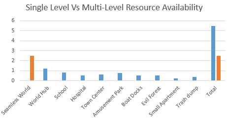
The concept here is very simple. If you are using one large map, it's seamless - without load times. But it's going to be slower because it's got to load all those objects into memory. It's also going to be less flexible because each unique model you add to your level is going to increase memory consumption. So concessions will have to made if you do that. There's also the issue of load times. If you run a massive level, it will cause gigantic load times for game-guru. You also *ONLY* will ever have 2.5GB of memory to work with. That's a huge bummer if you're using high quality textures.
Fallout 3's map - the red spots are *mostly* a level portal to a new area as discussed.
Instead we're going to launch sophisticated areas (Schools, hospitals, houses, minizones) as their own zone and thus free up the memory we would normally use for the world and pour that into each individual zone. For the sake of load times, we don't want to go too crazy, but even if each zone is 500MB in size it quickly would add up if made as part of a massive world map.
The difference is clear, at least in terms of memory usage.
This gives us the ability to rapidly distribute the load across multiple maps and bring up our total resources used. It also gives us access to extra goodies in Game Guru such as differing skies or settings between maps.
To further speed things along we're going to use low poly models when available, low quality UVW (UV-Wraps, aka textures), and try to reuse models. Every time we reuse a model, it further saves memory by simply requiring a pointer in memory vs a huge reload of the object into memory.
Ground Up Design Processes
Now that you know *WHAT* we're going to be doing - it's time to do it!
The above is a simple demonstration of how to perform a multi-level configuration in Game Guru.
The first thing we want to do, as usual, is map out our levels. We want to keep in mind that any main areas will be sectioned off. Even the world map can benefit from being broken up into sections. I prefer to use major areas or quadrants.
I like to draw on paper exactly how things will flow for the player.
But this isn't paper. This is the internet. So you get a bad MS paint drawing.
It's terrible, but you get the idea, probably.
The next thing to do is to figure out the assets we're going to be using for these zones. Each of these areas will have it's own specific feel and layout. So make sure you create a list of each area's similar assets so you can keep track as Game-Guru's asset management is pretty abysmal.
This is, in essence, the very rudimentary beginnings of a pre-production blueprint. You should check this link on more about that:
So basically what we want to do is use similar, low cost entities when doing background pieces and higher cost/high poly models in foreground elements. Remove anything extraneous and wherever possible duplicate items.
Picture sourced from game-guru.com's screenshot gallery by user Morphtactic
You can see above a good example of reusing elements. The trick is primarily to use them assymetrically. Giving an object that's visually similar the same orientation causes the brain to see it quicker. Giving it a slight twist, say 10 degrees, can make all the difference in how two identical models are perceived. I give more info on little tricks like that in this article: http://gamegurureport.blogspot.com/2016/06/technique-training-level-building-basic.html
So all that aside that's basically it! Just break up the level into easily digestible chunks and it will keep things nice and low for you. You can still have sprawling maps - just be smart and keep the load times down!
Finer Tuning
Once you've got your indoor levels fleshed out it's important to remember that indoor levels can basically be stripped of terrain and/or water using the stock script 'goindoors.lua'. This will further help framerate on visually intensive locations. Just make sure you account for the lack of terrain if you have transparent windows looking out into the world.
Another important element is to not load up your scenes with tons of enemies. Unfortunately the AI right now really doesn't support group think very well so it tends to act in a very poor fashion when more than a handful of AI are active at a given time. Done properly (use blind corners, traps, etc) you can still make the situation difficult for the player without killing their CPU in the process.
Other things you can do are fine tune your occlusion settings, which are tricky to get functioning properly but once enabled will properly cull objects out of view to ensure that the maximum framerate is being used at a given time. This however will be a topic for a future date, when I can devote more meaningful time to the discussion of occlusion.
After Christmas I'll put a post up showing more specifically how I used this and screenshots of the work involved so a better idea can be had about how it was utilized.
No actually I've been exceptionally busy with the holidays! There's a lot to do, after all.
I'm in the process of making a game, with my 6 y/o ... our first collaboration ;) for my wife, for Christmas. In that vein, I've had to do some scripting for lighting transitions, collect quests, etc.
The actual game design work is coming along well. Though there's still a significant amount to do. Actually with such a clean cut end goal to run towards, it's really helped streamline my process. I learned a lot along the way as well, which I will hopefully be adding here soon.
I'll try to get some reviews done. All in all though, very good stuff.
One very interesting thing that's developed was this:
Game-Guru is fairly synonymous on steam as being a source of 'total abject shit' games. And I don't say this lightly as someone who's a frequent user of it.
This isn't really a bad thing, it's more a predictable thing - primarily because the game engine is marketed towards and genuinely appeals towards the extremely casual novice game maker. You unfortunately end up with a lot of this:
And for some reason this guy thought to 'improve' the stock 3d rifle with a static 2d image set.
And that's just not good for your reputation, despite the fact that it's really easy for even a total neophyte to make a game with.
There are, however, some very skilled Game-Guru game makers. People who use it both professionally and casually but have a well of experience that make their products and offerings worth looking at or keeping an eye out for. Some of these projects are completed. Some are in progress. Bottom line is they make a good baseline for what kind of work you want to emulate if you're going to create and try to be successful, legitimately, with Game-Guru.
1) Ertlov's "Father's Island"
This is probably the most commercially successful game made for Game Guru as of the time of this writing. It's a strange game with a lot of interesting elements. Basically a puzzle thriller with some interesting secondary elements and a lot of personally done acting done by the creator (Ertlov). It's been critically reviewed in Austria and has a small, loyal following. The graphics are well done, the lighting superb. The impression I get is it's mostly stock assets too, which is even more impressive.
2) Wolf's "Acythian" and "Shavra" games.
Wolf is well known in the Game Guru Community as a unique artist and freethinker with an eye for dramatic lighting in his games. He's got two separate projects on the table:
The above is Shavra - Renaissance . It's a high-fantasy adventure with tons of custom assets. The scenery is gorgeous and should stretch the limits of the engine's power. I love the tapestries and imagery. His custom characters are pretty impressive too. Check out the progress thread here: https://forum.game-guru.com/thread/209529
His other game, of comparable quality, is a Sci-Fi thriller called Acythian. It's right up my alley with well paced action, a gritty futuristic vista, and fast action.
It was incredibly hard to pick a scene for this game, too many good choices.
This is another really gritty cyberpunk style game, though it's far more in the vein of blade runner or more specifically Ghost in the Shell. It's not done yet but my only complaint about it is that it will only be three levels. You can, however, pick up most of his objects on the store if you want to build similar levels. That said, what's available here should be complete very soon. Once it's done, you will likely want a copy if for no other reason than to try to learn a few things from it.
4) Savior v3
Savior's been in progress for a very long time. So far, however, the results are promising. It seems Tarkus runs into the same issues I do with life actually eating up available free time.
The positioning of the clutter items shows a fine degree of care and thought.
This is one of those games that just OOZES perfection. He's obviously taking his time trying to make sure that this is exactly how he wants it to be, something I can respect given my own slow development tendencies.
On a side note, I made a custom sky for Tarkus and I'm hoping it finds its way into his game. We'll see soon enough I suppose!
Ok I wasn't going to include this one, but I have to admit it's promising. He's taken a pretty basic concept (alone in the woods but not really) and made it into a very compelling visual thriller with a good combination of eye candy and suspense. He's smartly using the dark to hide the flaws in Game Guru and as such it looks and acts very clean.
His only problem (and he's aware of this) are the mountains are a little bland. I pointed him at my tutorial on building good mountains in Game Guru so hopefully he'll be able to bring that up to a level he's more satisfied with. Overall though, a good looking game and also being greenlit on steam. Nicely done!
Interestingly this game has a similar style as MLAW but that's not a bad thing. The game looks good but I think the dev gave up and moved on.
My own project
I should mention that I hold myself to the same standards that I hold others to. It's part of the reason my process is so excruciatingly long and torturous. I take every scene and evaluate it against what I want, feel, and try to maintain a reasonable performance to boot. It's difficult, at best, using this engine. What you see is a very early work in progress. I hope one day, it'll be more nearly what I consider acceptable. This scene lacks clutter objects. That object behind the glass is a ship. A single, massive ship. I'm looking forward to bringing this project to fruition.
Hopefully you'll take some hard looks at my blog and see some good lessons to draw from in developing your own projects. I truly hope to raise the level of everyone's game development and now with 1.33 available, we might have a real door opening towards a brighter future with this engine.
Lee recently did a twitch broadcast going over the changes coming in '1.33'. There's a lot of things being added.
Here's a summary of relevant things:
Individual object specularity :O .. now you can set it on a per-item basis which is a huge boost for maintaining a good looking level while providing 'metallic' entities.
5 sounds per dynamic object. This is pretty huge of a boost from 2.
A shader for skies! Wow.. I think this is going to take some work to figure out but that'll really boost sky visuals.
Lots of LUA commands, including weapon commands- which opens up upgrade-able weapons and variations in stock weaponry without making a whole new weapon.
Improved pathfinding for AI (this is a big deal).
Legacy terrain generator. There was a great RNG terrain maker which was removed.. the new one was trash. The old one has been re added and is brilliant. He even lowered the height (a major issue previously) so the water level is right there. That helps a lot.
I find myself in a weird spot with my 'development' of games. I'm in that familiar place where I don't learn anything new, don't do anything new, and generally let my projects languish.
I'm in a rut.
It's happened before, many times over. Part of indy gamedev is that it's really daunting. Usually you're flying solo on a project. You have to be orchestra, band, stadium, and instrument-maker. Or in this case:
Coder - LUA script is easy but I'm rusty AF.
Modeller - my 3d modelling skills are .. minimal at best.
Artist - I'm a terrible artist
Designer - My designs are so-so.
So I have a LOT of hurtles to overcome. My biggest ability on this list has always been scripting/coding but I find myself unable to dedicate the time to make the code I want to make. The CPU cycles required for coding are a lot higher than say 'dreaming of art pieces'. At least for me, your miles will inevitably vary.
Tools help a lot. I use a number of free or cheap programs:
As such though I find myself wanting in a lot of respects and decide to try to learn things that other people take for granted. I've happily learned how to do alpha masking, transparencies, and now I can even weather a texture.
It's a pet peeve of mine that so many models I buy/own/obtain look pristine. To me, in any game, it's going to be incredibly rare to see a perfectly painted model. The more gritty and grimy - the more realistic it gets.
It's a simple enough technique to do. First you need the alpha mask plugin for paint.net.
After you have that plugin you open your texture file.
For this example I'm using a free steel seamless texture.
Here's the original:
Not bad, but let's make it look really old.
The above texture is to some extent pre-weathered but I want to really add a layer of decay to it.
First you open the file in paint.net. Then you want to CTRL-A (Select all) then CTRL-C (copy).
Go to the edit menu and choose 'paste as new layer'.
At this point we're just using the paste as a guideline for size and position. This is more useful if you are using like a rectangular copy tool or something but *Shrug*... this is an example after all. Then simply render clouds over it, use the alpha mask tool, and merge the layer down. There's a bit more than that - you can find tons of examples everywhere if you google for 'weathering a texture in paint.net'. But the end result looks like this:
Not great, but not bad either.
I use this technique for touching up some of the models I work on so they look more .. real.
You can also add color by simply modifying the levels slider on the cloud layer before alpha masking/merging layers and getting something like this:
Now with a nice rust color!
The negative of using this particular method is you run into errors with the seamless wrapping so usually I'll do a cutout of an area instead and just work over that. The basic principle is the same. Use the lasso to copy an area. Paste it into a new layer. Use clouds to generate fractal-style art on it. Transparency it, then merge it down.
I'm not going to win any art awards, am I?
While it looks ... cruddy ... like this once you add normal maps and what not it tends to really improve the quality of it's 3d appearance. Example:
Or even the 'rusty' texture can look good when UV mapped over a non-repeating surface:
Little things like this are how I keep myself entertained and skills from diminishing. I'm an old dog, learning other people's old tricks. At least though they're new to me and that keeps me satisfied.
Some convincing for other members of the community was needed. So I enabled ReShade's optional 'split screen mode' on one of my sitting in stasis levels and you can see the difference. On the left is the ReShade enhanced version (only setting changed from default is HDR to 16 from 8). On the right is GG default.
It's like someone smudged one lens of a pair of glasses, right?
So I really like the wall textures coming through better. Some of the freebie stuff I used was fairly low quality to begin with and it's pretty impressive how much better it looks when getting sharpened up by ReShade.
One of my favorite rooms really did a fantastic job of being improved by RS.
Here's an example of a low quality model's bump map improving drastically:
Now if only I could get rid of the lighting artifacts.
And an even more dramatic comparison of a stock asset GG barrel:
Right side is "eh, not bad." Left side is "Wow, that's pretty decent."
And lastly I bring the final example - 'The EAI potato chip bag'. So EAI is a fantastic artist; he's made some of the best stuff available in GG and I use it as often as I can find a place for it.
What you'll see is the full picture, then a blowup comparison. I think you'll get the idea and I can at that point rest my case.
Here's the potato chips as show unfiltered with a raw GG setting:
And here's the chips after:
Let me show you up close what this difference is:
A minor difference, to be sure, but worth it to me.
I'm what you'd call a 'min/maxxer'. I believe the little things matter. And these are little things to be sure. In my eyes though when using an engine as dated as the GG engine that's so underwhelmingly powerful - this is one way to help level the odds. Your miles may vary.
So recently it was brought to my attention that the wording I used in my previous lighting guide was confusing or came across as flat out wrong. This was specifically because I was trying to simplify the concept for a general audience. As a result of this though I feel a clarification is in order.
Here's the post in question (I recommend reading it if nothing else for the excellent screenshots):
And the specific bit I want to address is here: "Now on to what rubs me against the wolfish fur: Lee is wrong.
Quote: "The response was nothing less
than astonishing. Lee told me outright that the brightness of the
static lights is DIRECTLY tied to the bloom slider."
It isnt. I've been using mid level bloom settings around 50 in most of
my scenes. I've only started to go higher because I was going for a
washed out, hazy retro'ish look with recent efforts.
Seeing this I loaded up a large, completely lit map of mine and started
to play with the bloom slider. I got the results I have expected. Bloom
is just that. Bloom. While it adds a lot haze and shininess
directly to light sources and bright surfaces it does not affect the
lightmaps themselves."
This is 100% correct.
THE ONLY VALUES THAT SHOULD EVER DIRECTLY INCREASE LIGHT POTENCY SHOULD BE THE ACTUAL LIGHT VALUES OF AMBIENT/SURFACE LIGHT.
My response was thus:
"Sorry if I was unclear - surface light value IS the primary driver for
static light potency (as mentioned I think in my lighting guide, section
3) ... but bloom *DOES* have an impact on how bright those values appear. It's obvious the way I worded that in my 4th guide is a bit in error and will need a fix to clarify.
But basically I get what Lee was saying. Because of the additive effect
bloom has on light values as rendered, it has an EFFECTIVE (as in not
direct, but end result is similar) value of increasing the light's
brightness.
Even wolf's example shows this very clearly:
Pay specific attention to the wall underneath the foremost blue column
in the middle of the room. It very clearly is getting brighter.
So as you can see - the pillar in the middle is increasing in brightness per the renderer. While the ACTUAL LIGHTMAPPING IS NOT CHANGED the appearance to the end user is that it is brighter.
So when I say "seriously advanced" let me just preface that by saying that ... this is still Game-Guru. The lighting engine is still a decade or so behind where it should be. But we can still fake it well enough to be decent.
WARNING: THIS ARTICLE ASSUMES YOU HAVE READ THE PREVIOUS THREE.
So when I wrote my last lighting article I thought that'd be the last one. However, I recently had some correspondence with Lee Bamber (@leebamber). He's the head programmer for the Game-Guru project. Imagine this guy:
No, seriously, imagine it.
As a programmer. That's Lee in a nutshell. He's pretty competent at programming but does it all himself; he takes on advanced topics and tries to make it available for the everyday layman. Overall, he does ok, which is actually quite the compliment given the magnitude of the task.
Anyways this correspondence basically stemmed around me asking him if there's any way to increase the brightness of the static lighting in game-guru.
The response was nothing less than astonishing. Lee told me outright that the brightness of the static lights is DIRECTLY tied to the bloom slider.
Think about that for a moment.
So basically the brighter you want your static lights, the higher that bloom slider needs to be. It's a minor, but incredibly important distinction.
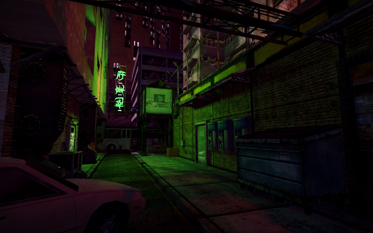
Now let's show that in action. Here's a screenshot from Wolf's upcoming 'Acythian' cyberpunk game.
There's at least 7 separate lightsources here. Can you find them all?
Now this isn't a maximum bloom setting, but it's up pretty high. He's running around 70 or 80, I'd wager. I realize it's not the latest Deus Ex title, but this is pretty damn good for the Game-Guru Engine. My wife, a well seasoned gamer, knows well the limits of what she calls a '10 year old graphics engine' when she sees it. She couldn't believe this came from Game Guru.
Wolf's advice for this particular piece goes back to something I wrote about in part three of the lighting tutorial:
"You increase lightmappingquality to 1000 and lightmappingsizeentity as well (or higher) in the setup.ini.
Now you place your lights either according to realism or colorscheme. I
have written a lot on that in the past, lets just say here that basic
leveldesign rules apply. (This is important because Gurus lightmapper is
a bit wonky and so is the post processing which means that bad choices
stick out way more than in something like the UE4.)"
If you've read the previous guides, then you knowexactly what he means by this.
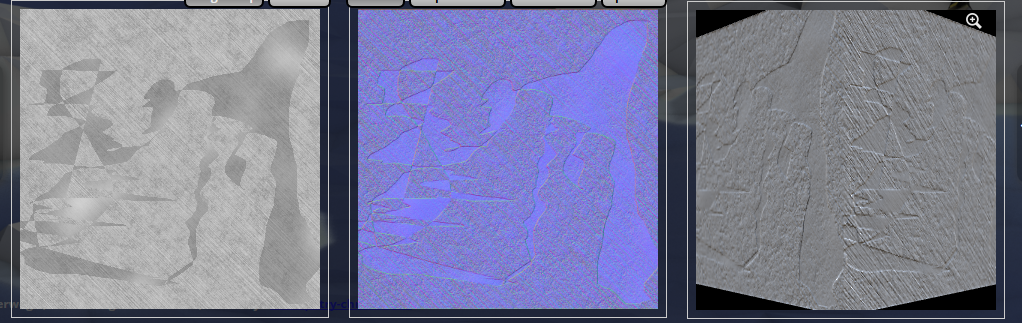
My own efforts have yielded improved results as well. Here's a little before and after:
Single light source, default settings.
Well the after looks remarkably similar but the devil is in the details, notably the lines between the shadow and light are far better aliased. They're smoother; the light range is moderately better on the actual objects in question as well. Take a look - make sure you open it up in a new window to get a real close look because most of the improvement is very hard to see. Focus on the shadows on the boxes and in the green crate.
With a single light source, using 1000 quality/1024entity settings in the setup.ini
So if you're not aware, I am using a modification to gameguru called Reshade. Reshade was brought to us by NomadSoul, who ported it so we can use it. It's a AAA post processing system which can really improve the quality of your game's output and graphics. It can't add dynamic lighting or pre-processing stuff though so mostly you're just sharpening up the graphics or adding a filter.
I have to say that this particular piece is pretty much a 'must have' for Game-Guru. If you want Game-Guru to look like your game came out in the past 10 years, you need this.
I believe if you want your game to sell, it needs to compete... at least a little. I can respect the efforts of anyone who puts significant time into their game. But if you aren't trying to tune it up so people will find it graphically pleasing - you will pay the price. Interest will wane or collapse. You will be derided privately and publicly. Adding post processing and tuning it is part of that process.
As you can see the jaggies are removed, edges are smoothed, bloom is cleaner, lighting is nicer and the tone map is significantly improved.
The cartoon setting allows older models to look more like they belong in a modern context. A lot of older freebie stuff had very simple textures which effectively sent it to background art.
Note the darker lines and more dramatic color ranges. It's a fast way to a borderlands-style look. One thing that WOULD need done is to make a mask for the HUD elements; it's within reshade's protocols so make sure you read the files that come with it.
As you can see there's a lot here that can be done to help create a unified theme for your game or bring it up to a more modern level. Gamers with lower power cards (this author uses a GTX960) will need to disable Reshade as it will cause a framerate dip. It assumes you have something capable of running it.
Picking appropriate lighting colors
Inside the GG engine, there's several different lights available. These choices result in some of the most atrocious color schemes possible. Unless you are specifically looking for a lime green or neon purple color to an area, you will need to modify these considerably by customizing the colors so they don't wash out your textures.
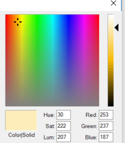
The best way to do this is to pick a standard color you like (Orange, Green, Blue, whatever) and move it towards the white range. White effectively is a 'clear' color for the renderer when using static lights. Let me say that again:
WHITE IS EFFECTIVELY A CLEAR COLOR FOR THE LIGHTMAPPER.
So if you use white lights you will sit around scratching your head wondering why the hell you're not getting any brightness. What you want to do instead is pick a color like yellow - and move it towards the white range - like this:
This will provide a nice, orange glow.
If you are thinking about how this lightmapper works, it effectively throws a layer on top of the texture, TINTING IT towards the color range you are trying to achieve. So the 'whiter' it is, the more transparent it applies it towards the texture. The darker the color, the darker it will apply it. You can actually make lights and that in and of itself is interesting.
This tinting is applied as a layer which is then controlled in intensity by bloom. I honestly believe this should be a separate setting. Why it was tied to bloom I will never understand.
So using my existing scene, I've modified the settings from bloom at 35 up to 80, my usual trick of a light fog to unify colors and lowering the ambient down from 35 to 20. This is also with the enhanced 1000/1024 lightmapping setting in the setup.ini.
I think this looks much better, don't you?
As you can see the lightmapped objects look phenomenal for something out of a mediocre engine like Game-Guru. The illumination mapped objects (the Dagored scifi walls and Jackal's free sci-fi container) look awesome with some bloom, really giving them a feel of brightly lit objects. It's really important not to go overboard here otherwise you will wash out your scene very quickly. This is especially true with the ambient light levels; if they are set too high with a high bloom setting, you will get nothing more than a retinal migraine.
As usual, I hope these tips and tricks have helped you as they help me.
Wolf remains one of my favorite artists on the store, as well as off the store. You'll find a link on the right to his personal page as a result.
He's got a good eye for creating interesting and unique shapes. His designs are among the most daring shapes you can find available for Game Guru. Also important to me is that he shares a passion for Sci-Fi; specifically cyberpunk.
Cyberpunk, for those who don't know, is a specific sub-set of Sci-Fi which revolves around neon textures, rusty pipes, gears, a sort of grungy technomancer look that really looks great in games. Deus Ex, for example, could be considered Cyberpunk.
Or, according to a '94 issue of Mondo 2000, meet the above criteria.
This kit is not available on the TGC store. It's privately sold. It's also well priced (currently costing $10, get it while you can!)
Some of these clutter objects are very large, like the satellite array, which is EEENNOOORMOUS
It features a whopping 79 total entities. Most of them are clutter objects, but brilliant ones that are low poly enough to be used in many, many projects. Further, a great many are illumination mapped so you can get illumination effects when you add lighting.
Please note, actual pieces are shown above from the kit.
Basically the concept here is you take a city scene and modify it to make it more cyberpunk style. This can be done very rapidly by simply building a standard city (use my instructions, if you need help!) and simply adding the pieces of flair, as it were.
Here's a quick example:
Literally the barest minimum here, two objects added to a building.
You can do a lot with these pieces. The mazes of wires, the advertisements make for a rich setting.
They also go well with his other pieces by following the same trend; you can use pieces from the Mega Pack 01's future set if you are looking for another good bargain to mix with these.
Overall, I'm exceptionally pleased with this. It's been a great investment and will do much to improve my levels as they move forward.
For the money this is a fantastic value. These set pieces will give you a lot of mileage. My only complaint is that they look better in his editor than they do in Game-Guru. But honestly, that's really par for the course at least until Game Guru's renderer improves. Regardless, they still prove to be quite capable and worth the pickup.
IN THE INTEREST OF DISCLOSURE I RECEIVED THIS PACK AS A REVIEWER'S KIT. IT DID NOT IMPACT MY ANALYSIS OF THIS AT ALL. I RECEIVE NOTHING FOR PROVIDING POSITIVE REVIEWS.