Search This Blog

Showing posts with label level design. Show all posts

Wednesday, January 31, 2018

Lessons Learned from Deus Ex: Mankind Divided (DEMD)


Minor update: In the lower portion I have some errors which were corrected by Sylvain Douce, the Senior Technical Designer @ Eidos Montreal (who made DEMD).  He states:

"Very good piece! One minor things: AI middleware we used for DXHR and DXMD is Navpower ( ), everything else was built in-house."

Also, it's extremely awesome of him to read it, enjoy it, and retweet it! Thanks a lot Sylvain!

---------------------------------------------------

I don't think it's any great secret that I love Sci-Fi, especally cyberpunk dystopian themed sci-fi.   While I find Bladerunner a bit droll, the environment it helped create persists as one of my favorites.  So Deus Ex games have long fit into my inventory of favorites and this game was no exception.  I absolutely loved Human Revolution so it was only natural I'd eventually get around to playing through Mankind Divided.

Now for reference I should mention this was played through on PS4.  This means it almost always is going to be somewhat graphically optimized to improve the speed and provide a fluid experience on a console.

I've decided to do a rather lengthy deconstruction of the game as it pertains to Independent Gamedevs specifically using Game-Guru.  Others may find it useful, your miles will invariably ... vary.

First of all, it bears mentioning this game was developed using the 'Dawn Engine.' created by Eidos- Montreal.

The engine is not without some controversy due to some issues with load times.  Overall though, it's a fairly stable engine that ran relatively well in my instance.  It did, however, seem to lack some of the really high end features that can set apart an engine.  From what I could tell though:

  • It seems to have been developed directly for DEMD as no other games have used it since it's inception in 2014.
  • it has reasonably high graphical fidelity with low framerate cost.  I will discuss this in greater detail below.
  • The AI package used was very good, albeit it's middleware (APEX AI).  There's actually a fair amount of middleware, but that's not tremendously surprising. (SEE ABOVE)
  • The game engine is apparently a heavily modified glacier 2 engine.  For those not aware, that's the 'Hitman' game engine.  I recommend reading the linkthrough for a highly technical summary of what the Dawn Engine encompasses.

That all aside, let's begin our lesson.

Graphical/Lighting tricks

Deus Ex: Human Revolution gave us great gameplay in a fantastic looking game.  Deus Ex: Mankind Divided is no exception.   There are a lot of extremely fancy tricks used to produce great framerates while providing a very impressive visual experience.

The first thing you'll notice, if you're new to Deus Ex, is there is no more 'gold filter'.  This means the scenes feel less cohesive if they're not built specifically to match.  While the gold filter is a bit of a bludgeon, it did give a sense of character to DEHR that is somewhat lost in DEMD.  DEMD however makes up for it in spades by having a significant amount of purpose built coloration in the scenes while at the same time using giving identity to each area.  On one hand they lose the 'Deus Ex' filter but gain individuality in each scene.  It was a reasonable tradeoff.

Gold filter comparison
Modders removed the gold filter and added some fidelity in DEHR, but it also serves as a good example of the type of difference you see between DEHR and DEMD.


I am big fan of using colors to 'unify' the palette so that a scene feels more cohesive.  This technique artistically speaking is useful for helping to help join together disparate textures which I have a massive quantity of due to many different artists providing many different assets for my use over the years.  In my case, I'd have kept the gold filter or color tone map (assuming you are using reshade).  All in all though if you have a ton of custom art in a lot of wildly different locations like DEMD did, it makes more sense to not filter them all through a gold lens.


PBR and resource management.

DEMD uses a physically based rendering pipeline which allows for some really impressive visuals.  While mirrored surfaces don't look particularly impressive, the shine on the floors is really good.  Certain elements of the environment really stand out, notably pipes.  These shiny surfaces help you realize that in terms of our own engine (GameGuru) which recently obtained PBR capabilities we'd want to use them selectively on things that BEST show them off.  While it's nice to have every single thing in your game use it, it simply eats too many resources.  Selectively choosing the best scenes for it (shiny metal, hardwoods, glass, etc) is a much more attractive option than putting it on bland surfaces where you receive minimal visual 'pop' like concrete.  This in turn helps us save vital resources, which is a struggle with a 32 bit engine like Game-Guru.

pbr example
Check out the subtle nuance of those textures and their PBR materials!

The reflections used localized cubemaps which are definitely available in Game-Guru so that's a nice addition on Lee and Preben's part which will allow us to create beautiful reflections  on pipes and mirrors.

Transparencies on light planes

DEMD cleverly uses light planes with alpha-transparencies to create the illusion of 'dust' in the air.  The game supposedly has volumetric density for the engine, but I suspect they de-tuned it for the PS4.  If that's the case, at least it's given us a specific example we can draw from.

Streams of light
Those streaming beams of light look more like vertical 'planes' from head on.

Take for instance the above picture.  I walked back and forth and noticed several clear planes (2 dimensional flat objects in a 3d space).  Now granted, it was probably algorithmic or volumetrically done but we can reproduce the same effect with this basic texture for our plane in Game-Guru:


Poorly drawn image by yours truly
Yeah, I got lazy and made the last line too wide.
So basically what we have here is a series of blank spaces that are alpha masked completely open.  Then I took the 'filled' areas, put in a white to grey gradient, then created an alpha mask off those as well.  This gives us a semi-transparent 'beam' of shadowed area.  So we basically get the OPPOSITE effect of what we see above.  Give it a try with your own plane.  I'll probably put one of these on the store (for free) once I correct the mistakes made in the above file.

Flares on lights that  get a lot of attention

In the opening area of the main game you begin in Adam Jensen's house, which acts as a sort of technical demo for the game.  In that location if you look up you'll see a significant amount of studio lighting but notably they use a flare decal that is facing the player.

lightflares example
Those are circular lights with a line-shaped flare.
 We can achieve this same effect using a decent flare and the player_facing.lua script that is included with game-guru.  One thing that DEMD did really well though was it's occlusion; when you are NEAR a corner the flare switches off subtly so that it looks seamless.  Overall, a fairly simple but nice looking effect is achieved.

Baked lighting 90% of the time. 

These days, a lot of games really rely on  dynamic lighting.  It's fancy, it looks nice, and it's GPU intensive.  It also has clear limitations which are another topic for another time.   Deus Ex uses an updated older technique, notably Tiled Lighting that's baked in.  This allows high speed renders of scenes where the light is not likely to change and also allows the artist a great degree of control if they're willing to invest the time.

DEMD Prague outdoors static lighting example
You start to see it everywhere the more you start looking for it.

Unfortunately Game-Guru cannot do dynamic lighting very well and as such it leaves us in a pickle a lot of the time. However in DEMD they do a LOT of baked lighting and it shows.  This game is virtually a showcase for 'how to do static lighting the right way'.  Color choices are not obtrusive, are placed to provide windows with indoor light.


Jensen's apt indoors static lighting example
The red circle shows where the light is, outside (approximately 30ft behind the wall).


Note the placement of the light and how it streams in through the window.  It bakes cleanly onto the surface and gives it a nice 'early day' feel.   This same technique can be done with Game-Guru, rather than relying on 'sunlight' - we pre-bake static lights outside of a window to provide the building interior with realistic lighting.

Clever transitioning

One interesting element I think is worth mentioning is, as the heading suggests, 'clever transitioning'.  While many levels simply pop you to a loading screen, moving about the main city of Prague gives you a varied scene (depending on where you are going to or coming from).

Jensen looking bad AF on a train
The screen changes perspective several times and the characters all move around to provide a sense of 'aliveness'.
The only downside is the animation is repetitive, but that makes sense given it's literally just a facade over a loading screen.  While I realize loading screens are effectively the devil I thought it was worth mentioning it.  I don't have an answer for Game-Guru in that respect as our loading system is vastly different but I think it at least underscores the need to give people something to look at other than the basic 'Game-Guru loading screen'.   The best answer is probably something like the other loading screens in Deus Ex, which effectively consist of a picture and some information for the player to read.

Have a mini-game 

The hacking mini-game remains mostly unchanged from DEHR but really felt at home in this game. While it's a lot of extra work, at the same time it can really provide a payoff for the player who needs some variety in their game beyond the usual 'shoot or sneak' methodology.

Dat hacking minigame bro
Oh no, only 2 seconds left! ABORT! ABOOOOOORT!

Often I found myself in a higher sense of tension from the hacking minigame than the actual game itself.  Sometimes even the threat of discovery while hacking (the world doesn't just stop while you're hacking) provided it's own 'sinking feeling' while you were ferociously attempting to subvert system nodes to bend an non-compliant computer to your will.  While the additional 'sink' of adding a mini-game is seemingly unnecessary, it also adds a lot of play value to a game.

A living city

I have a good friend who also is very into Deus Ex; he's actually the one who first pointed me at Human Revolution, even bought my copy back when I was flat broke.

I asked him what he thought of Mankind Divided, without spoiling anything.  He replied "it's a great game, they really did a great job of making it feel like a living city."

I felt that was worth mentioning here given how spot on his analysis is.  This game really does a great job of making you feel like you are in a living, breathing, ALIVE environment.  Each area has tons of sandboxing and detail which makes every single space different and independent.  So how did they do it?

Lips on a building!
The red light district, for instance, really takes it's name to heart.

Well, foremost - each area is it's own 'scene'.  It's as if they built one overarching area, built the major components, then filled in the rest with minor story pieces.

Meow
This room exemplifies the microcosm within macrocosm feel.
 
There's a world of microcosms within the macrocosm of the individual 'global' level and it really provides this deep sense of uniqueness to each specific room.  The stories for these rooms aren't anything significant most times.  Often they are simply something as simple as 'this is the asshole gang dealer who doubles as your local black market shop' room.  Other times small rooms take massive twists and turns, such as the crazy cat lady who ends up having her own miniature story that makes her a much CRAZIER cat lady.

While often the rooms are 'revisited' for story purposes and such you can pretty usually boil them down to a basic, simple story.   Obviously the indy dev can't afford the time to write a massive, engrossing story for each sub-mission in their game.  Which apparently, neither can AAA devs.  Which brings me to my next point.

Secrets are simply unexplored areas 

In my "Lessons learned from Doom's Level Design (part 1) (part 2) (part 3) (part 4) " I discuss use of secrets and their necessity for gaming.  It's something that helps reward a player for investing even more time in their game than absolutely required.  I mean let's face it, most people play games to feel rewarded, to enjoy the satisfaction of accomplishing a challenge.  Deus Ex rewards this in spades by ensuring that every single hidden area is replete with it's own set of rewards ranging from extra ammo to hidden secret rifles.  I still remember being in the ARC headquarters level and going down literally 5 or 6 stories on tiny rails just to find a hidden rifle.  It was an insane amount of detail for a single secret, but these are the types of things players remember.

ARC: the throat secret gun
I was being literal in the literal sense.  That yellow dot is where you start at before worming down to the gun.


Try to use your dead ends and open spaces to provide the players with additional reward for looking at your hard work.  Open up your single alleyways into branching paths that lead them to interesting rooms that really are just there to provide life and depth to the game.

Open ended level design

Deus Ex games have been renowned for their  open ended level design but it's worth discussing, at least briefly here how it was implemented in DEMD.  DEHR had a fair amount of 'open-endedness' to it, but I think in this case DEMD gets the upper hand.  You literally had piles of avenues to perform different possibilities.  Missions had more than one failure or success condition and you often had branching trees that could spell serious disaster later on.

I remember in mission one, I was helping out an agent (Singh).  You are to save his life at the end which is no small feat as you're attacked by masked assassins in a sandstorm.  It is, in short, a train wreck of a situation. Keeping him alive is incredibly difficult.
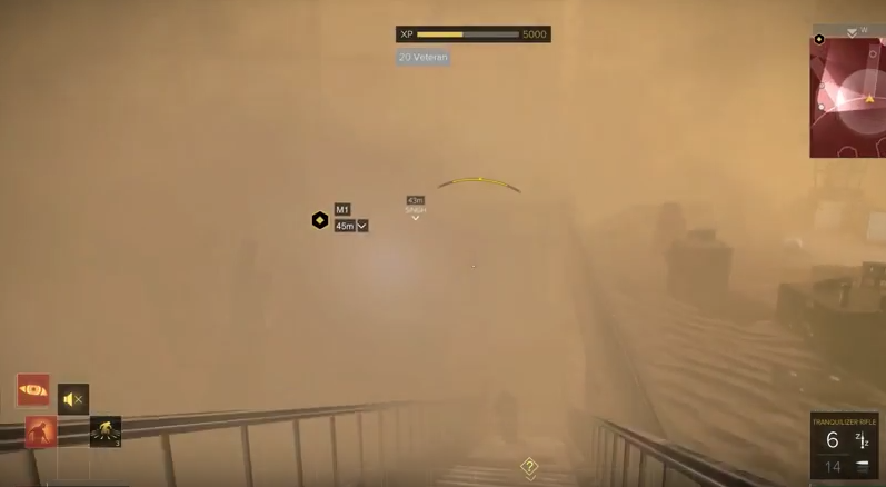
Dubai: sandstorm
I'm sure you'll see him if you just keep staring long enough.
 I did this, but only to have him die later in the game because I neglected one small sub-objective on that same mission of disabling a communications tower.  This causes him to get killed while undercover as his cover was blown.  Little things like this are like a spaghetti plate of decisions, which require lots and lots of planning.  That means writing things down.  Which also means, you guessed it, a design document - and we all know that's basically the same thing to an indy dev as garlic to a vampire.  Sure, it won't kill you... but it's damned uncomfortable.

Multiple answers to singular problems.


Moreover level design is incredibly fluid; you have lots of answers to single problems.  This means you often have the choices of going in loud by shooting everything in sight, hacking your way in via a console, taking rooftop access stealthily, running through vents to come up behind your foes, or a myriad of other alternate choices that often boil down to 'get from point a to point b'.

Palisade bank
There are about a dozen ways in and a dozen ways through the 'uncrackable' Palisade bank.


This depth of level design is a big draw for this game type, allowing players to really dig in and pick how they want to do things.  Sometimes you just want the pure visceral thrill of unloading a 28 round magazine from a fully automatic pistol into some poor bastard who dared to wander too close.  Other times hitting people with tranquilizer darts in the neck out of sight of others is the better tactical choice.  These types of dynamics often aren't so much planned as they are a result from thorough level design and planning with a focus on building multiple avenues of approach for a single objective. 

Intelligent AI design

The AI in this game is something else.  There are a lot of times where you feel like you want to really get in there and mix it up and find yourself dealing with attacks from both sides.
While a lot of this has to do with level design (alternate routes, enemy placements, the location of an enemy taking the shortest route to your location) it also has a lot to do with an intelligent system that is attempting to find the best way to kill you.  It's impressive and not easily duplicated.  Maybe one day we'll have that depth in Game-Guru, though at this point in time your best method will be use of lots of navigation nodes and good enemy placement.

Wrapping up

All in all, I found myself least interested in the main story, which is the unfortunate side effect of having an impressive game with great mechanics.  I can't think of anything about the game I really hated.  Everything played well and it served as a great teacher to a willing student.  I highly recommend you give it a run through and see what you can learn from it too!

Addendum: 


There's a pick up objects script you can use to create a similar style to Deus Ex found here:
https://forum.game-guru.com/thread/207801?page=16#msg2562166

Friday, October 27, 2017

Technique Discussion: Modern games and Mazes

Recently I was following the progress of this gem:


Dimoxinil is not only a hard to spell username, but also one of the premier Game-Guru creators.

His previous works (though uncompleted) really set the bar rather high for what's capable with this handy little engine we all like to dick around in from time to time.

This newest game is a really well thought out piece of work and we got a little off topic discussing level design principles;  specifically this particular image:


And also it was noted that there should be some differentiation in the shapes being used by Dimoxinil on this image:

It's really hard to believe quality like this can come out of Game-Guru.
So this got me thinking and I had to expand on some of my own thoughts posted there by way of a highly verbose piece written here :)

So I really have no complaints myself about this particular image. It's a little washed out, maybe, but the shapes used are really pretty good at providing a maze-like feel.  If that's what you're going for, that is.  If you are trying to provide a clearly navigable experience, however, you get lost in it.

I personally don't really like the trend of modern games going the route of "This is my linear movie level.  It's highly detailed, but not mentally stimulating in the least."

An oldie, but a goodie!


The above picture really illustrates once again that no matter how you dress up a simple linear FPS game, it's really just that - a Linear FPS game.

When I read "Masters of Doom", which I consider a must-read by any serious FPS game dev, I saw that John Romero had gotten his start in 3d level design making mazes.  Now this is an important differentiation between modern game design and 'old school' game design. 

Because of the lack of horsepower, gamedevs were FORCED to use more inventive methods to stimulate the player's interest.  This included mental stimulation on the level of insidious puzzles and secrets. This wasn't even a new concept.  The further back you went, the more obvious the mazes were (primarily because of the limitations involved with graphics,storage, and processing hardware).

One of the first mazes I recall from my youth showing on my TV screen.
In fact, if you look at video gaming history, it's rife with mazes.  At least, until, hardware improved.

Then we found ourselves in a place where the streets were long and flat but the window dressing was really good.  I noticed a correlation with this in the early 2k's.  Games were getting prettier .. and easier.  Tutorials, controls, everything started slowly getting simplified. 

Maybe our games are making us dumber?  The lack of mazes means lack of higher order thought; people can't process their environments anymore.  It's difficult to really figure your way around a maze with no clear start or end.. with no walls to guide you.  That however can bring it's own enjoyment.  There are, however, certain tricks you can use to make sure your players aren't getting lost (at least, until you intend for them to be!).

Now it's not hard for you to figure out I live in Pennsylvania.  I've lived here my whole life.  I have spent many, MANY hours as a boy meandering around the forests.  It's real easy to get lost because so much of it is just .. so ... SIMILAR.  As I got older my interest in Survivalism and Hiking helped me get a solid sense of navigational techniques.  These same techniques can be used to help guide a player.  Some games virtually beat you over the head with modern methods such as the 'use a light to guide the player' technique:

I absolutely enjoyed Doom 2016 but the hell maps were a case study in 'follow the green light to move on' 
While I respect and appreciate some of the things modern level designers have done (the aforementioned Doom, for instance, had superbly designed secrets), I really feel like we've over-simplified some of the bits that made gaming fun for those of us who cut our teeth on the Atari, Nintendo, and 286/386/486 PCs.

Rule One: Try to provide a significant landmark to guide players.

That big rock gives you a clear sense of where you are.
When you're out navigating the woods, when you find a major landmark you latch onto it.  It is your anchor, your safety net.  Landmark-based navigation is among the oldest and most easily used methods of finding your way through difficult terrain.  In the above picture, you have two great landmarks.  You have the big rock but ALSO a winding river.  Now if they diverge into separate paths, most people will automatically use that to triangulate where they are.  It's sort of a built in function of the human brain.  Giving people a clock tower, obelisk, large river, mountain, or building can easily change a level from a faceless, winding maze to something where you never truly feel lost.  After all, you're always still anchored to that rock in the distance.

Rule Two:  Light is a landmark, but don't overdo it.

Another time-honored tradition in the real world for navigation is using the position of the sun, moon, or stars to determine where you are.  It's natural for humans to seek light as a source of navigation; cave exits, campfires, houses, all are denoted by lights.   When you get to the point of literally cutting almost every single light out to give people a deliberate trail though of 'green lights' then you are at that point going a little too far, in my humble opinion.

The light is a precious resource; something you don't realize until you are lost in the forest, alone.

Consider this; you are walking through a forest, on a path without a compass.  The path is winding with many forks and the trail is faint.  The trees are like walls, blocking out any landmarks.  You have a watch and know it's 8am.  Suddenly, you get a glimmer of light from the sun; you realize it's to your right and because of that you know that the sun rose in the east - making your direction currently north.  That's opposite the way you wanted to go! You return to your previous fork and try a different path, carefully keeping the position of the sun in line with the direction you wish to go.

These are real world usages of this.  I've been lost in the forest myself before.  I was literally standing on a path wondering where the hell I was.  I knew the path had diverged before.  Obviously I was *SOMEWHERE*.  Until I caught a glimpse of the sun though, I really had no idea which direction I was headed. 

Rule Three: Paths are guidelines, not rules.

Sure, you can keep following the path, but what happens when you go off the trail?
The expression "off the beaten path" is an oft-used one but really denotes that most people tend to follow the trails as given.  Which, let's be fair here, trails exist for a reason.  They are the typically navigated path.  The problems arise when you put the player on a trail they cannot deviate from.  That's not a trail; that's a railroad.  Providing a player a rewarding experience is more than simply giving them a huge art budget and professionally written story.  It's about making the game fun too; exploration is an oft-underutilized component of modern gameplay.  Worse still are examples (I'm looking at you, World of Warcraft) that literally turn exploration into a clinical exercise in boredom. 

Rule Four:  If you really want to get a player lost, take away their frames of reference.

Variety is the spice of life. While it's wonderful to give players a thoughtfully done level that is intuitive to navigate, yet challenging in it's complexity, it's often good to sometimes pull the rug out from under them.

Photo by Alex Wise.
When you dump your player into an area with no clear beginning or end and everything looks the same... they're going to feel a type of helplessness that really can't be described in words.  This type of change of pace can often be enough to really help break apart the monotony of longer games.  Putting in a hedge-style maze that's got a ceiling on it, a teleportation maze where every room is almost the same, or just a great big forest with a whole lot of trees can really change the tempo of a game and give you a real hand in the player's fate. 

In conclusion:

I think Wolf really said it best on the original forum post in question:

"I think divisions like this are toxic in a medium that should be about freedom of art and expression. Multiplayer legends like "killbox" or "facing worlds" wouldn't make me an expert?
A lot of very simplistic multiplayer levels are well loved. This also feeds into the culture of bearded, flannel wearing people with a mild depression that tend to overthink and navel gaze game development. This statement is personal, neither objective, nor fair, nor grounded in anything but my own petty dislike for some happenings in the indie scene lately though."


Or if you really want to simplify it, take Bugsy's sage advice:

"remember kids: if your map doesn't have a rotunda, you're not an expert level designer"

Sage advice, indeed.  I'll settle for just telling anyone reading this to maybe think about maybe adding more intellectually stimulating mazes, if only for my own gaming pleasure.


Thursday, December 15, 2016

Technique Training: Optimizing Game Guru Levels

So I was working on my most recent project - *famous game* homage for my wife.
Something she could play for christmas.  My son and I were both going to help each other and produce a really masterfully done game for her in the vein of one her favorites.

This would be done in a 3-4 week timeline with about 3-5 nights a week of a good solid 3-4 hour runs on adding stuff.

Sourced from Seriouslyjacque.com - very accurate assessment of stress, IMO


Well we quickly discovered how unwieldy a large map would be treated by Game Guru.  So I decided to go back and optimize the map in every way I could.  Here's a bit of that process.

Before we begin...Limitations

A key understanding here is that Game-Guru is only 32-bit.  It's also using DirectX9.  These are effective, but outdated infrastructure components.

32-Bit applications are limited to 4GBof memory. But really, considering all the underlying subsystems, operating system data, etc.  It's more like 2.5 GB.  Also, for the uninitiated, memory is basically the short term, high speed data storage your computer runs applications in.

Holy crap he writes, makes games AND uses excel, incredible!
 
64-Bit on the other hand, can access something like 16 EXABYTES ... some absurdly large number that's out of reach for the time being.  So arbitrarily, we'll use a common value of 16GB for our memory example.


As you can see, your game only takes up a *FRACTION* of available memory on a 16GB system.

Bear in mind though no matter if you're running a 64-Bit version of windows (as I am) that the application itself, in this case Game-Guru, can only ACCESS 4GB of ram at any given time.  And it always considers the OS as part of that.

In real terms, this means that only 2.5 GB of memory is ever available for any given time.

Now consider that every single item you add, every texture, every object, etc - occupies a bit of that storage space.  If you are using thousands of unique objects, each one has to be stored separately.

DirectX9 adds another limitation in that it is vastly more CPU reliant than DirectX11.  So in my case, for instance, I have a quad core AMD running at 3.2GHZ for my primary system.  My video card is a GTX960, with 1gb of video ram.  While it's not top tier it's still an excellent card for any game.

Except, of course, Game-Guru games. This is because DirectX9 relies on my CPU which is at best, mediocre.

Unfortunately this is another pipe-lining bottleneck we have to work around (at least until Lee gets off his duff and codes this thing in DX11!).

Optimizing Memory


From this standpoint of minimizing memory usage, we need to utilize this knowledge in a ground up context.  While a lot of AAA titles these days use incredible CPU and Memory resources to produce an earth-shaking experience, many older systems and titles had to be more inventive.

Some examples of this are:
Fallout
Silent hill
Resident Evil

What we're going to do here is emulate the design by using a tried and true multi-level system with several small zones off a hub zone.  This is the main world, an area where you navigate from place to place.  However once you arrive off the world map, you open a door to a building and are transported to a new level.  This is done in such a way that the load times are minimal and it typically makes logical sense.

Example:
Outdoor zones in fallout 4 are part of the 'world' zone -
This quarry, for instance.


But when you go to a building of any measurable size, you get an 'enter' option that you can click which gives you a loading screen like this:

Side note: Probably the most interesting weapon in FO4.

Then you're loaded to the new zone.  Now we can accomplish a similar trick (albeit without the fancy loading screens) using winzones.  The winzone object in Game Guru allows you to setup a pointer to another level which is then brought along when the game is compiled.  When the player steps over the zone, it ports them to the new level.  You can also port them back to the original level, if you desire.  This is the method we'll be using.
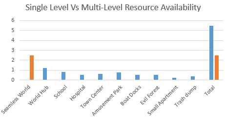
The concept here is very simple.  If you are using one large map, it's seamless - without load times.  But it's going to be slower because it's got to load all those objects into memory.   It's also going to be less flexible because each unique model you add to your level is going to increase memory consumption. So concessions will have to made if you do that.  There's also the issue of load times.  If you run a massive level, it will cause gigantic load times for game-guru.  You also *ONLY* will ever have 2.5GB of memory to work with.  That's a huge bummer if you're using high quality textures.


Fallout 3's map - the red spots are *mostly* a level portal to a new area as discussed.


Instead we're going to launch sophisticated areas (Schools, hospitals, houses, minizones) as their own zone and thus free up the memory we would normally use for the world and pour that into each individual zone.  For the sake of load times, we don't want to go too crazy, but even if each zone is 500MB in size it quickly would add up if made as part of a massive world map.

The difference is clear, at least in terms of memory usage.

This gives us the ability to rapidly distribute the load across multiple maps and bring up our total resources used.  It also gives us access to extra goodies in Game Guru such as differing skies or settings between maps.

To further speed things along we're going to use low poly models when available, low quality UVW (UV-Wraps, aka textures), and try to reuse models.  Every time we reuse a model, it further saves memory by simply requiring a pointer in memory vs a huge reload of the object into memory. 

Ground Up Design Processes

Now that you know *WHAT* we're going to be doing - it's time to do it!


The above is a simple demonstration of how to perform a multi-level configuration in Game Guru.

The first thing we want to do, as usual, is map out our levels.  We want to keep in mind that any main areas will be sectioned off.  Even the world map can benefit from being broken up into sections.  I prefer to use major areas or quadrants.

I like to draw on paper exactly how things will flow for the player.
But this isn't paper.  This is the internet. So you get a bad MS paint drawing.

It's terrible, but you get the idea, probably.
The next thing to do is to figure out the assets we're going to be using for these zones.  Each of these areas will have it's own specific feel and layout. So make sure you create a list of each area's similar assets so you can keep track as Game-Guru's asset management is pretty abysmal.

This is, in essence, the very rudimentary beginnings of a pre-production blueprint.  You should check this link on more about that:

http://www.worldofleveldesign.com/categories/level_design_tutorials/why-i-failed-for-years-at-level-design-and-game-environments.php

Moving on.

So basically what we want to do is use similar, low cost entities when doing background pieces and higher cost/high poly models in foreground elements.  Remove anything extraneous and wherever possible duplicate items.

Picture sourced from game-guru.com's screenshot gallery by user Morphtactic

You can see above a good example of reusing elements.  The trick is primarily to use them assymetrically.  Giving an object that's visually similar the same orientation causes the brain to see it quicker.  Giving it a slight twist, say 10 degrees, can make all the difference in how two identical models are perceived.  I give more info on little tricks like that in this article: http://gamegurureport.blogspot.com/2016/06/technique-training-level-building-basic.html

So all that aside that's basically it!  Just break up the level into easily digestible chunks and it will keep things nice and low for you.  You can still have sprawling maps - just be smart and keep the load times down!

Finer Tuning

Once you've got your indoor levels fleshed out it's important to remember that indoor levels can basically be stripped of terrain and/or water using the stock script 'goindoors.lua'.  This will further help framerate on visually intensive locations.  Just make sure you account for the lack of terrain if you have transparent windows looking out into the world.

Another important element is to not load up your scenes with tons of enemies.  Unfortunately the AI right now really doesn't support group think very well so it tends to act in a very poor fashion when more than a handful of AI are active at a given time.  Done properly (use blind corners, traps, etc) you can still make the situation difficult for the player without killing their CPU in the process. 

Other things you can do are fine tune your occlusion settings, which are tricky to get functioning properly but once enabled will properly cull objects out of view to ensure that the maximum framerate is being used at a given time.  This however will be a topic for a future date, when I can devote more meaningful time to the discussion of occlusion.


After Christmas I'll put a post up showing more specifically how I used this and screenshots of the work involved so a better idea can be had about how it was utilized.

Monday, January 18, 2016

Lessons Learned from Doom 1: PT 2 - Romero's *New* Level Design.

Warning: Long post/Profanity ahead.
This is an update post based on this:

http://gamegurureport.blogspot.com/2015/12/lessons-learned-from-doom-1-pt-1.html

John Romero made a replacement e1m8 level.  I messaged him on twitter, let him know I did a review of his Doom 1 level design rather recently... and he replied indicating that he might be interested in further review.  So rather than make some impromptu write up over this weekend while I was grinding for a Cicada 2A in Mechwarrior Online (which I play a considerable amount of) - I decided to give this thing a proper run through.  I cannot understate my excitement here.  A god of gamedev not only knew I existed but had read a post of mine on his work.  Further, he had redone a level I absolutely hated.  I always felt E1M8 was sort of a weak conclusion to what was otherwise an EPIC first chapter of Doom.  It's no secret I love that first episode, having gamed it to oblivion over the past 20 years. 

I WAS NOT PREPARED.

Let me make this abundantly clear; I went into this thing knowing how John Romero recommended playing it:  Old school - start with a pistol, no mouselook, no jumping, no cheats (of course) and in my case - ultraviolence difficulty.

I also kept my usual setup:  smoothdoom + textures and 'fast' enemies.  Doom64 weapon graphics (except the pistol; original pistol is the best!), blood sprites, gore sprites, weapon shell casings.. etc.  Mouselook and a crosshair because I don't think I can send myself that far back in time.  No sound because I don't have that luxury at the moment.  So that's an added difficulty I impose on myself as well.

Yeah, this should be fine.  No problem.


I quickly learned how mistaken I was.  Romero was NOT fucking around.  Not a single - damn - bit.

This is literally the first room and probably my fourth or fifth death.

 Remember this?  Well - 20 years later, it happened.

So ... I had to turn fast monsters off.  I was simply getting mauled with that setting on with no gear to speak of.  I tried again and... dead.  Even on standard ultra-violence with just a pistol I was having difficulty.  Luckily I had a recent save from a play-through where I'd stopped on E1M7.  


Ready to go, clearly this will be enough (I hoped).

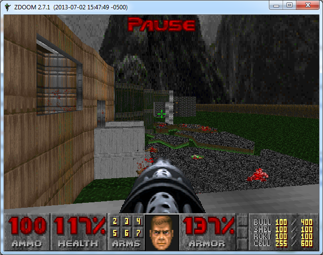
Side note: You'll notice the weapons 6 and 7.  That's because on this play through I wanted extra weapons like the BFG and Plasma rifle - so I used the cheat code on E1M1 to get them.  However, for the sake of the old school, I swore not to use either.  Bear in mind up to this point I'd been playing just fine with my fast monsters/etc.

 Yep, that did the trick.

So at this point, I'm realizing he really was going for broke.  I'm not going to rehash 'old dogs learning new tricks' or some other trite bullshit.  It doesn't do him the justice he deserves.  

Romero clearly wasn't up to par - he was beyond it.  Gods, after all, don't age.

Around this point I noticed the monster count in the mapper.  291 enemies - that's... pretty substantial alright.  Someone's clearly going to make me earn the 'beat this level' achievement.  Fine.  Let's do this.   On top of that, I was trying to get good shots of the level design.  I noticed he'd kept the map texturing consistent with the old episode of doom.  The Brutalist Architecture was in prime form and every corridor gave me a renewed respect for someone who clearly hadn't diminished in the slightest.

This map, no kidding, is GIGANTIC.  The outdoor area is mindblowing for a doom map.

Refined principles of lighting, design and traps showed that Romero had designed not something for the masses to enjoy.  This was something for himself to enjoy - he just deigned to share it with us.  

 No matter how painful that gift is, we still love it.


Secrets were well placed; they provided a welcome refuge against the literal onslaught of hell-hordes which constantly required piles of brass and a bullet hose to cleanse and purge.  
 
This one, in particular, gave me a wicked grin.  The berserker pack on this map is wicked fun.

Brutal and effective.  The invisible pinkie splits in half quite readily.

One thing that really stood out here was that this map supports a variety of playstyles.  I for one, take a fast but conservative method.  I'm not a big fan of those speed-runs that just get you through the map as fast possible.  I want every ... SINGLE ENEMY DEAD.  Weapons can be anything you want; he's got it setup that if you want shotguns, you use shotguns.  Chainsaws? Fine.  Fists?  Go for it.  Inventive use of barrel explosions?  You betcha.  Whatever you want, this map has it in spades.  It only asks for one thing:

I know this lady.  She's a harsh mistress... but I know what she likes - blood.

Heaping buckets of blood, specifically.

So now for some more critical elements I've picked up while blasting my way through this map:
 
  1.  Romero clearly had an itch to redesign E1M8 - I'm just spitballing here but this is the kind of thing that reminds me of an itch that had never been scratched just right and for whatever reason deemed now was the time to get it right.
  2. He uses a lot more Doom-3 style surprise teleports where the enemy appears behind you and you're left wondering how the hell they got there.  This was a frequent cause of my demise.
  3. Secrets are difficult at times to find and easy at others.  His old tricks of texture maps being slightly off or an out of place color seem cleaner and more efficient.  There are a few that you'll only find if you bang on every wall with a hammer or check the map for obvious wall differences.  A certain one in particular ran me in loops for 30 minutes reloading saves until I finally figured out the right way to make a switch appear.
  4. The sense of awe on this map  can only be known by playing *IN* the game.  I mean it's something to behold, literally.  The colors, the SIZES of the rooms.  The outdoor area - there are many times I just stopped to soak it in.  It's something rarely matched in modern games - let alone a map made in a 20 year old engine.
  5. The use of enemy position on this was far greater than previous work that I've seen.  This was some kind of devil-bastard child of Peterson's traps with Romero's level design.  
  6. One thing I realized here that Romero had that Carmack never did - Romero coded; he was adept at it.  He also did a lot of other things - but eventually ended up doing level design.  Carmack never had that breadth of experience.  It gave him an incredibly powerful but narrow view of game development.  To me, that explains why the life fell away from iD after John Romero's departure.  Carmack is a coding god in his own right - but without the force of energy and passion behind the game you end up with something very rigid, clean, precise - and boring.  Romero's levels are anything but.
  7. Item placement is handled at first with a sort of liberal aplomb but it's actually very well managed; at times you feel like you're starving for an item and then realized `if only I'd have found that secret, this wouldn't be happening`.
  8. Use of color is expertly done with natural contrasts occurring regularly - browns and blues, reds and blacks (See below).
The redesign of this room gave me cold chills on the first glimpse of it.  I knew what was coming and was anxious, happy, thrilled, and fearful all at once.  Note the cell count hasn't wavered.  I stuck to my promise and cleared this bastard using only what I'd earned to this point.

I'm not sure how to wrap this up, honestly.  I'm going to be absorbing what I can from this asymmetric masterpiece for at least the next few weeks.  It will *ABSOLUTELY* take the place of E1M8 for me - in perpetuity.  It's easy to see this was how it should have been.  I can literally forego the rest of the Doom saga - to me - this is all that's needed.  It brings to a close the best episode of the best FPS game I played as a kid.  I am humbled to have witnessed something like this in my lifetime.  It's akin to Leonardo Davinci coming back to life and adding another painting to his original works.  Or, if you're an Ayn Rand fan - it's a bit like hearing Richard Halley's 'Fifth Concerto'.

I truly hope that Romero keeps working on more games; a talent like this should not be wasted.  It's something that can only be gleaned by thousands upon thousands of hours of gameplay, testing, design, and full understanding of  game development as a WHOLE by living through every piece of it.  The world is better off for it, in my very humble(d) opinion.

For now, I am happy to have witnessed and perhaps learned something myself from it.  He's given me a lot to think about, that's for sure.

Friday, December 11, 2015

Project(s) status Friday: 12/11/2015

I started this morning off with disappointment.
Got told flat out by TGC that some of my art (Note, I'm not a great artist so this isn't horribly surprising) was of insufficient quality for the store they have.  Given the level of some stuff that's on there either they are upping their standards or I just *REALLY REALLY SUCK*.

Sigh.

Well, on with the project status.  My wife, as many may or may not know, is pregnant.  So we're anxiously awaiting our new addition in a few months.  It takes up a lot of my time.

What time I do have is spent at work, with the kid, doing housework, or very infrequently - playing games.

Every monday I sit with my 5 year old (Soon to be 6) and do some game-guru 'daddy time'.

Anyways... today I wanted to have an update ready but turns out someone posted some 'free weapons' that were blatant plagiarism and as such kind of mucked up my ideas for today's review post.  I may do a different one later, but not right now.  It frustrates me to be stymied like that.


Current project status:

1) NMC Book 2 - still waiting for beta readers to get back to me.
2) Javascript Mechwarrior Dark Age game.  No further progress (currently no desire)
3) Yet to be named "sci-fi" FPS game - good progress!  Figured out and corrected internal shadow systems, can now proceed normally.  Looks like I'll be getting a free scientist model from one 'henry weaver' and that will help CONSIDERABLY with some of the efforts I'm moving forward with.  Combined with the lackluster character creator (though I've done some interesting things with the face mapping) I have a bare bones set of 'original' characters plus some bad guys.  Now comes level design, then population of levels, then scripting, object placement for pickup objects, tuning, refinement, etc.
4) The doom analysis is complete for Doom 1.  Interesting stuff in previous blog posts  here here and here!
5) I promised to look at zombie AI code but someone already found the issue - so that's off the list.
6) I need to take more screen shots of my WIP.


At work, I'm writing a script to use puppet to deploy salt-minion on SLES SP3/4.  Irony level rising.


Wednesday, December 9, 2015

Lessons Learned from Doom 1: PT 3 - Peterson's Level Design.

And here we are.  The final episode of the original Doom.  Not counting 'ultimate doom', that is.

"INFERNO!" 

So around this time, if you're familiar with the mythos of iD software, you find that Sandy Peterson's levels kick in.  Some have described his levels as 'ugly'.  I'd describe them as hideous.  But that said.. let me get to the real crux of the matter here.

I utterly despise Sandy Peterson's levels.  I mean that, of course, in the nicest possible way.  It's actually a compliment.  They did good choosing Sandy as the guy who did the "Hell" maps.  This guy... I mean he's just a sadist, through and through.  His maps make this game very, VERY challenging in very short order.  I can get through the first two episodes on stupidly hard difficulties (including the Brutal Doom versions) without issue.  I get to Sandy's and .. shit just falls apart.

Here's your first indicator something is off.  The very first thing you see on Episode 3 is this closed-eye-switch-thing.  A far cry from the 'unfamiliar rooms' of Tom Hall and John Romero.

Don't worry... it opens when you toggle it.
From this point an elevator rides you upwards to... the surface.  Yes, an actual outdoor area complete with withered trees and... three imps (on ultraviolence setting, of course). 

I find using melee tends to save a lot of ammo when playing his levels.
So you shoot the imps down, pick up two boxes of ammo and open the door to find two Cacodemons.  Now.. this is a big deal for those who don't know.  Cacodemons are TOUGH.  They hit *HARD*.  They generally act as a damage sponge and work best if you use them to kill other minions.  You know - the ones you just iced.  

Damnit, Sandy.
So you tear down these two Cacodemons and are presented with what seems like an obvious trap.  "Get the shotgun, and you'll be better armed!", your mind says.  You, like an obedient dog, oblige in a Pavlovian fashion.  

It's a shotgun on a bridge, what could go wrong?
As you run across the bridge.. it sinks.  Into the lava or blood or .. whatever that hurty liquid shit is.  So you learn to just run across and think something will happen - a wall will drop or ... but nothing happens.  You literally run RIGHT THROUGH THE WALL into ... you guessed it - 3 imps with no room to maneuver.
Damnit Sandy.
This pattern continues.  Over .. and OVER again.  Simple trap becomes complex trap becomes keyboard smashing rage-inducing trap.
This isn't an isolated event.  It happens again...
Damnit Sandy!
and again...
 I SWEAR TO GOD SANDY!
AND AGAIN... 
*Throws Keyboard*
 This insanity was brought to you buy a god fearing Mormon, if you can believe that.
AND IT GOES ON FOR 9 DAMN LEVELS.
Now.. I have to say - I *REALLY* respect the proficiency of Sandy's trap and maze design.  He may make the game less fast paced and fun in the Romero sense - and he may not have Tom Hall's MASSIVE level design with hundreds of secrets - but he really has a truly insidious method of drawing you in and blowing you to pieces.  It has it's own rhythm and there's a lot to learn from.
So here's a few cliff notes I've taken on his methods vs the others:
Sandy's biggest weakness is actually of all things wall textures.  His use of wall textures was ... minimal at best.  His light sourcing was some rock bottom shit.  That said, you barely have time to notice it as you fight for your life in what goes from a run-gun-shootfest to a George A. Romero-esque survival horror.

  • Sandy uses very assymetric architecture like John Romero (no relation to George A.) - but in a completely different way.  Areas are large and flat, but open. 
  • Use of outdoor is taken to an extreme.  Outdoor areas are huge, with trees and what not.  Presents its own challenges in terms of enemies and mobility.
  • Sandy places objects in locations that are deliberately going to impede your movement.  For instance you get pillars in the middle of an area that gets swarmed, doors shut behind you and lock you in against hordes, etc.
  • His secrets are nastier than just 'walk in and pop a monster swarm'.  It's more like 'walk in, get item, die in lava unless you move backwards in which case you get crushed by the ceiling instead but oh hey if you survive you get to fight fifteen enemies at once and only get four shotgun shells for your effort.'.  
  • Sandy's secrets were INCREDIBLY hard to find.  In many cases they were not intuitive at all.  That said, they were often necessary as part of your progress (if you weren't cheating) just to keep your ammo count from hitting the dreaded goose egg (0).  
  • Sandy's Doom 1 levels are time consuming mazes that actually tend to wear on you.  I found this element a lot less fun.  When taken in context with the other two developers it's easy to use lessons from each to strike a balance.
I found myself getting bored by his levels.  The traps became routine (ironically), the ammo scarcity was frustrating on an unnecessary level, and I had no desire to spend 40 minutes getting lost in a maze.

That said, his levels for Doom 2 are SUPERB.  His textures are still a little flat but improve dramatically and the design is interesting and novel.  Though seriously - his traps only get nastier, if you can believe it.

The final word here is despite the negatives Sandy's levels really represented Hell for both the player in a figurative AND literal sense.  So in this, it was a good choice to make his levels the final piece of Doom 1's original set.  I respect the hell out of a guy who can take an action shooter like doom and turn it into what basically amounts to a fucked up version of Myst with shotguns and demons.

So this concludes the Doom 1 level design lesson set.  I hope you've had as much fun reading as I've had writing it.  Hopefully you've learned a few lessons about how the devs managed their design methods - each one had a good and bad side; all of them had things one can glean.  I for one, have learned a great deal and hope to put those lessons forward in practice soon!  I hope a few of you replay doom and maybe post your comments about the design; I'd love to see what else everyone else picked up on this!