I'm a Linux Systems Engineer, amateur sci-fi author, and gamer who's dabbled with gamedev since I was about 12 years old. Author of several mods as Mechwarrior 4's Siege Mode and the CoopBot for Quake1. This blog is my sounding board on Game-Guru, gamedev, and tech topics in general. Currently authoring a start to finish guide on Game-Guru for Taylor and Francis publishing, should be on shelves around June 2019.
This site uses cookies - EU compliance notification.
Search This Blog
Showing posts with label technique training. Show all posts
Showing posts with label technique training. Show all posts
I really dig the constant release cycle we're seeing from Game-Guru and TGC now that it's gone to GitHub. Here are the full details on the 04.14.18 PP (Public Preview) release available on steam:
This one seems to be more of a bugfix/legacy components fix and users are reporting good results. That means we're inching closer to a production stable build.
Not a lot going on but some interesting stuff. GraPhix continues his PBR work with a nice looking bus stop. One thing that stands out is that the glass isn't suffering that awful 'everything past the second pane gets deleted' bug so it should work flawlessly by the look of it.
There's a house set if you're interested by relative newcomer 'Homewreckers studio' and some very nice snow decals by RoseMadder (I always love innovative uses of the decal system).
Lastly there's a Randomized Sound System by Corrosion, who continues his utility scripting. This particular one looks really useful and I might consider getting it myself. Definitely give it a view!
There's a pretty big update for AGK but that's really only useful for people using GG Loader, at least from this blog's standpoint. Beyond that, apologies but I haven't sifted through the mountains of posts on the forum about updates. Suffice it to say we should expect a lot of integration of utilities in the near future into GG public releases.
Random Acts of Creativity:
So this is the area I'm *MOST* excited about. We have two mega updates here that need some attention. Firstly, of course, is Dimoxinil's "Space Losers". This game continues it's march towards completion and there's also a recipe for cooking eggs buried in there? That's definitely a new one.
He's added a savegame feature, day/night transition, a friendly NPC, and a village.
Details here: https://forum.game-guru.com/thread/217908?page=4#msg2599091
That DuchenKuke had posted a pretty awesome update and test video for his upcoming fallout/STALKER style game. You can watch that video here (highly recommended as it's informative just in the sense of learning how to use terrain effectively):
This is absolutely gorgeous and he's done a great job. My comments in full can be found at the video.
In My Own Works:
Ugh. Don't remind me that I have more work to do. I added about 3000 words last week to my book, which is pushing 145 pages now, unformatted. There is a ton of extra work to do.
If you keep an eye on https://github.com/TheGameCreators/GameGuruRepo/issues you can get an interesting sense of what is being looked at and what isn't. Currently there isn't a huge amount of 'buy in' for the github repo but it is coming along and in 6-10 months I expect it to be trucking along fairly well. There's a good body of issues being brought to the attention of Lee and company. So we'll see but for now, mum's the word.
NEW PRODUCTS IN THE STORE
What you see above is the whole of it. Gtox is adding new weapons (this knife apparently has an alt-attack, which is pretty cool!) and M Stockton has done some great work making a skate parka nd some parking blocks. High quality models are always good thing!
FREE STUFF
https://forum.game-guru.com/thread/219294 - DuchenKuke has offered a really great variety of free music from his old fallout work. I love this type of thing and highly encourage people to use it to help differentiate their product from stock offerings. https://forum.game-guru.com/thread/215012?page=15 - Bod has given us a great deal of things over the years and he continues to deliver. This time it's a Mallard train, carriage, and a really fantastic looking train station (check out the picture below!). Make sure you tell him how much you appreciate his work - I think he's getting fatigued a bit and it always helps to hear some encouraging words.
This is a really brilliant new piece, in my opinion!
https://forum.game-guru.com/thread/219211 - In HonkeyBoy's thread about his survival system, there's a new Lathe that's been added by GraphiX which is pretty impressive and definitely worth a download.
THIRD PARTY TOOLS
Nothing really new and exciting here. Preben did make an interesting change to GG Loader which apparently improved framerates significantly by reducing draw-calls. Hopefully this will have some future implementation in Game-Guru. I have more to do for my notepad API but it's going to be a bit. I simply have too much on my plate at the moment..
I love post-apocalyptic games and this one looks like a solid piece. It's interesting, I've asked him what his method is and he mostly just wings it. I guess some do have a natural talent for level-building. Lucky bastard was apparently gifted with it more than I was, apparently.
Check out the above video for details. Very cool stuff. Check out how clean the scripting and game play is! Definitely one to keep an eye on.
https://forum.game-guru.com/thread/219258 - Honkeyboy's latest creation - Death by Daylight shows a remarkable increase in level design and proficiency for Game-Guru's most prolific author. He's got rapid development down to a science at this point and it's really starting to make strides.
I've made some progress on the Camera system I'm working on. I have 3 out of 4 of the major pieces I want before I release it. Once I get the last piece in play, I will build a demo level, zip it up, and sell it (for about $4). It'll start off on sale at 3.50. The camera kit will have some very interesting components which I believe most will appreciate. I may add some niceties to it but that's not required at this point so it may get added down the road.
After that I have to finish my other two kits. So keep an eye out for some interesting news there.
NOTE THIS PARTICULAR TUTORIAL IS HEAVILY RELIANT ON ALL OF THE PREVIOUS ONES. PLEASE BRING YOURSELF UP TO SPEED HERE: My Tutorial and Evaluation Page.
So it's no secret Game-Guru is really weak in terms of performance. I've covered several topics in the past ranging from more advanced lighting techniques to improving the way reshade handles your graphics.
What I've found in the past is it's really difficult to work with a lot of the stock models. There's simply a cutoff for what you can get from a model that's pushing 512x512 SD textures.
Before we continue, what I'm talking about here is something called 'texture depth'. I'm sure by now you've probably heard the acronyms "SD" and "HD".
Taken from some chinese blog, but suits the purpose.
Basically the less pixels you dedicate to the quality of the texture surrounding your model, the less 'depth' it will have in the sense of how detailed the picture can look. Here's an example. The stock asylum graphics are .. acceptable .. by Game Guru standards.
SD is really anything under 720 pixels wide/high. Most games tend to use standard divisors of 8 so you have like 256x256, 512x512, etc. This tends to max out around 4096x4096. This is primarily because of the graphic cards capabilities.
However you are using a 2048x2048 texture that's divided up into multiple subcomponent textures. This basically makes each effective texture 'SD quality'.
Some are more, some are less, but all are SD.
Now to spruce up the texture, what I do is go is open it up and immediately resize the texture to 4096x4096; then proceed to sharpen the picture significantly.
It's hard to see with this scaled down snapshot, but trust me, it's there.
The resultant image has much higher fidelity.
Now the real trick here is fully utilizing ALL of the mapping available (when necessary) for Game-Guru textures. Game-Guru can handle basically four types of mapping:
The standard UV map - this is your _D file.
The normal map - this is your _N file.
The specular map - this is your _S file.
The illumination map - this is your _I file.
Generally speaking, most models only include a _D and a _N file.
In the case of our asylum texture, we have a specularity file as well (_S). This particular addition gives a slight shinyness to the textures, making them seem wet or slimy. You can only see them with the entity shader set in the tab-tab options menu set to 'Highest'.
These settings are what I found using in combination with reshade as producing the best visual result for the asylum.
Default walls, unmodified. Looks ok.
Now that looks .. ok. That's the best you're really going to manage from stock assets and some really basic lighting. Now if we modify the specularity file so it's a lot more pronounced on certain areas. The basic specularity file is pretty clearly just a black and white image of the original _D file which is fine unless you want to really highlight areas. Now tile generally tends to have a shiny edge because of the enameling on it. So what I did is took the original image and modified the luminosity settings in paint.net to give it much higher contrasting on the black and whites, causing a more clear delineation in the shiny areas of the texture.
Old on the left, new on the right.
Side note: If you don't HAVE a specularity file with your models, you can generate one simply by making a black and white image, saving it as _S on the end of the filename and then modifying luminosity (or using edge detect even) to create bright white spots. Specularity maps work by using a greyscale of the image - the more 'white' it is - the shinier the surface will be.
The final result, in combination with static lighting ends up looking like this:
Note the cleaner texture lines, better shine on the walls, etc. It's really a vast improvement over the original configuration.
While a lot of this is trial and error, it's a big piece of improving your work to at least be within striking range of more up to date engines.
One final note: I personally run this setting in reshade's mastereffect.h file:
#define USE_HDR_LEVEL 2 //[0 to 2] HDR Level: Rendering bitrate. 0: RGBA8 | 1: RGBA16F | 2: RGBA32F
2 seems to be the highest fidelity setting possible if you're interested in HDR quality imagery.
Ciao!
So I was working on my most recent project - *famous game* homage for my wife.
Something she could play for christmas. My son and I were both going to help each other and produce a really masterfully done game for her in the vein of one her favorites.
This would be done in a 3-4 week timeline with about 3-5 nights a week of a good solid 3-4 hour runs on adding stuff.
Sourced from Seriouslyjacque.com - very accurate assessment of stress, IMO
Well we quickly discovered how unwieldy a large map would be treated by Game Guru. So I decided to go back and optimize the map in every way I could. Here's a bit of that process.
Before we begin...Limitations
A key understanding here is that Game-Guru is only 32-bit. It's also using DirectX9. These are effective, but outdated infrastructure components.
32-Bit applications are limited to 4GBof memory. But really, considering all the underlying subsystems, operating system data, etc. It's more like 2.5 GB. Also, for the uninitiated, memory is basically the short term, high speed data storage your computer runs applications in.
Holy crap he writes, makes games AND uses excel, incredible!
64-Bit on the other hand, can access something like 16 EXABYTES ... some absurdly large number that's out of reach for the time being. So arbitrarily, we'll use a common value of 16GB for our memory example.
As you can see, your game only takes up a *FRACTION* of available memory on a 16GB system.
Bear in mind though no matter if you're running a 64-Bit version of windows (as I am) that the application itself, in this case Game-Guru, can only ACCESS 4GB of ram at any given time. And it always considers the OS as part of that.
In real terms, this means that only 2.5 GB of memory is ever available for any given time.
Now consider that every single item you add, every texture, every object, etc - occupies a bit of that storage space. If you are using thousands of unique objects, each one has to be stored separately.
DirectX9 adds another limitation in that it is vastly more CPU reliant than DirectX11. So in my case, for instance, I have a quad core AMD running at 3.2GHZ for my primary system. My video card is a GTX960, with 1gb of video ram. While it's not top tier it's still an excellent card for any game.
Except, of course, Game-Guru games. This is because DirectX9 relies on my CPU which is at best, mediocre.
Unfortunately this is another pipe-lining bottleneck we have to work around (at least until Lee gets off his duff and codes this thing in DX11!).
Optimizing Memory
From this standpoint of minimizing memory usage, we need to utilize this knowledge in a ground up context. While a lot of AAA titles these days use incredible CPU and Memory resources to produce an earth-shaking experience, many older systems and titles had to be more inventive.
Some examples of this are:
Fallout
Silent hill
Resident Evil
What we're going to do here is emulate the design by using a tried and true multi-level system with several small zones off a hub zone. This is the main world, an area where you navigate from place to place. However once you arrive off the world map, you open a door to a building and are transported to a new level. This is done in such a way that the load times are minimal and it typically makes logical sense.
Example:
Outdoor zones in fallout 4 are part of the 'world' zone -
This quarry, for instance.
But when you go to a building of any measurable size, you get an 'enter' option that you can click which gives you a loading screen like this:
Side note: Probably the most interesting weapon in FO4.
Then you're loaded to the new zone. Now we can accomplish a similar trick (albeit without the fancy loading screens) using winzones. The winzone object in Game Guru allows you to setup a pointer to another level which is then brought along when the game is compiled. When the player steps over the zone, it ports them to the new level. You can also port them back to the original level, if you desire. This is the method we'll be using.
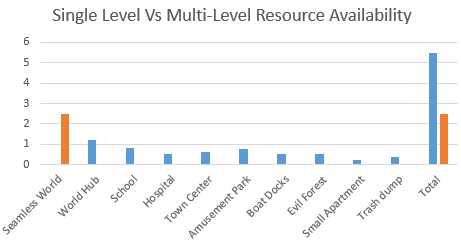
The concept here is very simple. If you are using one large map, it's seamless - without load times. But it's going to be slower because it's got to load all those objects into memory. It's also going to be less flexible because each unique model you add to your level is going to increase memory consumption. So concessions will have to made if you do that. There's also the issue of load times. If you run a massive level, it will cause gigantic load times for game-guru. You also *ONLY* will ever have 2.5GB of memory to work with. That's a huge bummer if you're using high quality textures.
Fallout 3's map - the red spots are *mostly* a level portal to a new area as discussed.
Instead we're going to launch sophisticated areas (Schools, hospitals, houses, minizones) as their own zone and thus free up the memory we would normally use for the world and pour that into each individual zone. For the sake of load times, we don't want to go too crazy, but even if each zone is 500MB in size it quickly would add up if made as part of a massive world map.
The difference is clear, at least in terms of memory usage.
This gives us the ability to rapidly distribute the load across multiple maps and bring up our total resources used. It also gives us access to extra goodies in Game Guru such as differing skies or settings between maps.
To further speed things along we're going to use low poly models when available, low quality UVW (UV-Wraps, aka textures), and try to reuse models. Every time we reuse a model, it further saves memory by simply requiring a pointer in memory vs a huge reload of the object into memory.
Ground Up Design Processes
Now that you know *WHAT* we're going to be doing - it's time to do it!
The above is a simple demonstration of how to perform a multi-level configuration in Game Guru.
The first thing we want to do, as usual, is map out our levels. We want to keep in mind that any main areas will be sectioned off. Even the world map can benefit from being broken up into sections. I prefer to use major areas or quadrants.
I like to draw on paper exactly how things will flow for the player.
But this isn't paper. This is the internet. So you get a bad MS paint drawing.
It's terrible, but you get the idea, probably.
The next thing to do is to figure out the assets we're going to be using for these zones. Each of these areas will have it's own specific feel and layout. So make sure you create a list of each area's similar assets so you can keep track as Game-Guru's asset management is pretty abysmal.
This is, in essence, the very rudimentary beginnings of a pre-production blueprint. You should check this link on more about that:
So basically what we want to do is use similar, low cost entities when doing background pieces and higher cost/high poly models in foreground elements. Remove anything extraneous and wherever possible duplicate items.
Picture sourced from game-guru.com's screenshot gallery by user Morphtactic
You can see above a good example of reusing elements. The trick is primarily to use them assymetrically. Giving an object that's visually similar the same orientation causes the brain to see it quicker. Giving it a slight twist, say 10 degrees, can make all the difference in how two identical models are perceived. I give more info on little tricks like that in this article: http://gamegurureport.blogspot.com/2016/06/technique-training-level-building-basic.html
So all that aside that's basically it! Just break up the level into easily digestible chunks and it will keep things nice and low for you. You can still have sprawling maps - just be smart and keep the load times down!
Finer Tuning
Once you've got your indoor levels fleshed out it's important to remember that indoor levels can basically be stripped of terrain and/or water using the stock script 'goindoors.lua'. This will further help framerate on visually intensive locations. Just make sure you account for the lack of terrain if you have transparent windows looking out into the world.
Another important element is to not load up your scenes with tons of enemies. Unfortunately the AI right now really doesn't support group think very well so it tends to act in a very poor fashion when more than a handful of AI are active at a given time. Done properly (use blind corners, traps, etc) you can still make the situation difficult for the player without killing their CPU in the process.
Other things you can do are fine tune your occlusion settings, which are tricky to get functioning properly but once enabled will properly cull objects out of view to ensure that the maximum framerate is being used at a given time. This however will be a topic for a future date, when I can devote more meaningful time to the discussion of occlusion.
After Christmas I'll put a post up showing more specifically how I used this and screenshots of the work involved so a better idea can be had about how it was utilized.
So when I say "seriously advanced" let me just preface that by saying that ... this is still Game-Guru. The lighting engine is still a decade or so behind where it should be. But we can still fake it well enough to be decent.
WARNING: THIS ARTICLE ASSUMES YOU HAVE READ THE PREVIOUS THREE.
So when I wrote my last lighting article I thought that'd be the last one. However, I recently had some correspondence with Lee Bamber (@leebamber). He's the head programmer for the Game-Guru project. Imagine this guy:
No, seriously, imagine it.
As a programmer. That's Lee in a nutshell. He's pretty competent at programming but does it all himself; he takes on advanced topics and tries to make it available for the everyday layman. Overall, he does ok, which is actually quite the compliment given the magnitude of the task.
Anyways this correspondence basically stemmed around me asking him if there's any way to increase the brightness of the static lighting in game-guru.
The response was nothing less than astonishing. Lee told me outright that the brightness of the static lights is DIRECTLY tied to the bloom slider.
Think about that for a moment.
So basically the brighter you want your static lights, the higher that bloom slider needs to be. It's a minor, but incredibly important distinction.
Now let's show that in action. Here's a screenshot from Wolf's upcoming 'Acythian' cyberpunk game.
There's at least 7 separate lightsources here. Can you find them all?
Now this isn't a maximum bloom setting, but it's up pretty high. He's running around 70 or 80, I'd wager. I realize it's not the latest Deus Ex title, but this is pretty damn good for the Game-Guru Engine. My wife, a well seasoned gamer, knows well the limits of what she calls a '10 year old graphics engine' when she sees it. She couldn't believe this came from Game Guru.
Wolf's advice for this particular piece goes back to something I wrote about in part three of the lighting tutorial:
"You increase lightmappingquality to 1000 and lightmappingsizeentity as well (or higher) in the setup.ini.
Now you place your lights either according to realism or colorscheme. I
have written a lot on that in the past, lets just say here that basic
leveldesign rules apply. (This is important because Gurus lightmapper is
a bit wonky and so is the post processing which means that bad choices
stick out way more than in something like the UE4.)"
If you've read the previous guides, then you knowexactly what he means by this.
My own efforts have yielded improved results as well. Here's a little before and after:
Single light source, default settings.
Well the after looks remarkably similar but the devil is in the details, notably the lines between the shadow and light are far better aliased. They're smoother; the light range is moderately better on the actual objects in question as well. Take a look - make sure you open it up in a new window to get a real close look because most of the improvement is very hard to see. Focus on the shadows on the boxes and in the green crate.
With a single light source, using 1000 quality/1024entity settings in the setup.ini
So if you're not aware, I am using a modification to gameguru called Reshade. Reshade was brought to us by NomadSoul, who ported it so we can use it. It's a AAA post processing system which can really improve the quality of your game's output and graphics. It can't add dynamic lighting or pre-processing stuff though so mostly you're just sharpening up the graphics or adding a filter.
I have to say that this particular piece is pretty much a 'must have' for Game-Guru. If you want Game-Guru to look like your game came out in the past 10 years, you need this.
I believe if you want your game to sell, it needs to compete... at least a little. I can respect the efforts of anyone who puts significant time into their game. But if you aren't trying to tune it up so people will find it graphically pleasing - you will pay the price. Interest will wane or collapse. You will be derided privately and publicly. Adding post processing and tuning it is part of that process.
As you can see the jaggies are removed, edges are smoothed, bloom is cleaner, lighting is nicer and the tone map is significantly improved.
The cartoon setting allows older models to look more like they belong in a modern context. A lot of older freebie stuff had very simple textures which effectively sent it to background art.
Note the darker lines and more dramatic color ranges. It's a fast way to a borderlands-style look. One thing that WOULD need done is to make a mask for the HUD elements; it's within reshade's protocols so make sure you read the files that come with it.
As you can see there's a lot here that can be done to help create a unified theme for your game or bring it up to a more modern level. Gamers with lower power cards (this author uses a GTX960) will need to disable Reshade as it will cause a framerate dip. It assumes you have something capable of running it.
Picking appropriate lighting colors
Inside the GG engine, there's several different lights available. These choices result in some of the most atrocious color schemes possible. Unless you are specifically looking for a lime green or neon purple color to an area, you will need to modify these considerably by customizing the colors so they don't wash out your textures.
The best way to do this is to pick a standard color you like (Orange, Green, Blue, whatever) and move it towards the white range. White effectively is a 'clear' color for the renderer when using static lights. Let me say that again:
WHITE IS EFFECTIVELY A CLEAR COLOR FOR THE LIGHTMAPPER.
So if you use white lights you will sit around scratching your head wondering why the hell you're not getting any brightness. What you want to do instead is pick a color like yellow - and move it towards the white range - like this:
This will provide a nice, orange glow.
If you are thinking about how this lightmapper works, it effectively throws a layer on top of the texture, TINTING IT towards the color range you are trying to achieve. So the 'whiter' it is, the more transparent it applies it towards the texture. The darker the color, the darker it will apply it. You can actually make lights and that in and of itself is interesting.
This tinting is applied as a layer which is then controlled in intensity by bloom. I honestly believe this should be a separate setting. Why it was tied to bloom I will never understand.
So using my existing scene, I've modified the settings from bloom at 35 up to 80, my usual trick of a light fog to unify colors and lowering the ambient down from 35 to 20. This is also with the enhanced 1000/1024 lightmapping setting in the setup.ini.
I think this looks much better, don't you?
As you can see the lightmapped objects look phenomenal for something out of a mediocre engine like Game-Guru. The illumination mapped objects (the Dagored scifi walls and Jackal's free sci-fi container) look awesome with some bloom, really giving them a feel of brightly lit objects. It's really important not to go overboard here otherwise you will wash out your scene very quickly. This is especially true with the ambient light levels; if they are set too high with a high bloom setting, you will get nothing more than a retinal migraine.
As usual, I hope these tips and tricks have helped you as they help me.
I was originally going to bake this in with my Advanced lighting series but this is more of a subject unto itself. One of the more powerful elements within Game-Guru for creating environmental effects is the fog system. The fog system was originally... laughable:
Picture courtesy of Lee Bamber's now extinct dev log.
As you can see it was just as simple coloring of everything in the background. By comparison, this is the fog system from the way past dead Game Creation System from the mid-late nineties:
Literally the same system in practice.
That said, at some point, Lee realized this was a titanic error and fixed it to provide a significantly better fog system. We ended up with something vastly better:
This is an old picture, but shows the lower limits of what's possible.
So as you can see this has a major impact on the function of environmentals. This game engine has very few 'modern' features. It's important to stretch everything to it's limit so that's what I'm aiming to teach you to do!
Realistic nighttime!
So with that we approach our first technique; realistic nighttime. In game-guru, nighttime effects are actually quite difficult to achieve. This is primarily because the sky system has a constantly active light which will frequently circumvent your efforts. This light is fixed in space and you can turn down ambient/shadow values to zero but your game will still fall short of achieving that desired 'nighttime' look.
The trick, the real trick, is to use fog. If you set all the values to 1 for RGB, set the range start up close and the far distance close, then modify the intensity as desired it will create a black fog which accurately mimics the feel of night and it's creeping darkness.
As you can see from this picture: it looks silly with a daytime sky.
But if you add a nighttime sky, it all falls together. The best part is it accurately sets up flash-light fall-off.
As you can see, it looks far more like night.
Distance simulation with Fog
One common mistake I see in Game-Guru games is that they very frequently don't factor in standard atmospheric effects. This in turn, makes their own job HARDER.
Not a bad city depiction, texture misalignment aside.
So this scene looks good. It's a basic city done with some simple city models someone made. Overall, not terrible.
Compare this against GTA IV:
Can you guess the difference?
The difference is atmospheric haze. A slight atmospheric haze provides a level of reality to any city scene as most any place in the world has at least SOME slight atmospheric haze.
Haze is defined as: "Traditionally an atmospheric phenomenon where dust, smoke and other dry particles obscure the clarity of the sky."
What you'll find is in almost every scene, from top to bottom at least a slight tinge of fog on the outlying distance (use your total visible range in an average scene, add fog to the last 15-20%) will have atmospheric haze.
Don't overdo it, or you'll look like silent hill.
Trivia fact: did you know the first Silent Hill's trademark fog was actually a way to disguise the draw-distance limitations of the PlayStation 1 and the respective game engine involved? By implementing a heavy fog they accomplished both an incredible atmosphere and also improved game performance. That's win-win!
When implementing your haze, you want to keep in mind that time of day matters; remember haze is effectively a reflection or light being blocked. As the time of day changes, so too does the haze.
Not a game-guru picture. Just some random image from google.
As you can see above, the relatively nearby trees have a SLIGHT orange tinge (even in the upper branches) caused by atmospheric haze and ambient lighting. The lightrays further illustrate the haze, though lightrays on Game-Guru are totally dictated by the aforementioned fixed sun.
This is more what you're striving for:
From Twin Worlds - Note the orange haze, matching the sky perfectly.
As you can see, these settings are pretty simple stuff. You can do quite a lot with them.
Further examples(settings included):
My city test - day, with Atmospheric (normal) coloring:
If you further modify your depth of field settings you can achieve a
more pleasing result, but this fairly decent for a quick example.
Preparing for a more night-oriented effect.
This is a longer range darkness, but still dark.I left the cloudy sky in for contrast.
Now is a really dark version - high intensity. Distance remains the same.
Notice how the red light is no longer visible.
Maximum darkness. Close range. No flashlight. Dark sky.
I had to move close just so you could see anything!!
Sunset Sky, Sunset fog for atmospheric haze.
My favorite, personally speaking.
Silent hill, just because :P
Just add pyramid head.
As always, feel free to comment. If this has been useful to me, please post a link to your results below!
Time for another Technique Training, class is in session!
One of the hallmark features of game-guru is the terrain system, which is basically the main difference between the old FPS Creator X9/10 and Game Guru (or FPS Creator Reloaded, if you remember it back that far). This system, however, initially feels very bland. With a little work though, you too can get pretty excellent looking terrain if you have an idea of how to use the tools available!
The first thing we're going to need is some inspiration. As always, I start in the usual place - google image search.
It's really that simple, honest.
Today, I've selected this picture as my inspiration. Please note, it's not designed to be a direct copy, but rather just something to give me ideas and a general feel for how I want my terrain to look.
So what we're going to do to start is load up a new, flat level and make the terrain sculpting tool the largest size possible (With the + key). Once it's the largest size possible, you're going to simply pick a point and make a mountain, right?
We're all done, right?
So you've made your giant lump. Congratulations! You've now officially joined the ranks of 'first time Game-Guru' user! Obviously, this is wholly insufficient for what we need. We are looking for a broad, jagged mountain range. So at this point the next step is to offset your position a little bit and 'build up' some larger hills to the side and front of it. I generally will try to add a light slope to the front as well because most mountains have this feature.
It's a little better, more 'mountainy', for sure. Miles to go though.
Now a big part of making mountains in GG look decent is adding depth to them; this is done not by adding tons and tons of hills but rather using a physical parallax effect. What's parallax, you ask? Parallax, simply put, is a layering method to produce a more depthful effect when looking at a flat image. In the past (and even in today's modern indy games/side scrollers/etc) it was used to produce a look that provides a faux three dimensional effect. In this case, we're going to be basically placing one mountain range BEHIND another.
In the case of game guru, we're going to create a parallax style background by using physical elements. The layering of mountain ranges will provide a *REAL* tangible feel to them, which is part of why I chose the original picture. If you notice, said picture has two basic seams of mountains running next to each other. That's what we're going to achieve here.
Note, this second mountain range is the one on the right, offset about one max size half circle width.
At this point you've got the basic terrain features. And boy do I mean basic. You have a few lumps and some rounded components which show the barest approximation of that beautiful vista I chose earlier. Don't worry, we'll tighten it up. The next thing you're going to want to do is make the circle about half of maximum size and start drawing lines to connect the ranges and taper off.
Still looking very much like a mashed potato mountain, but getting closer.
At this point you're thinking "Yeah, yeah... This is the easy stuff. ANYONE can do this. These mountains are neither good nor convincing!". And you'd not be wrong. Except this is just the barest piece. The next part is the crucial part, the part that really shapes this into a realistic mountain. You want to take your brush size down to the smallest size possible. What you're going to do now is starting at the top of the mountain and steadily drawing lines down to the bottom. This is to represent the hard edges you find on any mountain (aside from dome types, that is). Continue drawing lines down the side, breaking lines of into separate branches. Make sure you don't spend too long in one place or you will have a very ugly spire sticking up.
Remember to start at the top!
Continue tracing down the mountain, and going over each major ridge to give it a hard rocky look. It doesn't take much experience to do this. You can pick up the technique pretty fast.
When you overdo a section, like I did on the right, plan on doing a little extra to make it look natural.
After about 20 or 30 minutes of fine shaping you'll have a much more realistic rock face with hard ridges, faults, etc. It's real important to try to capture the shape of the type of mountain you are working with.
Definitely looking more mountainous now!
So you can see that it's looking more like a mountain but there's still a lot of overly sharp edges which don't quite look right. Even the most harsh mountain range still has SOME degree of erosion to it. So after you get this much of your shaping done, adjust your tool to be about half of maximum size again. Click on the blend mode tool and start doing 'taps' over the harder terrain to soften it up. It's important not to overdo the blend tool so just highlight an area and click once, twice, or however much is needed until you get the desired shape. This will make the mountains seem far more natural. You also can use the shift key to create indents or create channels (as opposed to ridges). You can also do single shift-clicks to create minor pockmarks that are far more realistic than a single click to raise terrain.
It's subtle, but you can see the difference the most on the right.
Now depending on how good you want this to look, you can probably stop there if you really just want some background mountains for a game. But if you're trying to create a photorealistic shot, you're going to want to adjust every component. Let's start by changing from the 'lush' terrain to 'Lush HD' and putting all the graphical settings in GG to 'highest'.
Hard to believe this was a bland old mound 30 mins ago, eh?
Understanding what you're working with for mountains is very important; if you're just winging it, you're going to look amateurish. And we wouldn't want that, would we? So take a look at some reference material, research growth patterns in geology, whatever. In this case, I'll save you some trouble on a rudimentary thing like vegetation. Vegetation rarely grows on the tops of mountains. It's typically moderate or dense at the bottom and then becomes more sparse as it goes up.
Just a start, but the basic concept is there.
With Game Guru, I prefer vegetation quantity on 100%. The width and height for this were set at 50% (default values). I initially started with swapping the sky to my 'moonlit ocean' sky. Vegetation matching as a result required a darker, less obtrusive color. This one I think is called 'thistle'.
Lookin' good for something not even done yet!
While that's nice, I realized I wanted to give the other terrain features as well including the half-rounded hill, inlet with island, and simple path. It's important to lay down secondary vegetation as well. For this I used foliage bushes 1 and 2. For bush 1 (the smaller of the two) I used the spray tool (the "I") key. For the larger bushes (bush 2) I hand positioned them and rotated them periodically to give them a more natural look.
Adding some minor vegetation to the island and inlet.
One of the tricks I use to make inlets is to reduce the terrain to a depth I like (moderately shallow, player-depth water) then use the Level mode tool to 'cut out' the terrain I want. I usually move the mouse around rather slow for specific areas and moderately fast for areas to give a slight elevation to (such as that slight beach in front of the island).
Continue tuning until you get the desired result.
Creeping foliage up the side, a good waterfront, reasonable mountains... success!
Around this time you can add decals for fog (free ones on the forums, HERE or HERE which will provide you reasonably decent fog that you can tune to either give a misty mountain appearance or perhaps that of a volcano.
Placement of these is trial and error but not terribly difficult.
That said, I wanted to get close to the original, if possible. so I added a few more pieces including a rounded hill that had a sharp cutoff through it to give a similar appearance to what is in the original picture. I used the level tool to cut through the mound to give it that sharp rock face.
The leveling tool is one of my favorite additions to the toolkit.
Now it's time to set the sky and colors. It takes a little twiddling but you'll notice that when I switched the sky up I had serious issues with the existing foliage being too dark; here again I had to go modify it to suit the scene, as you will often do.
Thistle is real good, but pretty dark, overall.
You can find yourself in a number of possibilities the terrain system. It's very flexible and fluid if you're willing to invest the time into trying to learn new things.
Probably my favorite pic of the lot.
One trick is to take rocks from the scenery that comes with Game Guru and add them to the mountain.
You can get a sense of my workflow here with the reference photo on the left and the editor on the right.
In the above picture I'm positioning one of several rocks which are masked by the vegetation system.
The final result came out pretty good. Of course there's always more work that could be done but overall I'm pleased with the results. Hopefully you'll be pleased with your results too. Feel free to post some images of your own to imgur.com and link them in the comments.


