Search This Blog

Showing posts with label ID Software. Show all posts

Monday, January 18, 2016

Lessons Learned from Doom 1: PT 2 - Romero's *New* Level Design.

Warning: Long post/Profanity ahead.
This is an update post based on this:

http://gamegurureport.blogspot.com/2015/12/lessons-learned-from-doom-1-pt-1.html

John Romero made a replacement e1m8 level.  I messaged him on twitter, let him know I did a review of his Doom 1 level design rather recently... and he replied indicating that he might be interested in further review.  So rather than make some impromptu write up over this weekend while I was grinding for a Cicada 2A in Mechwarrior Online (which I play a considerable amount of) - I decided to give this thing a proper run through.  I cannot understate my excitement here.  A god of gamedev not only knew I existed but had read a post of mine on his work.  Further, he had redone a level I absolutely hated.  I always felt E1M8 was sort of a weak conclusion to what was otherwise an EPIC first chapter of Doom.  It's no secret I love that first episode, having gamed it to oblivion over the past 20 years. 

I WAS NOT PREPARED.

Let me make this abundantly clear; I went into this thing knowing how John Romero recommended playing it:  Old school - start with a pistol, no mouselook, no jumping, no cheats (of course) and in my case - ultraviolence difficulty.

I also kept my usual setup:  smoothdoom + textures and 'fast' enemies.  Doom64 weapon graphics (except the pistol; original pistol is the best!), blood sprites, gore sprites, weapon shell casings.. etc.  Mouselook and a crosshair because I don't think I can send myself that far back in time.  No sound because I don't have that luxury at the moment.  So that's an added difficulty I impose on myself as well.

Yeah, this should be fine.  No problem.


I quickly learned how mistaken I was.  Romero was NOT fucking around.  Not a single - damn - bit.

This is literally the first room and probably my fourth or fifth death.

 Remember this?  Well - 20 years later, it happened.

So ... I had to turn fast monsters off.  I was simply getting mauled with that setting on with no gear to speak of.  I tried again and... dead.  Even on standard ultra-violence with just a pistol I was having difficulty.  Luckily I had a recent save from a play-through where I'd stopped on E1M7.  


Ready to go, clearly this will be enough (I hoped).

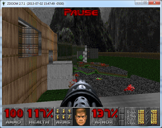
Side note: You'll notice the weapons 6 and 7.  That's because on this play through I wanted extra weapons like the BFG and Plasma rifle - so I used the cheat code on E1M1 to get them.  However, for the sake of the old school, I swore not to use either.  Bear in mind up to this point I'd been playing just fine with my fast monsters/etc.

 Yep, that did the trick.

So at this point, I'm realizing he really was going for broke.  I'm not going to rehash 'old dogs learning new tricks' or some other trite bullshit.  It doesn't do him the justice he deserves.  

Romero clearly wasn't up to par - he was beyond it.  Gods, after all, don't age.

Around this point I noticed the monster count in the mapper.  291 enemies - that's... pretty substantial alright.  Someone's clearly going to make me earn the 'beat this level' achievement.  Fine.  Let's do this.   On top of that, I was trying to get good shots of the level design.  I noticed he'd kept the map texturing consistent with the old episode of doom.  The Brutalist Architecture was in prime form and every corridor gave me a renewed respect for someone who clearly hadn't diminished in the slightest.

This map, no kidding, is GIGANTIC.  The outdoor area is mindblowing for a doom map.

Refined principles of lighting, design and traps showed that Romero had designed not something for the masses to enjoy.  This was something for himself to enjoy - he just deigned to share it with us.  

 No matter how painful that gift is, we still love it.


Secrets were well placed; they provided a welcome refuge against the literal onslaught of hell-hordes which constantly required piles of brass and a bullet hose to cleanse and purge.  
 
This one, in particular, gave me a wicked grin.  The berserker pack on this map is wicked fun.

Brutal and effective.  The invisible pinkie splits in half quite readily.

One thing that really stood out here was that this map supports a variety of playstyles.  I for one, take a fast but conservative method.  I'm not a big fan of those speed-runs that just get you through the map as fast possible.  I want every ... SINGLE ENEMY DEAD.  Weapons can be anything you want; he's got it setup that if you want shotguns, you use shotguns.  Chainsaws? Fine.  Fists?  Go for it.  Inventive use of barrel explosions?  You betcha.  Whatever you want, this map has it in spades.  It only asks for one thing:

I know this lady.  She's a harsh mistress... but I know what she likes - blood.

Heaping buckets of blood, specifically.

So now for some more critical elements I've picked up while blasting my way through this map:
 
  1.  Romero clearly had an itch to redesign E1M8 - I'm just spitballing here but this is the kind of thing that reminds me of an itch that had never been scratched just right and for whatever reason deemed now was the time to get it right.
  2. He uses a lot more Doom-3 style surprise teleports where the enemy appears behind you and you're left wondering how the hell they got there.  This was a frequent cause of my demise.
  3. Secrets are difficult at times to find and easy at others.  His old tricks of texture maps being slightly off or an out of place color seem cleaner and more efficient.  There are a few that you'll only find if you bang on every wall with a hammer or check the map for obvious wall differences.  A certain one in particular ran me in loops for 30 minutes reloading saves until I finally figured out the right way to make a switch appear.
  4. The sense of awe on this map  can only be known by playing *IN* the game.  I mean it's something to behold, literally.  The colors, the SIZES of the rooms.  The outdoor area - there are many times I just stopped to soak it in.  It's something rarely matched in modern games - let alone a map made in a 20 year old engine.
  5. The use of enemy position on this was far greater than previous work that I've seen.  This was some kind of devil-bastard child of Peterson's traps with Romero's level design.  
  6. One thing I realized here that Romero had that Carmack never did - Romero coded; he was adept at it.  He also did a lot of other things - but eventually ended up doing level design.  Carmack never had that breadth of experience.  It gave him an incredibly powerful but narrow view of game development.  To me, that explains why the life fell away from iD after John Romero's departure.  Carmack is a coding god in his own right - but without the force of energy and passion behind the game you end up with something very rigid, clean, precise - and boring.  Romero's levels are anything but.
  7. Item placement is handled at first with a sort of liberal aplomb but it's actually very well managed; at times you feel like you're starving for an item and then realized `if only I'd have found that secret, this wouldn't be happening`.
  8. Use of color is expertly done with natural contrasts occurring regularly - browns and blues, reds and blacks (See below).
The redesign of this room gave me cold chills on the first glimpse of it.  I knew what was coming and was anxious, happy, thrilled, and fearful all at once.  Note the cell count hasn't wavered.  I stuck to my promise and cleared this bastard using only what I'd earned to this point.

I'm not sure how to wrap this up, honestly.  I'm going to be absorbing what I can from this asymmetric masterpiece for at least the next few weeks.  It will *ABSOLUTELY* take the place of E1M8 for me - in perpetuity.  It's easy to see this was how it should have been.  I can literally forego the rest of the Doom saga - to me - this is all that's needed.  It brings to a close the best episode of the best FPS game I played as a kid.  I am humbled to have witnessed something like this in my lifetime.  It's akin to Leonardo Davinci coming back to life and adding another painting to his original works.  Or, if you're an Ayn Rand fan - it's a bit like hearing Richard Halley's 'Fifth Concerto'.

I truly hope that Romero keeps working on more games; a talent like this should not be wasted.  It's something that can only be gleaned by thousands upon thousands of hours of gameplay, testing, design, and full understanding of  game development as a WHOLE by living through every piece of it.  The world is better off for it, in my very humble(d) opinion.

For now, I am happy to have witnessed and perhaps learned something myself from it.  He's given me a lot to think about, that's for sure.

Wednesday, December 9, 2015

Lessons Learned from Doom 1: PT 3 - Peterson's Level Design.

And here we are.  The final episode of the original Doom.  Not counting 'ultimate doom', that is.

"INFERNO!" 

So around this time, if you're familiar with the mythos of iD software, you find that Sandy Peterson's levels kick in.  Some have described his levels as 'ugly'.  I'd describe them as hideous.  But that said.. let me get to the real crux of the matter here.

I utterly despise Sandy Peterson's levels.  I mean that, of course, in the nicest possible way.  It's actually a compliment.  They did good choosing Sandy as the guy who did the "Hell" maps.  This guy... I mean he's just a sadist, through and through.  His maps make this game very, VERY challenging in very short order.  I can get through the first two episodes on stupidly hard difficulties (including the Brutal Doom versions) without issue.  I get to Sandy's and .. shit just falls apart.

Here's your first indicator something is off.  The very first thing you see on Episode 3 is this closed-eye-switch-thing.  A far cry from the 'unfamiliar rooms' of Tom Hall and John Romero.

Don't worry... it opens when you toggle it.
From this point an elevator rides you upwards to... the surface.  Yes, an actual outdoor area complete with withered trees and... three imps (on ultraviolence setting, of course). 

I find using melee tends to save a lot of ammo when playing his levels.
So you shoot the imps down, pick up two boxes of ammo and open the door to find two Cacodemons.  Now.. this is a big deal for those who don't know.  Cacodemons are TOUGH.  They hit *HARD*.  They generally act as a damage sponge and work best if you use them to kill other minions.  You know - the ones you just iced.  

Damnit, Sandy.
So you tear down these two Cacodemons and are presented with what seems like an obvious trap.  "Get the shotgun, and you'll be better armed!", your mind says.  You, like an obedient dog, oblige in a Pavlovian fashion.  

It's a shotgun on a bridge, what could go wrong?
As you run across the bridge.. it sinks.  Into the lava or blood or .. whatever that hurty liquid shit is.  So you learn to just run across and think something will happen - a wall will drop or ... but nothing happens.  You literally run RIGHT THROUGH THE WALL into ... you guessed it - 3 imps with no room to maneuver.
Damnit Sandy.
This pattern continues.  Over .. and OVER again.  Simple trap becomes complex trap becomes keyboard smashing rage-inducing trap.
This isn't an isolated event.  It happens again...
Damnit Sandy!
and again...
 I SWEAR TO GOD SANDY!
AND AGAIN... 
*Throws Keyboard*
 This insanity was brought to you buy a god fearing Mormon, if you can believe that.
AND IT GOES ON FOR 9 DAMN LEVELS.
Now.. I have to say - I *REALLY* respect the proficiency of Sandy's trap and maze design.  He may make the game less fast paced and fun in the Romero sense - and he may not have Tom Hall's MASSIVE level design with hundreds of secrets - but he really has a truly insidious method of drawing you in and blowing you to pieces.  It has it's own rhythm and there's a lot to learn from.
So here's a few cliff notes I've taken on his methods vs the others:
Sandy's biggest weakness is actually of all things wall textures.  His use of wall textures was ... minimal at best.  His light sourcing was some rock bottom shit.  That said, you barely have time to notice it as you fight for your life in what goes from a run-gun-shootfest to a George A. Romero-esque survival horror.

  • Sandy uses very assymetric architecture like John Romero (no relation to George A.) - but in a completely different way.  Areas are large and flat, but open. 
  • Use of outdoor is taken to an extreme.  Outdoor areas are huge, with trees and what not.  Presents its own challenges in terms of enemies and mobility.
  • Sandy places objects in locations that are deliberately going to impede your movement.  For instance you get pillars in the middle of an area that gets swarmed, doors shut behind you and lock you in against hordes, etc.
  • His secrets are nastier than just 'walk in and pop a monster swarm'.  It's more like 'walk in, get item, die in lava unless you move backwards in which case you get crushed by the ceiling instead but oh hey if you survive you get to fight fifteen enemies at once and only get four shotgun shells for your effort.'.  
  • Sandy's secrets were INCREDIBLY hard to find.  In many cases they were not intuitive at all.  That said, they were often necessary as part of your progress (if you weren't cheating) just to keep your ammo count from hitting the dreaded goose egg (0).  
  • Sandy's Doom 1 levels are time consuming mazes that actually tend to wear on you.  I found this element a lot less fun.  When taken in context with the other two developers it's easy to use lessons from each to strike a balance.
I found myself getting bored by his levels.  The traps became routine (ironically), the ammo scarcity was frustrating on an unnecessary level, and I had no desire to spend 40 minutes getting lost in a maze.

That said, his levels for Doom 2 are SUPERB.  His textures are still a little flat but improve dramatically and the design is interesting and novel.  Though seriously - his traps only get nastier, if you can believe it.

The final word here is despite the negatives Sandy's levels really represented Hell for both the player in a figurative AND literal sense.  So in this, it was a good choice to make his levels the final piece of Doom 1's original set.  I respect the hell out of a guy who can take an action shooter like doom and turn it into what basically amounts to a fucked up version of Myst with shotguns and demons.

So this concludes the Doom 1 level design lesson set.  I hope you've had as much fun reading as I've had writing it.  Hopefully you've learned a few lessons about how the devs managed their design methods - each one had a good and bad side; all of them had things one can glean.  I for one, have learned a great deal and hope to put those lessons forward in practice soon!  I hope a few of you replay doom and maybe post your comments about the design; I'd love to see what else everyone else picked up on this!

Monday, December 7, 2015

Lessons Learned from Doom 1: PT 2 - Tom Hall's Level Design.

As mentioned in part one: Lessons Learned from Doom 1: PT 1 - Romero's Level Design.

I love the first doom game.  I've played it every way you can imagine, in every engine you can imagine.  I've played remakes, total conversions, the original hundreds of times - spent years of my teenage life deathmatching and playing co-op.

While I feel John Romero's levels are the pinnacle of what the original Doom can muster level-wise, I still have a huge amount of respect for Tom Hall's level designs.

If you've read the classic "Masters of Doom" book (which you really should) - you understand that Tom's desire for Doom was a bit grander in scope than what we actually got.  A bit slower paced, a bit more realistic with a lot more flexibility and options.  More characters, etc.  You can get a feel for that from the 'Doom Bible' which effectively is the technical design document for Doom that was ultimately scrapped in favor of what they ended up with.  Here's a link for those of you who haven't read it: Tom Hall's Doom Bible

Tom Hall was primarily responsible for the levels of episode 2.

The opening screen of E2M2 - note the structural differences between this and Romero's.

Here again right off the bat you see a big difference in color/lighting.  The tones are flatter, more muted.  They're greys, browns, blacks and yellows.  It's all very rational and very sane.

Tom's work is very representative of what you could consider a 'logical' style.  It's far less abstract than Romero's work but is still exceptionally good - especially in a modern context.  His work was similar to Romero's in use of texture, color, lighting... but he clearly had a completely different process.  Whereas Romero's levels gave you a sense of indoor/outdoor and this massive overarching awe at the implied size of it - Tom literally built these huge ass indoor levels.  I mean HUGE.
Courtesy of doomwiki

This is literally the second map.  The SECOND!  It's titanic.  On top of that, on the north part of the map you see what Tom really invented as a genre - the box maze.  You can literally get lost in piles of endless boxes.

Turn left and wait a sec, where the fuck am I?

The combination of rather bland colors and lighting actually work really well in this context; they provide a sense of loss of direction; everything blends in without being so similar that you completely feel hateful at the lack of texture (like Sandy Peterson's levels).  Tom also loved the monster trap - something he did in exquisite detail.  If you ran full speed down a corridor without looking you'd easily trigger a huge horde of monsters and usually your demise.

This is actually one of the smaller swarms.

Remaining observations are as follows: Tom loves secrets; in fact his levels far and away had more secrets than any others. It wasn't uncommon to find levels that had 10 or 12 secrets on them.  You really had to work to find them too; while some were fairly obvious, others took a while of hunting around just to get the feel for where they were.  Often, it was for a meager bit of ammo, just enough to keep you going.  This is in contrast with Romero's 'big win' method of secrets where a secret almost always gave you a huge boost.

Completing one of Tom's levels gave a real solid sense of accomplishment - like you really worked to earn it!  This was one of the better features of his design.  I didn't really like the fully indoors feel of his work which unfortunately left things feeling closed off.  But the mazes and monster hordes really did create an awesome experience which I believe has influenced many more modern games in a very impactful way.  A lot of what Tom did was based around a notion that this game was going to be different and then he got a rude awakening when the design had moved on without him.  As a result his levels have a different feel and rightfully so.

There's a doom mod that attempts to recreate the experience he intended called 'The Tei Tenga incident'.  It's worth a look if you've never seen it:

Definitely has the feel of one of Tom's levels.

So what can we say we've learned from Tom?  Similar palettes, box mazes and monster traps are all going to find their way into my game.  An avid fan of the secret, I think I'll have to make sure a few more make their way into my levels.

Ciao for now!


Thursday, December 3, 2015

Lessons Learned from Doom 1: PT 1 - Romero's Level Design.

Update 1/15/2016 - John Romero built a new level for Doom 1, I mentioned that I wrote this to him and he was kind enough to like and retweet it with this message:

Sounds like a 'compare the old and the new' is in order :D  (see link below)


Also as a courtesy, here's another review someone wrote in a similar vein if you're interested in more: https://speakerdeck.com/vinull/john-romero-level-design-as-presented-by-michael-neel

Update 1/18/2016 - writeup on the new level is here: http://gamegurureport.blogspot.com/2016/01/lessons-learned-from-doom-1-pt-2.html

**** ORIGINAL POST BEGINS HERE ****

Let me make this clear.  I'm a huge, HUGE fan of the original Doom game.  Like "Beat the game on ultra-violence with only my fists" huge.

Doom was one of those games that defined my generation along with grunge rock.  It was mind blowing and endorphin swilling action; something which is lost in today's translation.  What really ceases to amaze me is how I can load up doom what's basically TWENTY YEARS LATER (holy shit, how did that happen?!) and still enjoy it.

Well, most of it.
There's parts I can't stand.  Which we'll go over shortly.


I recently did a playthrough (on ultra-violence, of course) in the doomsday engine to just get a feel of how the level design shifts from designer to designer and how it impacts overall gameplay.  I've read the doom bible, bios, "Masters of Doom" etc.  And I have to say, bar none one indisputable fact:

John Romero might have a titanic ego - but he earned it.  He's the best level designer I've ever seen from a pure gaming standpoint.  His masterworks - the levels in doom, doom 2, quake - are all easily my favorite levels (long before I knew they were his creations).

What spawned all this was I recently found this blog post:
http://vectorpoem.com/news/?p=74

It's a superb writeup from the guy who made one of the best areas in the original Bio-Shock (Arcadia) and Bio-Shock 2's lead dev.

It reminded me - why is it I liked Doom so much - what levels were my favorites?  Why?

So here's the opener:
The infamous first thing you see when you start a game in doom.

So right off the bat you have a few really important observations: 
  • Colors are a good mix of browns, bright blues, greys, dark greens, and sporadic bright red/greens.  It's well balanced and aesthetically pleasing, palette wise. 
  • Natural lighting is clearly present from the window but doubles as  means of 'highlighting the path to take'.  You also have a clear sense of the wall to the right, so you want to explore the left.  When you do you find: 
 
A breathtaking vista.
  • I mean it when I say these mountains were something I absolutely loved about the first episode of doom.  The choice of terrain, the eerie white lighting - it's subtle in it's mastery.  A blue sky would overload the scene; a red sky (as is done in later episodes) eliminates contrast on outdoor portions.  
  • Of course, after you are sucked in by the incredible concept of being outdoors or 'close enough to touch it' - you start to consider the weirdness of the space.  The design of the level is vaguely human but intuitive; exceptionally so.  Compare that with later levels done by Tom Hall which are exceptionally well ordered and feel 'human' but are cold and distant from a gaming perspective.
  • Each room acted as it's own scene; a picture to be taken in - sort of a hologram in that it's a two dimensional picture you can explore, like the eponymous 'computer room':
   
Still one of my favorites. 
  • This room was one of the few Romero EVER did that was linear and rectangular.  Even still, it had a clear feel of depth and height.  Every room he made gave you a feeling that the area was far bigger than merely a large box.  It was clear he was tired of running around the Rat-Mazes of Wolfenstein.
  • Paths were clearly denoted by color such as here: 
 
  • and lighting:


Lovefest aside, I came to realize as I played that as I got to later episodes* - I hated them.  Specifically episode 3. 
*EDIT: I had the word levels in here, swapped it for 'episodes' to clarify.
Each had their own unique style of course.

So I came away with a few understandings about Romero's design philosophy.
There are of course the known tenets of his design method:
            Romero's rules:
                Always changing floor height when I wanted to change floor textures
                Using special border textures between different wall segments and doorways
                Being strict about texture alignment
                Conscious use of contrast everywhere in a level between light and dark areas, cramped and open areas
                Making sure that if a player could see outside that they should be able to somehow get there                              
Example:
 

                Being strict about designing several secret areas on every level                Making my levels flow so the player will revisit areas several times so they will better understand the 3D space of the level
                Creating easily recognizable landmarks in several places for easier navigation

These are great rules but I discovered through what's basically amounted to several years of my life in this game the following about Romero's style:
  • He prefers fast, streamlined brutality.  Epic high speed fights were his preference.
  • He seems to loathe complex mazes. 
  • Rooms are huge; outdoor skies are used on indoor scenes to provide a false sense of size.  
  • Huge areas give people a sense of awe. Windows were an effective way to do this. Later designers rarely 'left the building' - save Sandy Peterson who periodically would go completely outside.  His designs however, are among my least favorite.
  • Light levels are hugely important to him; everything is carefully monitored and aligned to ensure a proper 'alignment' in the brain of where things are - despite the abstract and dreamlike quality to his levels.  
  • Abstract level design forces people to think in unique ways; brings them out of the doldrums into something interesting and new; makes them feel surprised by the shape and feel.  Truly lends to the 'alien' feel.
  • Asymmetric designs mess with peoples sense of space and encourage fun gameplay.
  • His secrets are easily found and of medium proliferation.  They act as a true reward for taking your eyes away from the 'line' of the level. 
  • His traps were mostly line of sight, they played off his high speed style that you'd 'run into' a horde of enemies.  Later devs used monster traps in different ways.
  • Items are arranged in very obvious locations so you will not easily overlook them. Often, they act as a carrot over a pit of zombies.

There you have it.  There's more of course; coming up I'll go over the pluses and minuses of the other game devs of Doom one; next up will be Tom Hall's levels.  While not my favorite levels I will say far and away he did superb mazes.

I don't care if DaiKatana sucked.  I can't fault Romero for reaching for the stars and failing.  He's done more than I'll ever likely do in Game development and did much of it in short order.  My hat's off to him and I'm sure I'll learn more in another twenty years when I go back and replay the first episode for the four thousandth time.