Search This Blog

Thursday, December 24, 2015

The Comprehensive "Must-have Free Stuff Guide for Game-Guru" (part 1)

Just in time for Christmas, as promised!  My comprehensive free stuff list :)
Please note - there are a massive amount of free items out there.  It's to the point where I couldn't even HOPE to put them all in one place.  This is just a list for you to get started with.

As I've stated before, Game-Guru is not an exceptionally powerful engine.  It's primary strengths are really in three or four main areas:

  • Community - the community is tight knit and not full of knobs.  Very nice people helping each other really is a refreshing change of pace.
  • Dev team - despite their size and at times inexperience, they remain dedicated and are constantly improving the product.
  • Shaders - this is the cheapest price point to get a shader-capable game engine shy of working in unreal/etc.    But those professional engines have something this one lacks:
  • Assets.  Assets galore.  Granted, I'd say maybe 20% are AAA rated, most slot into the serviceable category and a few are in the 'backdrop only' area.  But still - for the price of a single 'component' for Unity you can buy an entire artist's 600 piece collection in Game-Guru.
 Exceptionally good tools at unity, but the price orients that towards a professional studio.

On the note of 600 piece artist collections, here are the three I had in mind:

But we're not here to discuss paid collections are we?  We're here to discuss free ones.
So without much delay - here's my list of free stuff (volume 1) of must-have freebies.
TGC Store:

Game-Guru Files:
- Favorites:
3rd Party Sites:

Forum Freebies:
 
Forum Freebie Scripts:
And the granddaddy of scripts collections: Smallg's massive script stockpile

As stated, there's tons more out there.  Use the forums, the tgcstore, google, whatever you can to get the free stuff.  Support the authors when you can- most of these guys do this for fun and I go out of my way to purchase some of their pay items as way of a thank you for their hard work. 

Wednesday, December 23, 2015

Technique Evaluation: Lighting in Game-Guru

If there's one complaint I have about a lot of the homebrew games I see being made with Game-Guru (GG), it's the lighting.  It's clear people are going out of their way to develop games that they play for fun and usually are decent enough - but the lighting is atrocious.  This is because the default settings in GG are less than ideal for most if any games.  They are great for placing objects and determining where you want things to go though.  In that sense it's great as it shows you exactly what you did wrong because the seams and shadows stand out like a sore thumb.  Which is precisely why you don't want to use that on your base game.

From a previous article on ground clutter - note the very jarring colors/textures.


There are two different types of lighting in Game-Guru:  Interior and Exterior.  Both have different processes but similar methods.

Interior lighting is highly reliant upon placed static lights.  Exterior lighting much less so as the sun (which is not adjustable at this time) handles a lot of it.

I'll get into interior lighting in another article as it requires a significant amount of changes to level design and methodology.

For exterior lighting, you'll primarily be messing with the 'tab-tab' screen.  To reach it, simply fire up the game in test mode then hit tab twice.  Simple, right?

The 'easy game maker' sure has a lot of complicated options, eh? :)

As you can see in the above picture there are a significant amount of options.

Starting from left to right, top to bottom:
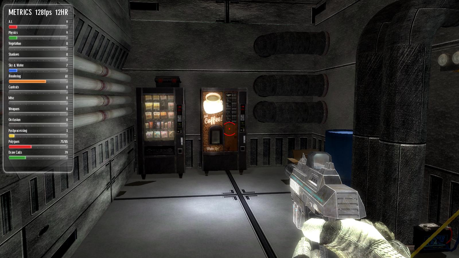
  • The 'metrics' are debug information used for troubleshooting speed, efficiency, etc.  That's another discussion for another day.
  • World settings are your most basic settings: What type of sky you want, what  kind of terrain you're using, and the type of 'grass' you can paint on the ground.
  • Quality settings can be summed up as: LOD = how far away things start to get shitty looking to save on rendering cost, how big the 'map' is, and vegetation settings.
  • Camera settings - I almost never mess with this because the defaults are good for most FPS games.  
  • Visual settings - the most relevant panel in the list.  This affects the colors and lighting you'll be using.  I'll go into further detail below.
  • Graphic options:  This is a more 'high end' feature.  It affects water reflection opacity, how 'thick' the shadows are, lightray amount and vegetation.  Occlusion and debug visuals will require hand tuning in your final pre-game tests.
  • Shader options:  I pretty much leave distance transition settings normal and put everything on highest.  
  • Post effects: What happens "AFTER" the lighting is done.  Bloom affects how fuzzy your light will look.  Vignette radius and intensity - Primarily used to give that 'old time horror game' feel.  Motion blur distance - I hate motion blur, so I disable this typically.  Depth of field I leave at 25 out of 100 but this can really give your game a sense of distance so definitely play with it to see what works best.

So really we've established that for MOST outdoor scenes your most important settings are going to be found in the visual settings tab.

 So let's start with the fog settings.  Starting in a previous version, the fog system is actually VERY impressive in Game-Guru.  It's a blended technique vs the brute force method original versions used. So in reality it's actually very good for making scenes have a unified color, which in turn helps unify the theme.  It also blends the distance very well so the horizon isn't as sheared.

A good example of using light fog to unify the color palette and theme.

A side note: On unifying colors the idea is that if you take a color and use it as a base or blend for the others you will help make a scene feel less jarring.  This can take the form of a common color, shape, or in this case - a fog to overlay a blended color.

I recommend setting fog nearest to around 5 and fog distance between 10 and 30.  Then select the colors you want from the R/B/G sliders.  Fog intensity will typically be around 30-40, unless you want a very heavy fog.

Someone overdid the fog and lighting, methinks.

Ambiance level is another slider you wll need to modify often; it's how much of the ambience r/b/g levels are automatically applied to a surface.  This is important because the brighter this is, the overall brighter your textures will be.  I generally find a setting between 15 and 25 is best here if the color bars are at 100.

Surface level will show HOW MUCH light is reflected by your textures.  This is especially important outside as it determine how much of the sun's light is put on your textures!  Often you will find less is more with this engine; setting this too high will cause highly pronounced shadows which at times are good but often just make things look very clean and unprofessional.

Yeah, it's the unreal engine.  This picture illustrates a low level of ambient lighting (around 5-10 in game guru terms) and a high level of surface lighting to highlight the sun's light (think 30-50).

Another important setting here is 'global specular'.  This slider controls the mirror-like qualities of the textures being hit with light.  This differs from the surface level because surface level changes the lighting on the textures themselves... global specular changes how reflective it looks.  Imagine the difference between a white wall and a mirror.  Both can reflect light very well, but the mirror has that telltale bright spot.

Specularity is low on the right and high on the left.

Understanding these settings is important for fine tuning your lighting.  There is no one size fits all here.  Every setting has to be carefully measured and tested but it does no good for you to not know what they do or how they work.

Let me know in the comments if this helps your project!
Tuesday, December 22, 2015

Errant AI's Arcade Set

This is a long overdue review.

When I spoke with Errant AI (A.K.A. "EAI") about his vendor machine set Errant AI's TGC Store Products review , we discussed our mutual love coin-operated equipment.  At that point in time (probably a year and a half ago) he mentioned he'd do an arcade set, which I was jazzed for.  I grew up in arcades and spent more than my share of allowance money there.

It was a great time and brought back fond memories.  He soon released the kit and... I didn't have any money.  NONE.  I was flat broke.  It sucked.  So for months and months bigger priorities would come up and I'd look at the store and see the really impressive looking set for the arcade objects that EAI built.

Recently I've managed to get my finances squared away and could spend some money on new objects for my upcoming sci-fi shooter.

It was at this point... I looked again at the priciest of EAI's growing collections (4, as of this writing) - the Retro Arcade Pack.  The Retro Arcade Pack clocks in at 15 USD.  It's by no means a cheap purchase.  But I'm a believer that if you want to have a quality looking game, you need quality looking assets.  This pack delivers - in spades.


 The full kit contents.  It's like my youth, reborn!

As you can see, the pack comes with a significant bevy of 30 items, which come in about 50 cents per object, depending on if any sales are occurring.
Most of these items are doubles - in many cases they are a blank version which can likely be modified to present your own possibilities.  Very cool!

In this case, the billchanger comes in both token and cash money varieties.

Now you may look at these and think "Yeah, that's cute - but how good is it, really?"  - what really sold me were the perfectly done animated screens which of course can only be watched in the form of a movie.


The above should show you the sheer and frankly unparalleled level of quality EAI brought to the table.  Even his previous offerings are overshadowed but how absolutely perfect these are.  While I realize it's not an asset for every game, you'd be surprised how you can work them in.  The biggest difficulty in using assets like this is that they tend to make your other assets LOOK WORSE.  It's a bit like taking your ugly friend to the bar to make you look better.  It doesn't help their case to have you standing there, that's for sure.  So if you are planning on using assets like this, prepare to have other assets - LIKE THIS.  It doesn't hurt that I have the snack attack pack and some other really high quality stuff that I've gotten through the community.  I meticulously filter and comb my assets to ensure that the quality is at bare minimum, consistent.


What's interesting is I was discussing 2-D "mode" for Game-Guru with Synchromesh - a forum user.

After some experimentation, he had discovered a way to fake a 2-D mode for Game-Guru.  He shared the secrets with me and filled in the blank spots in my own testing.  So the plan is to make a virtual arcade and then have it warp you off to another level when you use the machine - the level will be a two dimensional simplified mockup of one of these games!  I intend to do a walkthrough later after I've made a functional version of a few.  The driving one should be simple enough.

The bottom line:  The simple version is are you going to need this for all your projects?  No.  It's far more specialized than other packs he offers.  Is it one of the highest quality assets on the store? Absolutely.  If you can manage it, then by all means - find a way to work it in.  I for one, will be using it.

The Retro Arcade Pack can be found here: https://en.tgcstore.net/pack/10474


Friday, December 18, 2015

Friday Status: 12/18/2015

In the real world, I've accepted a full time position as Linux IIS Admin w/ The Bon-Ton Corp.

Things are going to get a lot busier for me, I suspect.

So status, in no particular order:
1) Neo-Monagasque Chronicles Book Two got a shitty review from a friendly reviewer.  That was ugly.   I'm not really sure how to fix the story problems he has with it, or if it's worth fixing at this point.  It kind of gutted my interest in it though.

2) Mechwarrior Dark Age Javascript game.  On hold, as mentioned previously.  No new work will get done on that till next year.

3) My Sci-Fi WIP has a bit more work done.  Working on cleaning up the lighting and finishing up the first zone's layout:
 Revised lighting.  Still having trouble with that primary pillar in the foreground.  The spool on the left is just a placeholder for more stuff later.  I want this entire area to look like a busy docking bay which means people, places, lots of workers and palettes of goods. While I like the lighting, I will say one significant negative is how the overhead lights look off now.  More work is going to need to be done.

More revised lighting.  Spotted some issues here -
  • Natural lighting should be seeping in from above, it is not.  Meaning I have to adjust some of the ambient levels or fake it.  
  • My coffee sign fell down, because I had to adjust the physics values of the entities.  A simple mistake, easily fixed.
  • Light post on right is poorly positioned and looks like it's off.
  • Needs more 'reason' to come over here.  I want to turn these machines into functioning entities, shouldn't be too hard. At that point the hard lighting used for illumination/shadows should really help push the player towards these machines.
This was originally an outdoor panoramic scene but because of an engine issue (shadows displaying on empty space) I decided to fool around with making it part of the ship and it came out really well.  So now you still have a window to space but you can see the ship more naturally as part of an extension of the actual player's experience.  The docking bay itself is actually an old free model done by cosmic prophet for dark city (or was it nuke city?).

This area is my first real "crew" area; it's clutter and design is specifically oriented towards giving a more human feel for the ship.  I'll have a few people sitting, eating, cavorting.  etc.  There should be a lot more decoration to give you the feel that this small mess area is a nice through-way for travelers.  There are a few mistakes here though.
  • One of the panels (mid center, slightly left) for the roof shows misaligned ceiling textures.  This simply needs rotated.  
  • The area needs more lighting in general to put shadows on the interior elements.
  • The far pouch actually is the first secret area and I need to hide this better.
So as you can see, this is coming along well but progress is slow because I have little time to work with this regularly.  I want this to give a nice solid feel; this first level (Receiving Bay) will actually be somewhere we visit again later - it should have a trashed feel at that point as things have gone to relative shit.  

More to come!   For now, I'm slowing down as it's end of the year; holidays are winding up, I have a lot going on in my life (Baby, Job, Holidays) and mostly I'm just taking it as it comes.

Forthcoming reviews:  The "Deep Space" package by oldflak
                                      My comprehensive 'must have free stuff' list - part one
                                      Wizard of Id's warehouse pack.
                                       Errant AI's Arcade Pack.

Deal of the week:  https://en.tgcstore.net/pack/10703  - ... 600 dollars worth of resources for 27 dollars.  Holy jeeze!