This is part 5 of a long running series on lighting techniques in GameGuru. It's advised you read the previous four if you haven't already so you have some fundamental understanding on lighting techniques used up to this point before taking this on.
Seriously advanced lighting (aka lighting, part four)
Advanced lighting, (aka lighting, part three)
GameGuru interior lighting (aka lighting, part two)
GameGuru Lighting Lesson (aka lighting, part one)
extra credit, Wolf's lighting thread:
https://forum.game-guru.com/thread/219206
I should mention that this work has taken me a considerable amount of time and is of significant length. Please take the time to comment on it if it's beneficial to you!
Before I begin
Obviously I've been busy with my book. Much of these posts will be revisited in the book itself in varying forms, but I was going through my old data and found this post I literally wrote a year ago and I feel a fool for having never actually posted it.
Hopefully it's not a question of too little too late and that many of you can find some use from it. Be aware the book has about 3x the amount of information on GameGuru lighting
Illumination mapping
I've discussed illumination maps in the past, though not in any great detail.
An illumination map is an interesting addition which is, in my opinion, underutilized in Game-Guru games. Effectively it is an additional step beyond to add luminosity to your levels. Take for instance this screen:
Add an illumination map (which is simply a copy of the 3d model's texture with the bright spots lit up in white and the rest in black, renamed to texturename_i.dds):
 |
| Yes, this is my hackneyed attempt to make a point. |
And you get this amazing difference in visual fidelity:
What's important here is that while as of this writing Game-Guru lacks an 'emissive' lighting system such as Unreal/CryEngine has, it does however have a certain little bit of fudge.
 |
| Left - regular texture, middle - illumination mapped, right - emissive lighting |
Emissive lighting is effectively self-illumination mapping which also spreads to the environment.
Bright lights really cause a sort of bleed-over with the bloom shader built in. So if you put illuminated lights in and you turn up the bloom it gives the IMPRESSION that they are giving off light (note, this WILL EAT SOME FPS):
Now at some point I wanted to see if I could control the level of brightness in a game-guru illumination map.
Unfortunately it doesn't appear to have any granularity to it. I had expected the ability to control 'how bright' something was, but alas it's either completely on (255/255/255) or completely off (anything else). So be aware that when you're using your illumination mapped objects you need to go with an all or nothing approach.
Updated 11/27/2018 - Per Wolf this has been changed and it DOES function with gradients on the illumination map!
It's a fantastic find and I'm really happy to see it's functioning. He's also provided some great screenshots below.
As you can see the illumination mapping clearly supports gradients so make the best use of them. Thanks again to wolf. Make sure you visit his page over at
seragalacaffeine.com for more great screenshots, tips and tutorials!
Static Light Mapping to Fake Light Emission
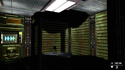
Going back to our previous example - what if you want that same scene to have an emissive effect around the lights? Sure, you can crank the bloom up, but that only does a fudge on the lighting to make it appear like it's glowing. The real trick here is to use a static light map. For example here I have a simple room with a table and a lamp on it. The lamp has a static light under it and it should cast a nice 'normal room light glow'.
 |
| See the little lighter spot on the table? That's all I really wanted! |
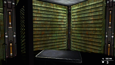
Hey... wait a minute! That lamp object is casting a massive shadow now! What gives? Well, if you're like me you spent hours trying to tweak your lights and configure them in such a way that it provides the best experience for your levels. One little trick I have is to cut out unwanted shadows by placing clutter objects *AFTER* I place my lightmapping. This way I can produce a much cleaner effect, especially in a well-lit room like this.
 |
| Now we've got the circle on the table and no shadow! |
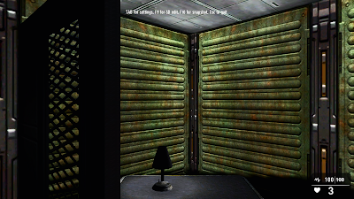
After I place my light and bake it using F3. Now we no longer have a ridiculous shadow.
 |
| Note: the darkness on the lamp is a result of my poor placement of a dynamic light. |
Now simply adding bloom will get your room to look more 'emissive' by blending the colors to provide a more natural effect.
Unfortunately, I cannot show this as I lost this level between when I wrote this a year ago and when I released this today. So here's an example from an older lighting document:
And another courtesy of Wolf
Note the subtle blending of the colors in the textures. That's due to the quasi-aliasing effect being performed by the bloom shader at lower levels. Even having at 50 can provide a pretty nice blend though I don't recommend going above 70 in most cases.
Colors, combinations, and why your lights look like crap.
You might be wondering why some lighting examples look phenomenal, while others look lackluster. There are several reasons for this. The first (and foremost!) is that the stock color choices in Game-Guru are quite literally HOT GARBAGE.
It's true. Due to the way the system 'adds' color to each texture, what you end up with if you use the stock White, Yellow, Blue, Red, Green, Magenta, Cyan, etc lights is a train wreck that is simply too much or too little depending on what you are attempting to accomplish. You almost always will want to modify the colors to be something more realistic. If you've read my previous articles you know that white translates to a 'brightness modifier', basically a clear color with a scale of how bright the individual texture's existing colors should be are! Details make the difference, folks.
As some of you know, I have an artist as a wife (
www.messinastudio.com) and she's very particular about her lighting. As such, I've learned a good bit more than I expected and it's been quite telling! For instance, did you know that natural/artificial lighting is measured on a 'kelvin' scale indicating how 'hot' it is?
This coloration varies from a deep orange to a cool blue. A little
past the middle (Approximately 6500 kelvin) is natural lighting. This
is the reason I have special 200w 6500 kelvin florescent bulbs in her
art studio.
This translates to the following tables from pixelemporium.com:
Light Source
|
Kelvin temperature
|
R
G B Values
|
Color
|
Candle
|
1900
|
255,
147, 41
|
|
40W Tungsten
|
2600
|
255,
197, 143
|
|
100W Tungsten
|
2850
|
255,
214, 170
|
|
Halogen
|
3200
|
255,
241, 224
|
|
Carbon Arc
|
5200
|
255,
250, 244
|
|
High Noon Sun
|
5400
|
255,
255, 251
|
|
Direct Sunlight
|
6000
|
255,
255, 255
|
|
Overcast Sky
|
7000
|
201,
226, 255
|
|
Clear Blue Sky
|
20000
|
64,
156, 255
|
|
Light Source
|
R
G B Values
|
Color
|
Warm Fluorescent
|
255,
244, 229
|
|
Standard Fluorescent
|
244,
255, 250
|
|
Cool White Fluorescent
|
212,
235, 255
|
|
Full Spectrum Fluorescent
|
255,
244, 242
|
|
Grow Light Fluorescent
|
255,
239, 247
|
|
Black Light Fluorescent
|
167,
0, 255
|
|
Light Source
|
R
G B Values
|
Color
|
Mercury Vapor
|
216,
247, 255
|
|
Sodium Vapor
|
255,
209, 178
|
|
Metal Halide
|
242,
252, 255
|
|
High Pressure Sodium
|
255,
183, 76
|
|
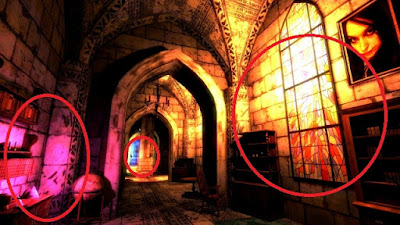
In Game-Guru you'll find that often the best results can be achieved by simply blending and letting the engine handle it for you. Despite whatever adjustments you might make, or if you use all the coloring charts on the reference page that I have ... it really helps to simply put two different colors in a room and let them blend together when you compile the static lighting.
 |
| From Wolf's WIP Game:Shavra |
As you can see in the above example, you have two separate light colors. One a sort of magenta while the other is a 'hot kelvin' type orange color. While either of these could be used to set the tone by themselves, by shifting the color dramatically he's achieved a very unique effect that clearly separates the room for a person's eyes to see.
 |
| Also from Shavra |
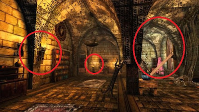
In the above picture you can see a more subtle delineation, allowing a cleaner combination of two similar colors. It also helps draw attention to a critical point, where something vital is hiding (near some glowing mushrooms).
use previous example to show blue/white colors and combination from lamp and overhead lamps.
In this example we've taken the lamp from the previous segment and put in a white overhead light for general room illumination and then underneath the lamp put in a bright blue light to give the simulation of varied lighting. The result, I think, pays dividends.


