Search This Blog

Tuesday, August 23, 2016

A few of Erart's more 'unusual' pieces.

So this is the review I was talking about.  The one where I have some things to say that may be considered somewhat negative.  Overall, I have good praise for Erart but a word of warning I do have some buyer's remorse over one object - specifically the coconut throwing weapon.

I'm usually very careful about what I purchase; I want to make sure I only buy the things I plan on actually using or I can use to some functional end.  This means a great many purchases I make are actually based around my Sci-Fi WIP. 

That said occasionally I purchase models for my son to use or objects I just plain find interesting.  I recently made a octonauts themed series of items for my son (nothing special, just some alpha masked 2-D decals he could place, along with a poorly made 3D model of the octopod).  I decided to splurge and purchase two items from Erart:

First was 'coral reef 2'.  This is the lower priced of the two coral reefs he offers.  It's a simple coral reef with some anemone and a starfish.  That said, it's really impressive what he's done - he managed to make a very functional dynamically moving object that adds a lot of life to your underwater scenes.

As you can see from this video, it's got a lot of really cool behavior to it.

In game, it looks like this:
Nevermind the coconut, that's for later. 

Now the reef itself is rather small but blends in well with grey or brown surroundings.  I for one was extremely happy with this piece.  It has a surprising amount going on and I'd reckon it's pretty much required if you want to run an underwater level of any kind.

The next piece was the 'underwater skybox'.  I've made a number of skies myself so it's not often I purchase other people's skies.  This was however a very unique offering giving an 'undersea' view of the surface water above and some jellyfish flying by.


Well.. Overall this is an excellent skybox. That said there are *SOME* complaints.   Nothing major here.  Primarily that the jellyfish appear very flat, are too frequent, and move way - way - WAY too fast.  I mean unless those Jellyfish are mounting jet engines, there's no way they should be moving so quickly.  It can be tuned, of course, manually via the skybox settings files but the end user shouldn't have to do that.  So buyer beware - it's a good skybox but you may find yourself tinkering with it.


So having purchased two separate items and being reasonably satisfied by his work - I decided to go for it and purchase what I felt was a 'must have' silly item - the coconut weapon.


So as you can see from the video, the weapon seems reasonable enough.  I want it specifically as a 'cheat code' silly weapon that will basically destroy anyone it hits.  That's easy enough for me to implement, of course.  The fact it's a coconut is perfectly ridiculous for me.  I feel that this has limited utility outside of a strictly 'survivalist' game, which there's really not a lot available in that respect weapon-wise so you may find yourself never quite in the situation I was in.

So let's start with the nitty gritty - first off, the modelling, method, and texturing is really well done.  What was done here was ambitious and I look forward to future weapons by Erart.

Behold the coconut, mighty in it's glorious power.
So the coconut is a hitscan weapon.  It's modeled very well.  The hands are a little... cartoonish but nothing game-ending for me.  What kills me though is actually the OFFHAND.  First of all - it serves NO function; it's just there. And second of all, it makes your character seem like they have Bell's Palsy or something.  You literally run around with your hand sticking out stuck in a sort of rigor.  Then when you toss the coconut, the hand comes up and comes down as if it's attached to a stick.  It's ... unfortunate.  I really can't find myself wanting to use this weapon simply because I can't stand the offhand.  I'd rather he just get rid of it altogether, if possible.  I may write him and ask this, I don't know. 

Take a look:

This is the start of the throw. 
As you can see above, the initial part of the throw seems ok - though that second hand really never touches the coconut at all.  And the main hand is ... awkwardly angled but that's less of an issue than it might seem.

The problem is the left hand remains locked in that posture and simply ... goes down.  It looks absurd.

Apparently you have really bad arthritis from years of coconut throwing.
So .. yeah.  That's the meat of it.  If the hand movement was less rigid, it'd be a top shelf gimmick item.

As it is, it's relegated to my 'maybe one day' bin.  Overall, I applaud Erart's absolutely unique offerings.  Almost everything he sells has some unique edge to it that can't be found by any other vendor.  I'm shocked at some of the genuinely impressive things he's done.  If he can just improve his model animations a smidgen he'll easily best some of the Game-Guru community's top authors.

Monday, August 22, 2016

Semi-regular (ok not really) update

So I've been busy with a number of projects recently.
But unfortunately real life has sucked up a ton of my time.  That said there's some news here.

First dealt with a Cygwin issue.  I use Cygwin at work with the metacity gnome desktop for x-windows.  I do this so I don't have to run a virtual machine and can interface as cleanly as possible with my required windows apps while having minimal overhead. 

So this week we had an issue where a recent update nuked my cygwin instance.  After much gnashing of teeth I had the Trendmicro admin add my c:\cygwin64 and cygwin64\bin folders to the exclusions list.  I then reinstalled cygwin.  I then ran into several weird issues.  The primary one was needing to reinstall pulse audio due to an error with the device not functioning and the dll not being found (found via .xsession-errors file).  The second was I wasn't using the right repo (local repos don't completely archive all possible components).  The third was a complete piece by piece reinstall of gnome.  That seemed to do the trick.

Next up I contacted Lee @ The Game Creators (makers of Game-Guru) about lighting.  I learned some interesting things which greatly impact how the lighting will be used going forward.  I plan on doing a detailed fourth part to my lighting tutorial based on what I've found.  I also played around with reshade to maximize FPS and produce the best graphics possible from Game-Guru (at this time).  The results were nothing short of shocking.  That will also go into that fourth update.

I learned some new tricks with game-guru in respect to level design and also renewed my interest in my sci-fi work in progress (as yet unnamed).  More resources were gathered.  I plan on revamping some textures and then reintroducing them as HD components.

I've also got my first review where I'm genuinely disappointed in what I've purchased.  It's unfortunate because I had such high hopes for it.  I promise not to beat on them too hard, I just have a case of buyers remorse :)

All in all things are moving along albeit slowly.  Stay tuned!

Monday, August 15, 2016

Wizard of Id's GameGuru Underground Pack

So this has been coming since the middle of July.  I apologize for both the delay and the scraped pictures.  I'd rather have done them myself but my life is incredibly busy as of current with the new baby and job stuff.

So it's about time to do some review stuff.

I recently purchased the Wizard of Id's (WID) Underground Pack.  It's an underground maze-system which has a great sewer or bunker-building quality to it.

This system contrasts against OldPman's underground kit which is similar but very, very different.

One of the more interesting things about WID's kits is that they are usually built with an uncanny level of detail; it's something very few artists pursue.  Each one has their own skillset but clearly WID's is his near obsessive level of focus on individual pieces.

Like this small sampling of the lights included.
This is a versatile kit which I think is well positioned as a competent middle ground for people looking for a very generic 'brick and tile bunker maze' system.  It's definitely reminiscent of a subway station or maintenance tunnel.

The first thing you'll notice about WID's kits is while they typically are not extravagantly modeled with ridiculous amounts of polygons... they have exceptionally good texture quality.

Speaking from experience, this is on medium.  Putting it on higher levels makes this really stand out.
WID's bump mapping is second to none, at least in the Game-Guru community.

He's got that down to a very enviable science.   He also tests his levels extensively using actual test levels he builds and with static lighting as well.  The results are clearly something which are
very mature in palette, texture, and shape.

The above is not too far off from what to expect from your own work.
It's a lot like going to a concert, really.  Sometimes you listen to a musician's audio track and think "I like this song.  I'll bet it's great in concert."... yet it ends up being an utterly flat dud.   Other times you think "This sounds as good or better than it does on the cd!" ... WID's work is a lot like that.

The pricing for his individual pieces is high.  I never buy his stuff individually.  His packs, however, are reasonably priced for art that's on peer in terms of quality with Errant AI's stuff (which I hold in extremely high esteem).

One thing worth mentioning... these pieces are HUGE.  I mean I was really flatly shocked after working extensively with other vendors like oldpman at how monstrous these levels could become.  It's not a bad thing, but you should know so you can plan accordingly.  Don't think you're going to create a tiny maze here on the edge of your map.  

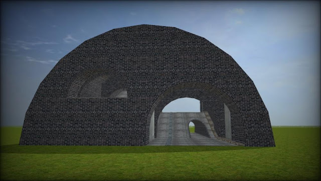
This is approximately the width of a skyscraper from the TGC City pack.
The bottom line: That said there's a lot of variety, quality, and depth to WID's work and this one is no exception.  If you are looking for a top shelf set that merely needs some clutter items, triggers, and enemies - look no further.  This will handle the bill in spades.


Monday, August 1, 2016

Just a quick new resource post

https://beta.deleddesigner.com/

This is a pretty impressive web-based 3d-modeller.  It's very simplistic but I actually prefer that.
Check it out!